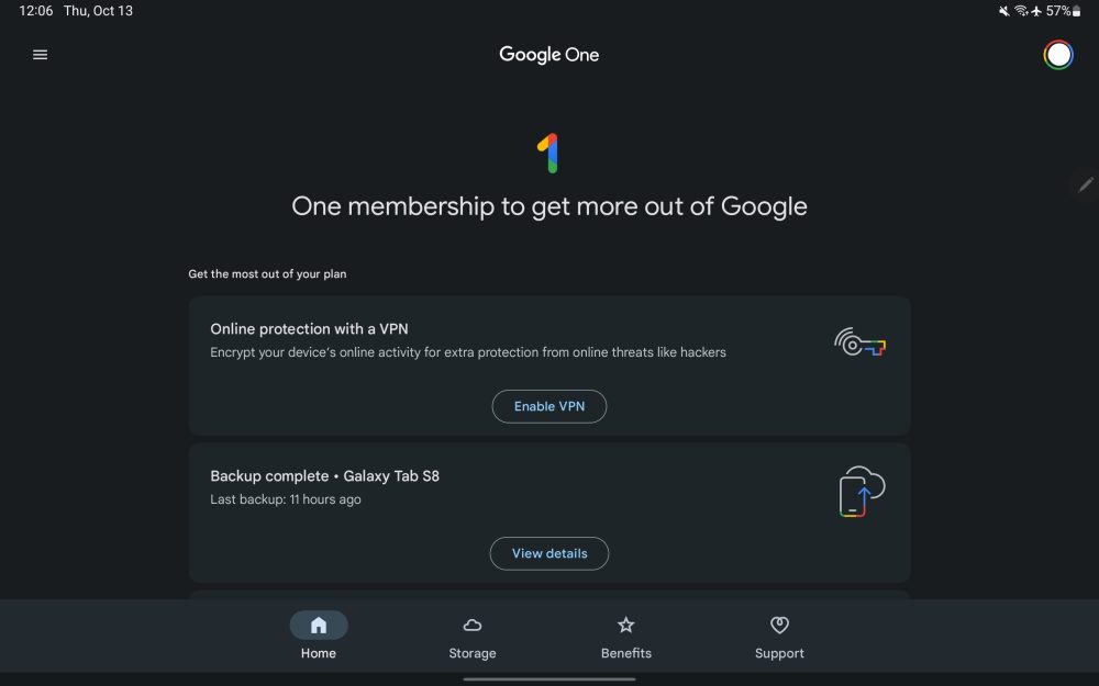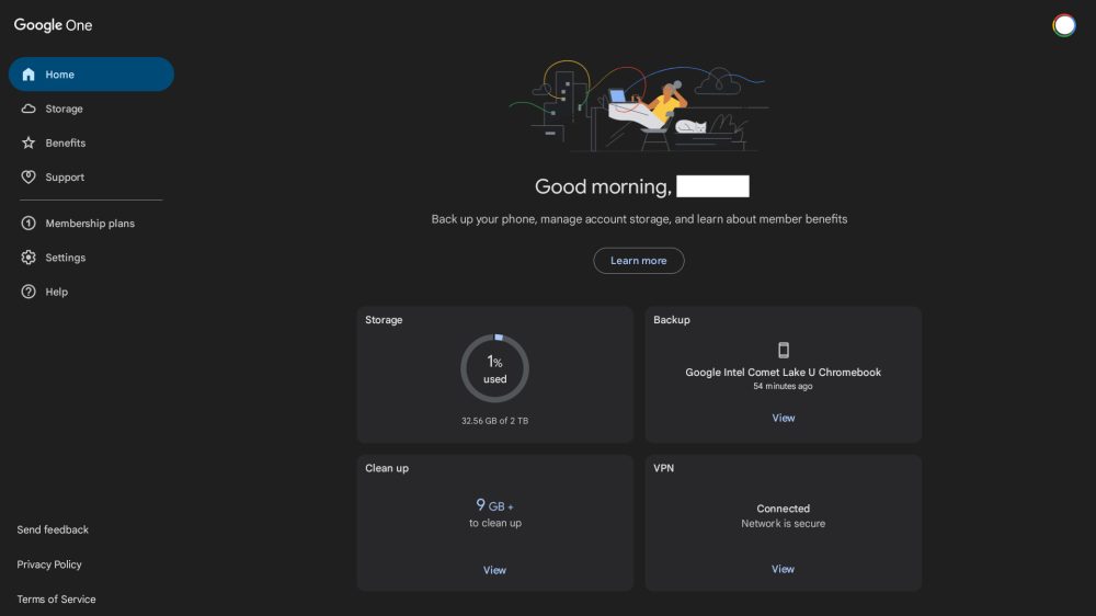
Besides announcing Mac and Windows VPN support today, Google One for Android is getting the tablet redesign that was previewed back in May.
The redesign started at the end of last month when Google One’s Home feed switched to a grid layout that highlights key details about storage space, backups, the clean up tool, and VPN status. It makes for a glanceable feed and also rolled out to phones.
That’s now being paired with an always-showing navigation drawer at the left that replaces a bottom bar, which was too tall on tablets and ate into the content.
The Google One logo appears in the top-left corner with Home, Storage, Benefits, and Support, appearing first as the core parts of the application. There are also links to Membership plans, Settings, and Help, as well as Send feedback, Privacy Policy, and Terms of Service. It very nearly lines up with one.google.com and makes for a consistent experience.


In portrait orientation, a top-aligned (instead of centered) navigation rail is leveraged with a hidden drawer also there.
A small bug (below) sees smaller screens that are not wide enough only show one card per line. The design (card width) will presumably be tweaked in the future to address that.
Several other Google tablet apps would benefit from this navigation change. Gmail and Google Home are expected to use navigation rails, while it’s already live in the Play Store, Photos, and Google TV.
Be sure to be on the latest version of Google One, but this tablet redesign is otherwise a server-side update.
More on Google One:
- Google One VPN coming to desktop with Mac and Windows apps
- What Android tablet & foldable apps would like in Google’s perfect world [Gallery]
- Every Google app with an Android tablet UI [U: Gboard, Play Store, Chrome, and Sheets]
- Google updating Chrome on Android tablets with tab grid, Groups, and more
FTC: We use income earning auto affiliate links. More.


Comments