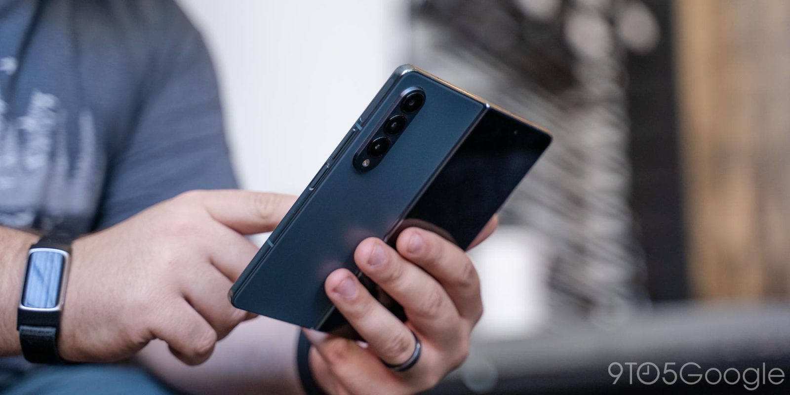
With the promise of a Chrome refresh coming to desktop sometime this year, we’re already seeing signs of a redesign on foldable devices, as subtle as they may be.
Google is no stranger to redesigns. Chrome itself has faced a few, with the most recent one being the Chrome logo’s adaptation into something slightly different but still quite the same. In line with that theme, Google is also working on a new refresh for Chrome on desktop, which would include changes made to a few menus and minimal tab strip changes.
While the details of that project are mostly unknown, its existence is easy to spot through Google’s experimental features. Similarly, Chrome’s latest stable version (112) includes experimental flags that work towards the same type of change in foldable devices or ones with larger-than-average screens.
In the new Chrome app design for foldables, Google has changed the way each tab is attached to the address bar (via AndroidPolice). In the previous version, an active tab was attached to the page you were browsing through, much like a physical file tab. Switching tabs would of course change what was highlighted in the forefront.
The new look now has active tabs highlighted in a thin floating card above your page, which acts as a Material You highlight. Each background tab that surrounds it is missing an outline and blends in behind it, though they’re still easy to navigate. When inactive tabs sit next to each other, a thin line separates the two, which acts as the tab border. On the far right, Google keeps the Material You “new tab” button with its color also determined by your device’s palette.
In the Chrome redesign for foldables, the new separations between the tab and address bar give the mobile version of Chrome a more modern feel. While the tabbed design meant to mimic physical book tabs was well kept up in design, floating card-like tabs seems to suit the browser much better. With that, the address bar, tabs, and “new tab” button all take advantage of Android’s Material You theming. That in itself gives the new look a nice little pop.
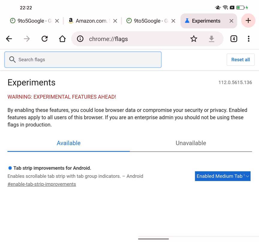
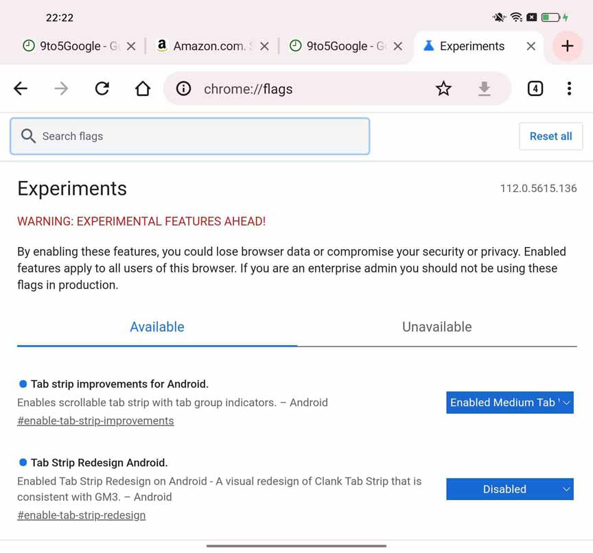
The change is server-side, with the new look acquirable through Chrome’s experimental flags. On our test devices – Galaxy Z Fold 4 and Oppo Find N – we had to play around with both chrome://flags/#enable-tab-strip-redesign and chrome://flags/#enable-tab-strip-improvements to get the device to display the new look. Interestingly enough, there were two variations of a newer design. One had Material You theming and a newly designed “new tab” button, though it kept the traditional tab design; the other was the new version with the floating tabs detached from the address bar. No concrete flag setting was able to give us the new design, rather, it took a lot of playing around to see each of these designs.
While this seems to be a stable rollout to some users, we had to manually find and enable the change ourselves.
FTC: We use income earning auto affiliate links. More.


Comments