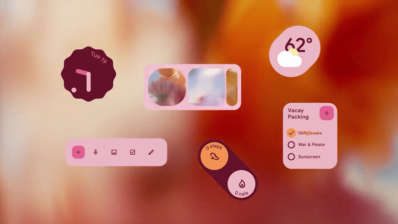
Google is getting ready to introduce a bolder, even more colorful version of Material You, allowing you to leave the pastel shades behind once and for all.
With Android 12, Google debuted its “Material You” design language, which ditches the usual baseline dark or light theme for something with a splash of color. Using the colors of your wallpaper, Android can generate an entire complementary Material You color scheme that is then applied to your favorite (supported) apps.
As it stands today, all of these themes begin to look more or less the same, translating the primary colors to similar pastel shades. These colors are usually pale and muted rather than bold and vibrant. This is ideal for ensuring your final theme colors have enough contrast for text to be readable and for you to visually distinguish between various parts of an app.
For Android 14, the Material Design team has prepared a new theme style that allows for significantly bolder Material You colors. Internally, the new style is called “Fidelity,” and it’s designed to ensure that your preferred base color is directly used in the final theme.
The “Google Design” team recently tweeted a video (which also showcases some concept art for Android homescreen widgets for Fitbit) that shows a much bolder color palette than is possible with Material You today. We believe that this is an early preview of the new “Fidelity” option in action.
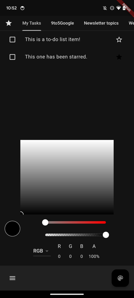
For now, the newer, bolder Material You colors aren’t available directly in Android 14 (though work to support them is in progress), but our team found that the style is already available in part of Google’s open-source code. As such, we were able to create a simple demo app to offer a better idea of the vibrant future in store for Material You.
The most important thing that we can emphasize about this next iteration of Material You is that the exact base color that Android pulls from your wallpaper will directly appear in your theme. Whether you’ve chosen hot pink, sports car red, lime green, or jet black, you’ll see that reflected.
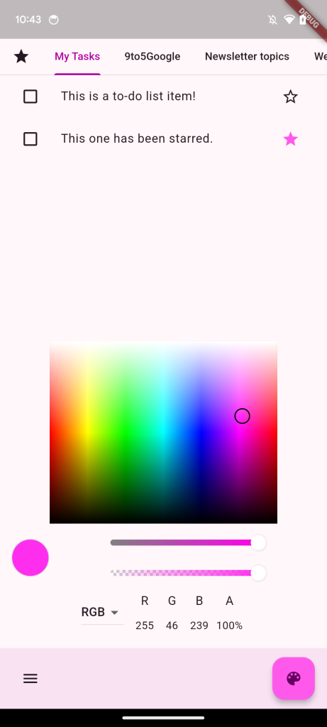
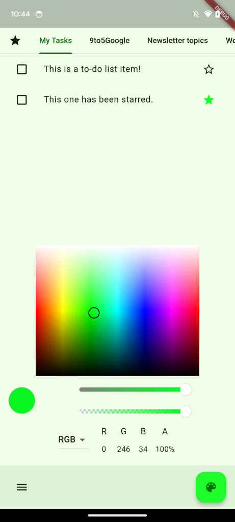
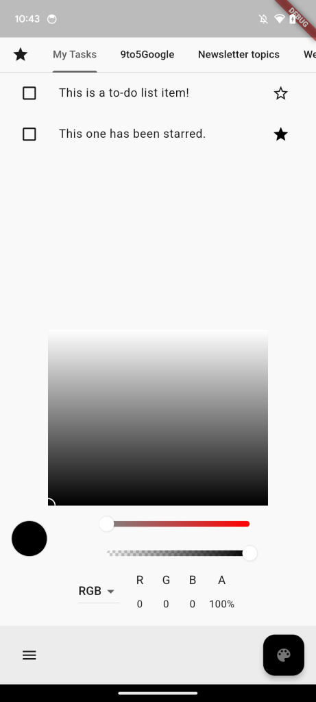
You can see that in action in our demo, which uses a simple color picker – of course, Android 14 would use color(s) from your current wallpaper, as normal – to show that effectively every color is possible.
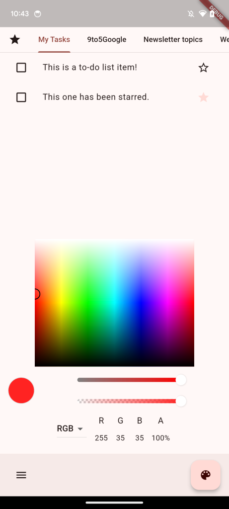
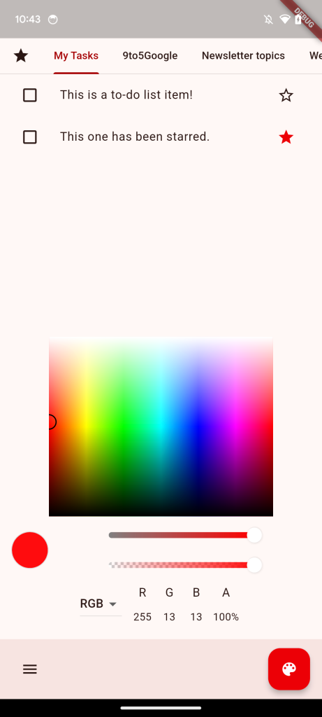
In fact, red or black colored themes are not possible in any way on Android 12 or 13, with the system instead offering a pale, almost pink shade. This alone should help make Material You a bit more fun and interesting. Below, you can see an example of what a “red” theme looks like on Material You today (left) versus the new Fidelity style (right).
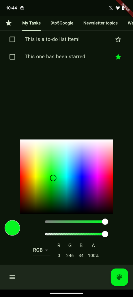
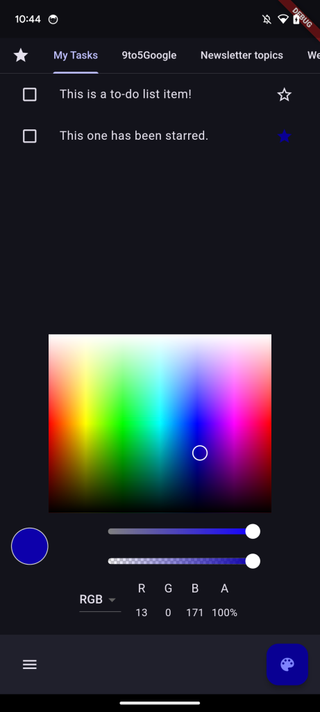
Upon switching to dark mode, your primary color of choice remains the same, while everything else changes to better suit it. Of course, this can backfire a bit, depending on your colors. If you try to use too dark of a wallpaper, things may start to blend together visually when in dark mode.
Overall, it seems like Google wants to use Android 14 as its opportunity to emphasize the “you” in Material You. This is particularly signified by the word “Personal,” which appears in numerous colors at the end of the new trailer.
Hopefully, we’ll learn more about what’s next for Material You at Google I/O next month. In the meantime, let us know in the comments what you think of the new color schemes. What color would you most like to use as a theme on Android?
Dylan Roussel contributed to this article.
FTC: We use income earning auto affiliate links. More.


Comments