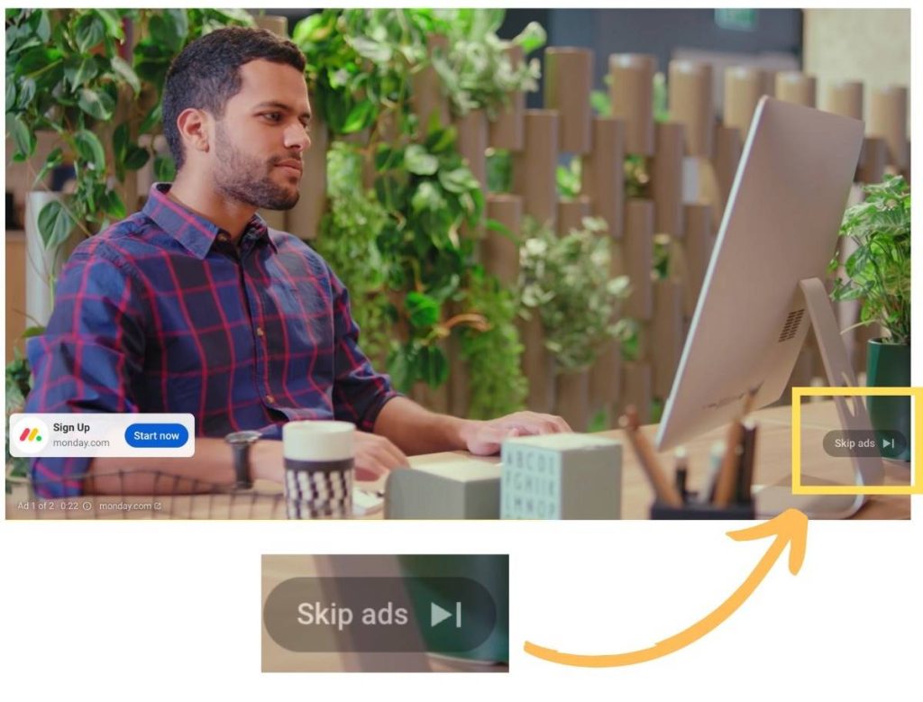
Ads on YouTube have been getting worse, but the “Skip Ads” button often comes to the rescue of lengthy ad breaks. In a new testing, though, YouTube is toying around with making that button much smaller.
The “Skip Ads” button appears across YouTube’s various apps and experiences, usually in front of extended ad breaks. The option generally has the same rectangular look, which admittedly has been a bit out of place following recent redesigns to YouTube.
That may soon change, as YouTube is testing a new design for the button as some users have noticed. The new button is much smaller than the existing design but is also much more in line with the new look YouTube has.
YouTube has since confirmed the test to SearchEngineLand, explaining:
We’re testing an update to the design of the ‘Skip Ads’ button across all platforms. Our goal is to provide a more consistent user experience in line with the updated look and feel on YouTube we announced last year.

Are you seeing this updates “Skip Ads” design on YouTube? Let us know in the comments below if you are!
More on YouTube:
- YouTube is testing summaries written by AI
- Multiview comes to YouTube and gets official YouTube TV launch, but with limits
- YouTube will stop showing videos on the homepage if your watch history is off
FTC: We use income earning auto affiliate links. More.


Comments