YouTube is testing out a new design for playlists and watch history on its TV app, now showing up for users on Google TV.
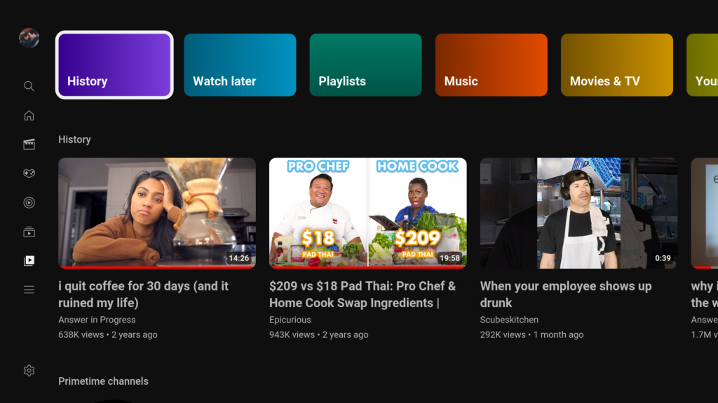
Rolling out to the YouTube app Google TV and Android TV, likely not to all users, a new design appears on the “Library” tab, which adds a splash of color to some key parts of the app.
Along a new top row, YouTube shows shortcuts for history, Watch Later, playlists, music, movies & TV, and your videos. The new shortcuts are then followed by a horizontally scrolling list of your watch history, any Primetime Channels you might be subscribed to, and then lists for your Watch Later, playlists, and liked videos. Each button at the top of the UI, though, will show the requested content in a fullscreen UI.
It’s a relatively minor revamp as far as the app goes, but it is much cleaner and easier to understand.
We’re seeing the new design across devices, including Shield TV and Chromecast with Google TV so far.
Google’s plans for the “Library” tab here are mostly still unknown, but the company did recently revamp YouTube’s Library tab on mobile apps as the “You” tab, and it seems like this TV redesign could be related.
Are you seeing this new look for YouTube’s TV app? Let us know in the comments, including what platform you’re seeing it on.
More on YouTube:
- YouTube begins public testing of ‘Playables’ gaming effort
- Clever workaround speeds YouTube ads up instead of blocking them [Video]
- You can now ask Google Bard questions about YouTube videos
FTC: We use income earning auto affiliate links. More.

Comments