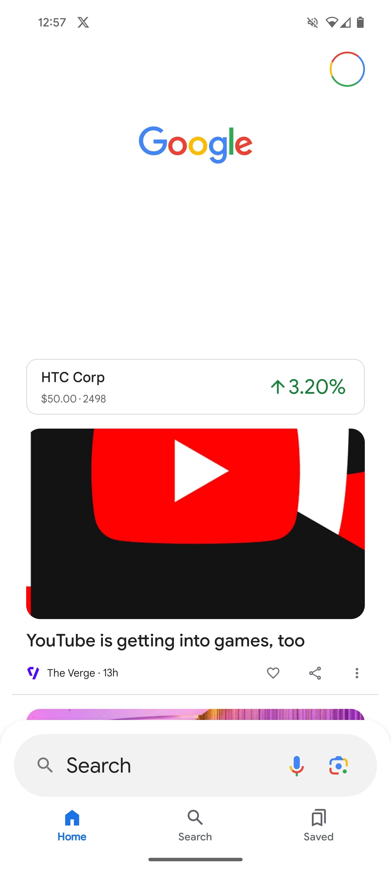
The first time we saw a bottom search bar for the Google app was in 2021, while we enabled a modernized version in late 2023. Google is now testing a Material 3 bottom bar redesign with an integrated search field.
At least one user today has encountered this bottom bar redesign in Google Search on Android. For starters, it’s finally using Material 3 with a pill-shaped tab indicator that has rolled out on the iOS version but was seemingly abandoned on Android after a brief rollout was pulled. (That said, the Google app screenshots in the Play Store listing feature it.) That change alone plays a big role in making this first-party application a bit more consistent.


Current vs. new (@Cookie_lolll)
Above the bottom bar is the tall search field that previously only appeared at the top of the Discover feed. At the moment, that thicker variant disappears on the actual Search results page. In the redesign, it remains there for some consistency, though it does still look comically large. Overall, the combined search field and bottom bar make use of a sheet container.
Top comment by Austin
The strangest thing to me is why they seemingly can't launch anything with dynamic colour anymore. It's always the default blue. They went on and on about being able to personalize our OS but in some of the biggest apps, like Google, Maps, Home, and Play Store all don't have it. Is it that complicated to program? Are they afraid of the colour coordination not being optimized? Don't they have a ruleset and style guide for how these are supposed to be implemented? Why does it take so long?
One complaint would be that it takes up more space that could be used for results, but the “Google” logo no longer appears at the very top, with the Search filters immediately appearing instead.
Instead of Dynamic Color, the default blue tint is used. It does stand out against the Search results page.
Compared to the current look, this bottom search bar redesign looks more modern, with the Google app decidedly looking a bit old as of late. Hopefully, it will see a wider rollout.


L-R: 2021, 2023, 2024 (enabled)
More on Google Search:
- Report: Google might make SGE a paid feature, not working on ad-free Search
- Google pushing Pixel 8 on Search homepage with ‘Upgrade now’ prompt
- Google now indexing Bitcoin’s blockchain to show wallet balances
FTC: We use income earning auto affiliate links. More.


Comments