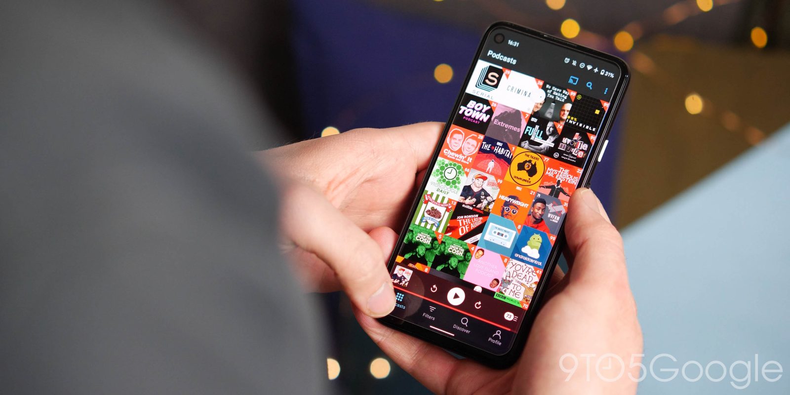
Pocket Casts for Android is getting a notable, wide-ranging redesign spanning the homescreen UI and widgets. It’s currently in beta ahead of a stable launch.
“Up Next” is now part of the bottom bar to provide even faster access to your queue of episodes. It slots in between the tabs for “Podcasts” and “Filters,” with “Discover” and “Profile” rounding out navigation.
You’ll also notice that the grid of podcasts has been tweaked with rounded corners so show art no longer goes edge-to-edge. The new episode badge has also been updated.
The mini player is no longer docked to the bottom bar. It floats and features rounded corners in a nice modernization.


Old vs. new
Last month, Pocket Casts started testing new homescreen widgets on Android. The three Pocket Casts widgets were pulled shortly after entering the beta channel, but are now back after a redesign that addresses beta feedback.
In April, the single-line widget became the “Medium Player” with the addition of the episode name at the top, while play, rewind, and skip were placed in circles and squished together. The May design is a return to the original look with big buttons that span the entire widget, while the episode name has unfortunately been removed. It can be as small as 3×1.
Tapping the widget opens Pocket Casts when nothing is currently playing, while the original widget remains as “Medium Player (Classic).”
The new 1×1 “Small Player” remains largely the same, though the play/pause button switches from the circle to a rounded square. The default red theming for each button is gone.
Finally, the “Large Player” also gets bigger touch targets. Matching standard iOS widget design, you get your Up Next queue below the playback controls. It can be resized to consume your entire homescreen.
This is currently live in version 7.64 of Pocket Casts, which is currently in the beta channel.


FTC: We use income earning auto affiliate links. More.


Comments