
Google is working on the latest set of Material 3 components, including a Floating App Bar and FAB menu. Keep in mind that Google has yet to announce these components, so they’re still a work-in-progress and might change.
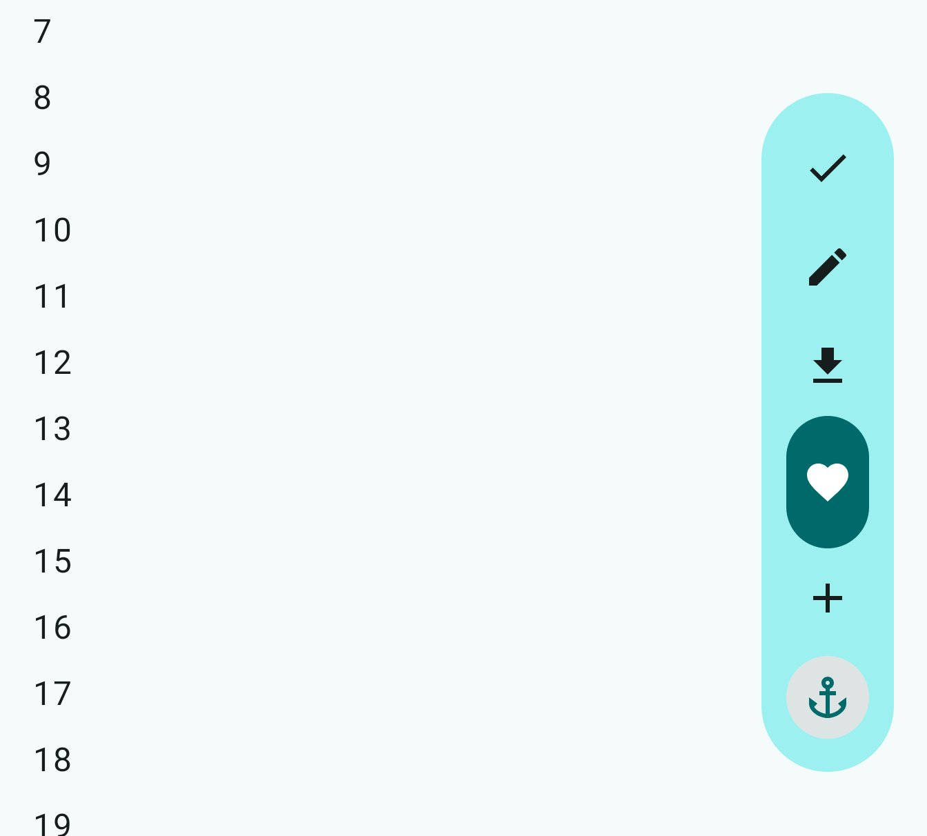
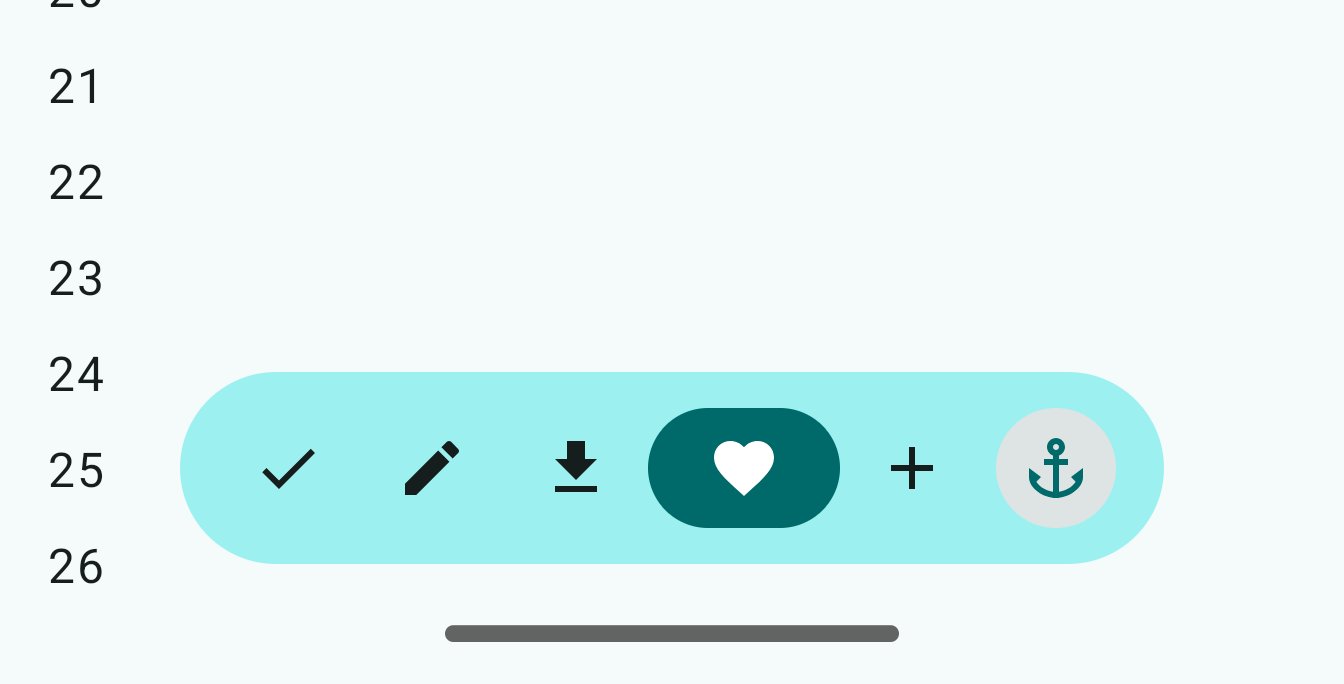
Shared by Dylan Roussel, first up is the Floating App Bar to complement the existing Material 3 Bottom and Top App Bar. It’s available in Horizontal and Vertical configurations, while it can hide upon scroll. The name suggests it will be a toolbar that contains important actions.
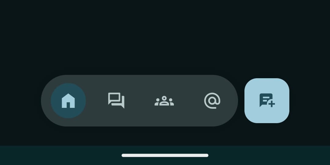
Another use for it is seen in Google Chat where it serves like a hypothetical floating navigation bar that provides access to key parts of the app, as well as the FAB. (To be clear, that new element in Google Chat is already called a “FloatingAppBar.”)
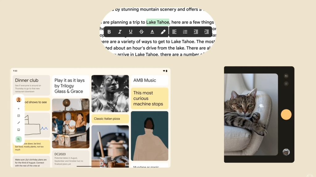
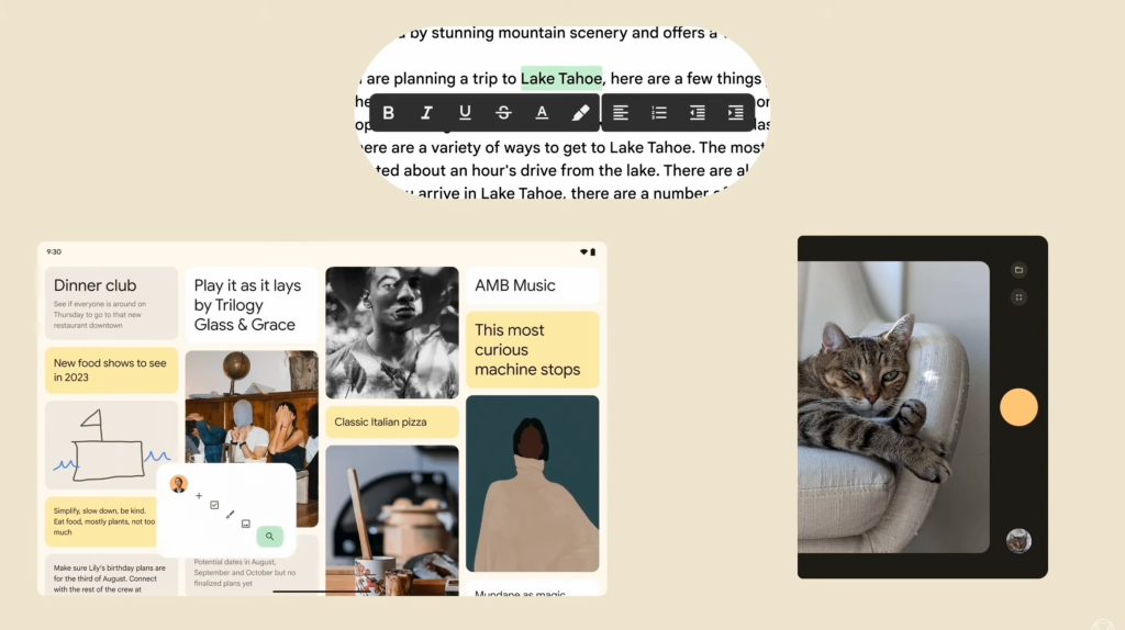
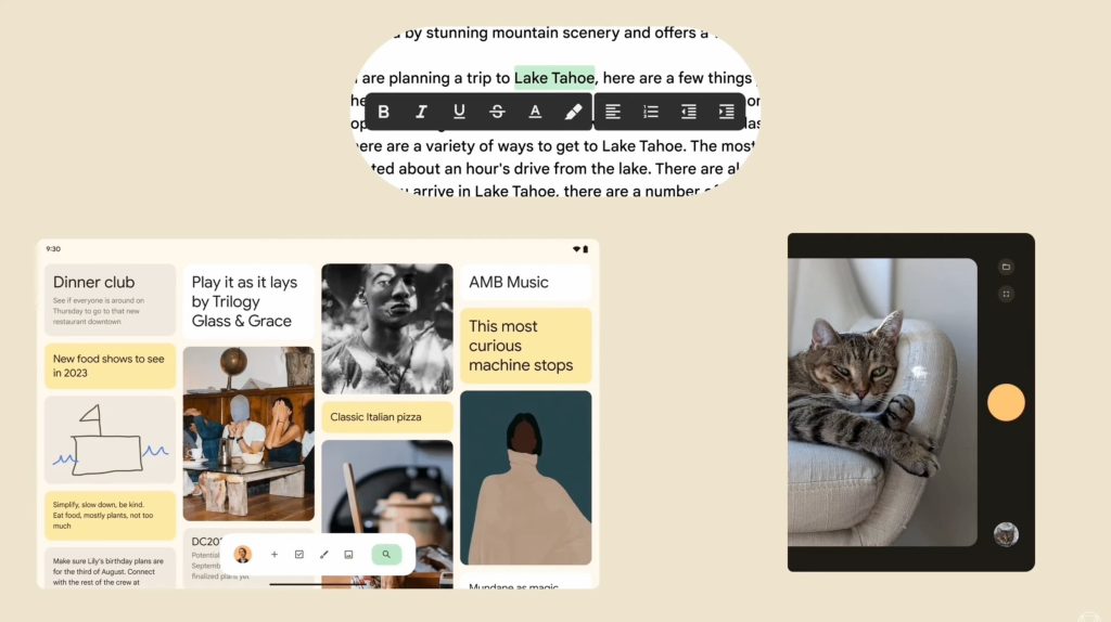
Meanwhile, Google at I/O 2023 previewed a personal future for Material You tablet apps. A Google Keep-esque example showed a panel with your profile avatar, search, and new note/list/drawing/image buttons that could be moved from the edge to the bottom of the screen. It looks similar to the Floating App Bar.
Google is working on a Medium FAB to complement the existing Small FAB (camera/scan button in Google Drive), (standard) FAB, and Large FAB (record button in Pixel Recorder + Google Clock).

There’s also a FAB Menu that you might be familiar with in Google Calendar and Google Docs/Sheets/Slides. Tapping the FAB shows additional actions that fan out with a nice animation.
Finally, there’s the Split button that you already have a version of in the Google Docs editors at the top-right corner.
More on Material 3:
- Google’s Android apps have maddeningly inconsistent navigation drawers
- Chrome address bar gets Material You redesign on Android tablets, iPad
- Google no longer developing Material Web Components
- Google Photos now uses an animated Material You carousel
FTC: We use income earning auto affiliate links. More.



Comments