
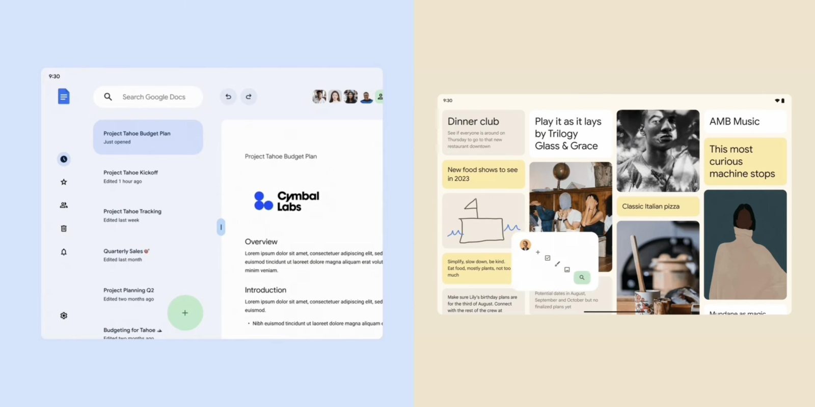
Following the launch of the Pixel Tablet and Fold, a handful of developer sessions at I/O 2023 were focused on how to optimize apps for large screens. At the end of one particular talk, the Material You team gave “a little preview of what [it has] planned for [its] Google Apps on large screen,” like tablets and foldables, in the future.
The preview during “Material You for large screens guidance” was centered on three themes/principles from the Making Material You films. These ideas are “still a work in progress” with a “in the next few years” timeline and show a world where Android apps on tablets and foldables are given a lot of attention and development.
Expressive
Google believes “large screens are a moment to bring that bold expressiveness that a smaller device doesn’t have the space for.”
Some examples of things you can do on a larger screen with more space include:
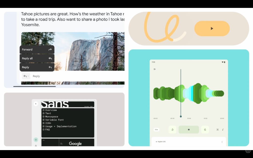
- “Icons that are reactive underneath your finger, built on Material symbols.”
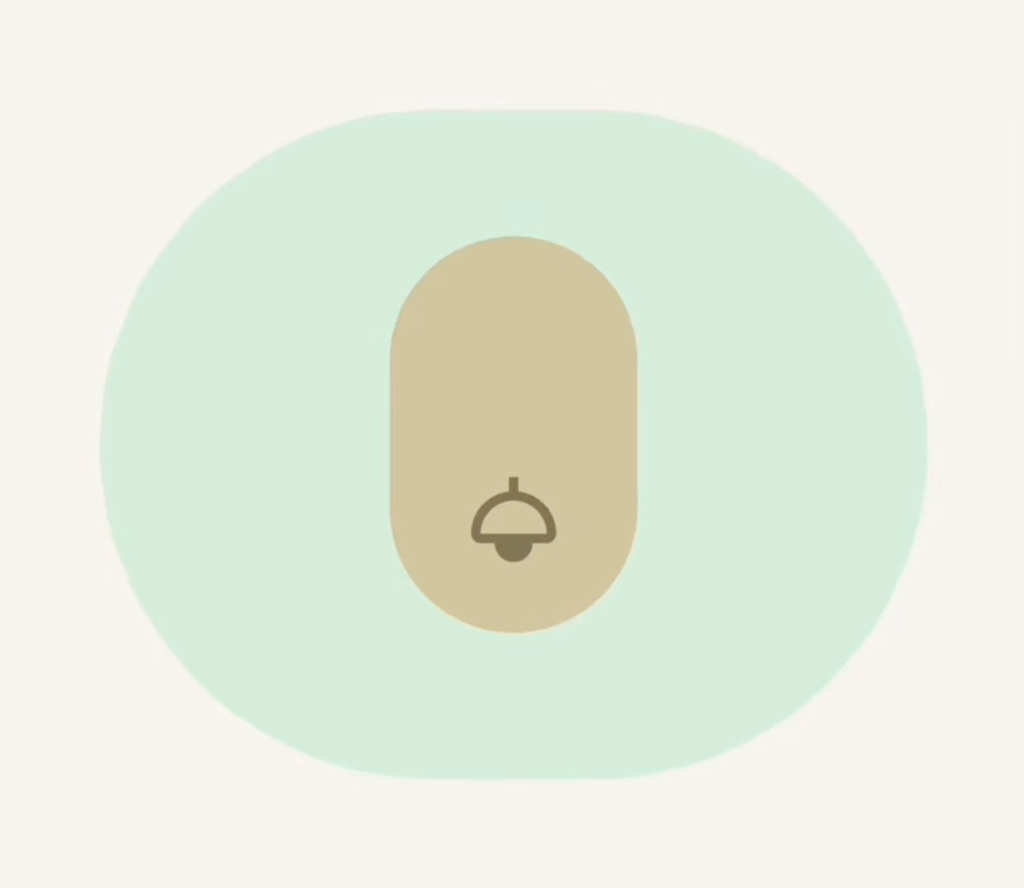
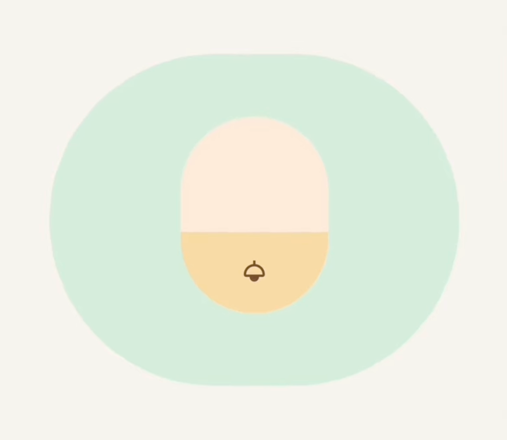
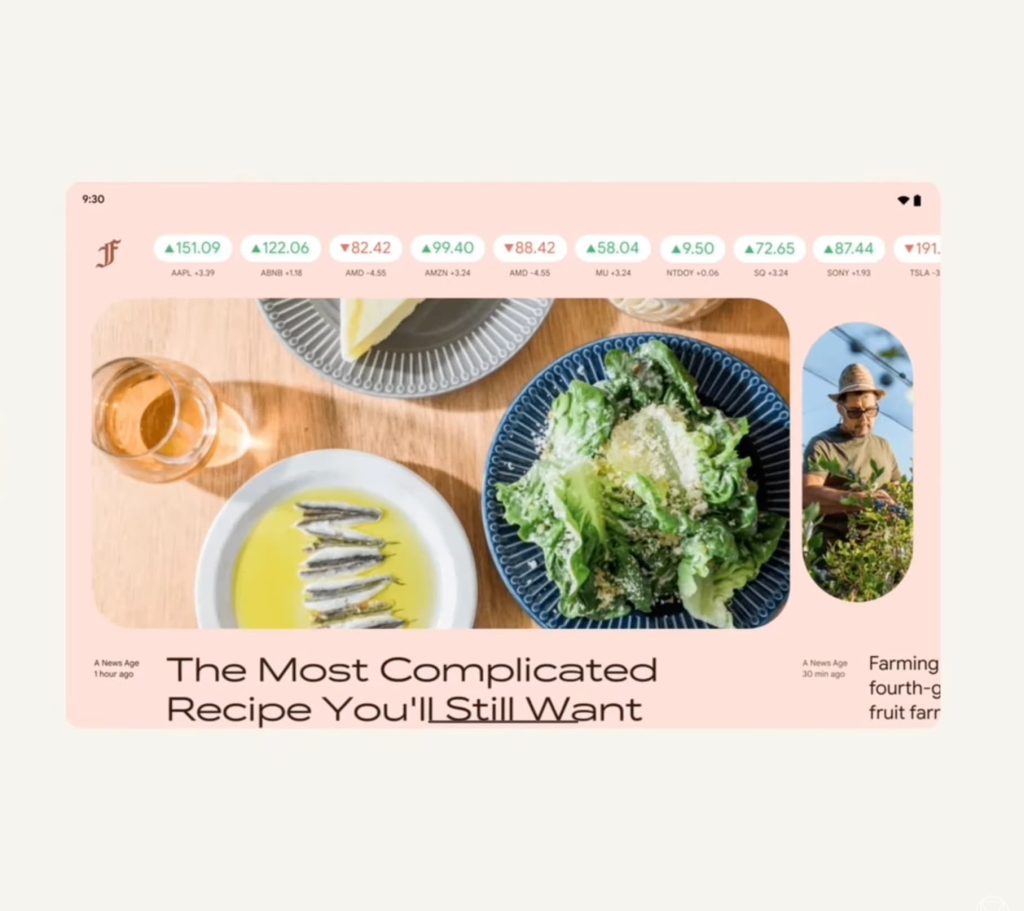
- “Expanding the canvas size allows for a broader range of typographic expression and, when combined with variable fonts, facilitates smooth transitions between wide to narrow or thin to extra bold states, dynamically adapting to changing layouts and panes.”
Google offered an example news app that leverages the Material 3 carousel and shows varying amounts of information:
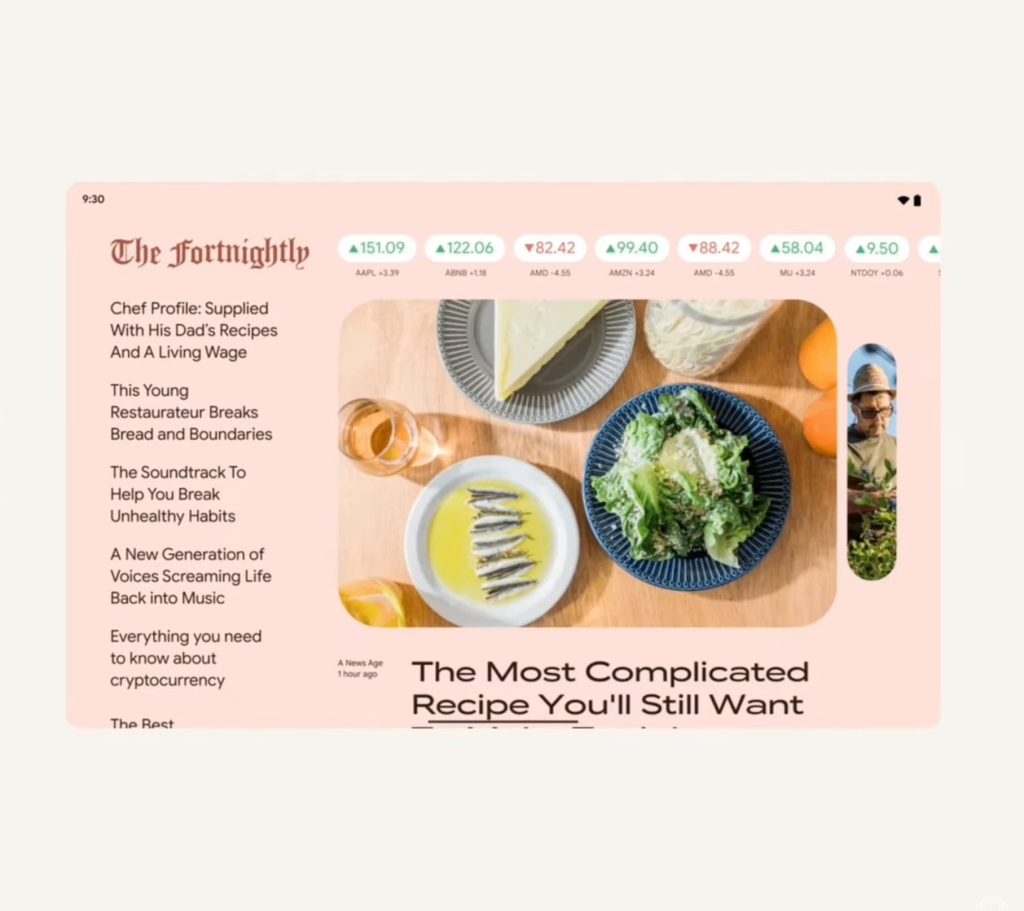
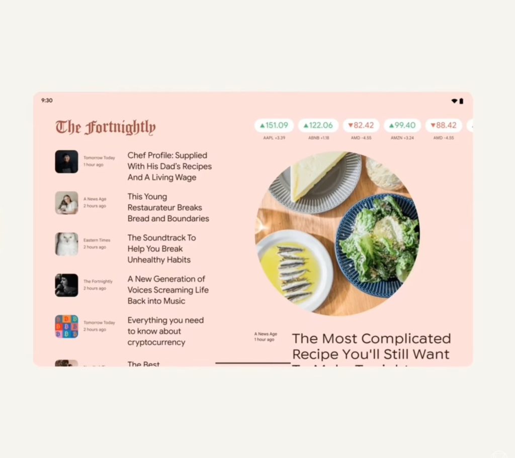
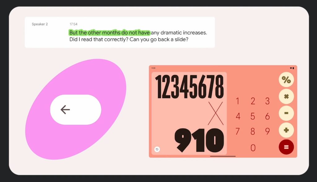
- “Rather than centering icons inside a button, offsetting them can draw attention to a particular action like page navigation.”
- “A screen with a greater range of expression–quiet when extra focus is needed or loud when you want to turn up the volume.”
Spirited
Top comment by Garrick Raigosa
I hate watching these animations now. Not because it doesn't look good. I think most of the design language shown is great but it's never true to the real world product. This is the design team showing off what's possible using the other google products. What happens when the actual team starts to implement it is usually missing the details. It's why little details like whether the app still has a contrasting nav bar continue happening. Gesture navigation isn't new. Apps should be edge to edge but still Google apps fail to consider those elements. The safety app had a consistent look but actually went backwards when they implemented a bottom row. The nav bar no longer matches. The Google home app matches on the main feed but if you click wifi or lighting it will clash again.
I appreciate the effort if the design team but it's not reality.
“Shape is one of the most iconic and extensive aspects of M3’s visual language.”
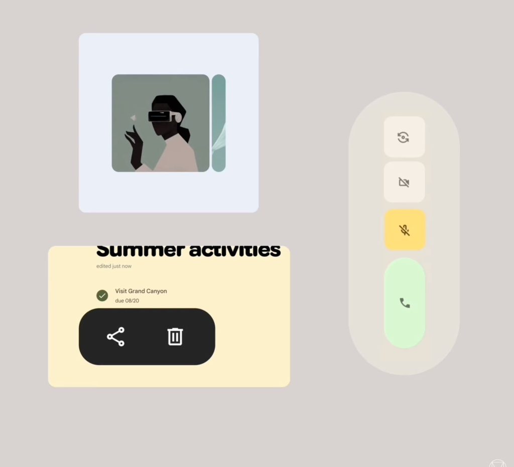
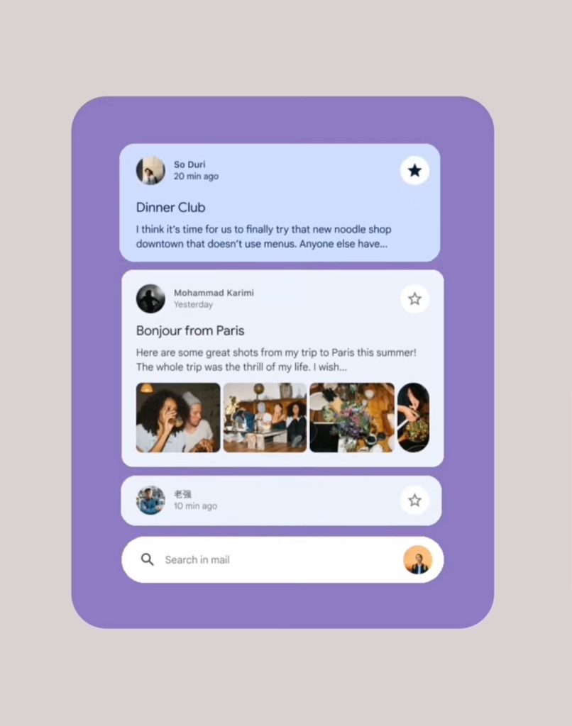
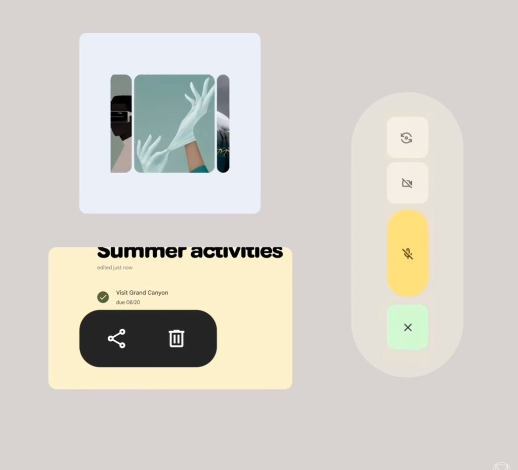
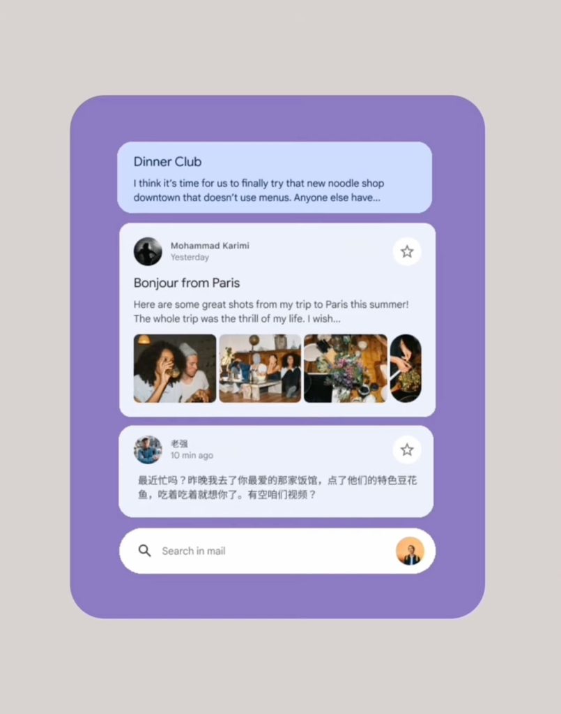
- “Shapes in motion can add emotion, feel fun, and add a liveliness to the UI. They can make a product feel far more human and alive and engaging. Shape transitions, particularly when changing the relative size of components or applying a unique shape, can communicate the change and hierarchy of the UI and draw the user’s attention to the important element effectively. Shapes can accentuate UI responses in unique ways, delivering a spirited feeling and alikeness.”
Personal
With the third principle, Google is hinting at customizable UIs that are “more personal and tailor made.”
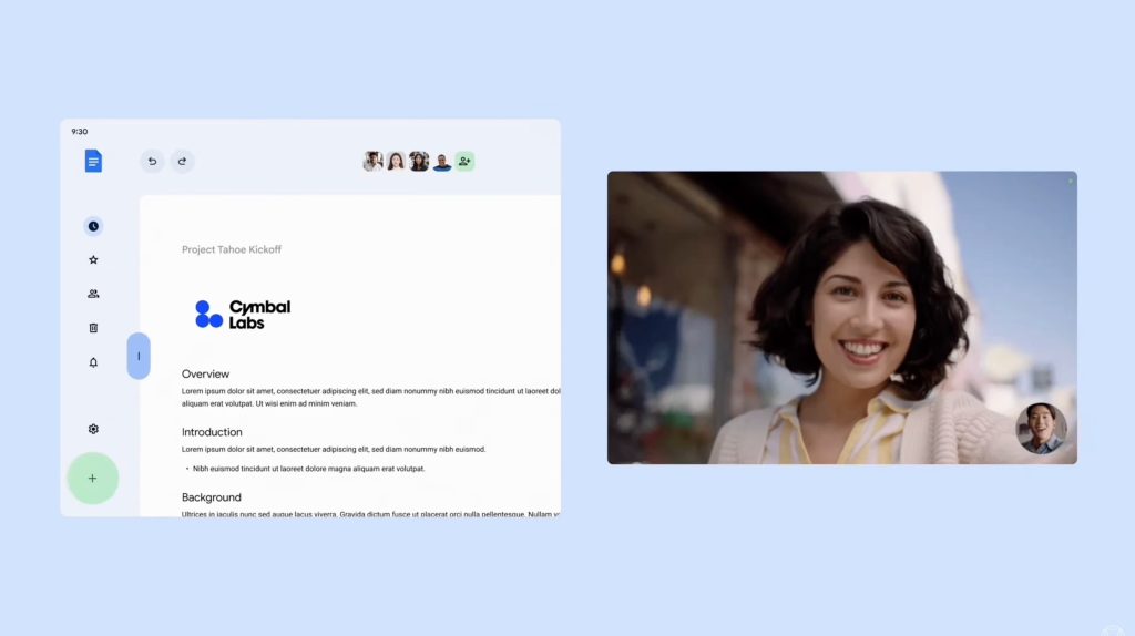
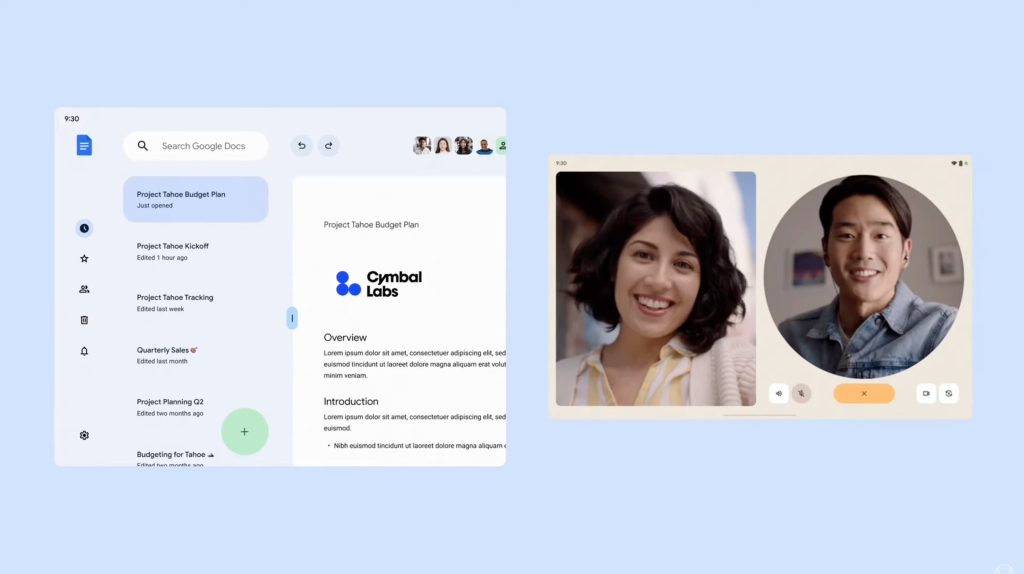
- “Enlarging tap targets, like these in call buttons, giving them a little more space to separate their functions, adjusting a pane to create a more focused workspace, or pinch zooming for a little more intimate conversation with a friend.”
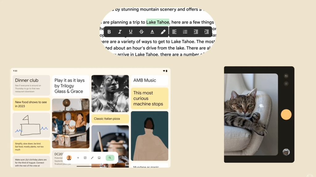
The Google Docs example where you could see a list of documents while one is open would be genuinely useful. Meanwhile, getting that list by dragging instead of a hamburger button in the top-left corner is a nice change.
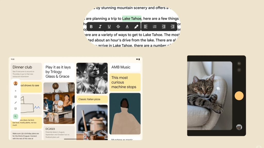
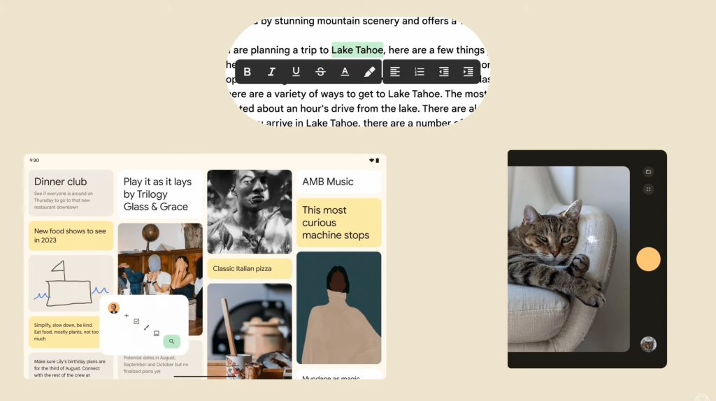
One of the most interesting examples here is a Google Keep-like app where you can move a panel with your profile avatar, search, and new note/list/drawing/image from the left edge to the bottom. (Check out the cool transition.)
- “A malleable UI allows users to customize their environment. And here, ergonomic placement of controls, right where you’re holding your device, right where you’re typing. And flexibility for a user to remake the UI to fit their needs.”


FTC: We use income earning auto affiliate links. More.


Comments