Ahead of I/O 2022, Google has updated its design documentation with the latest Material 3 components. This follows the initial additions in October.
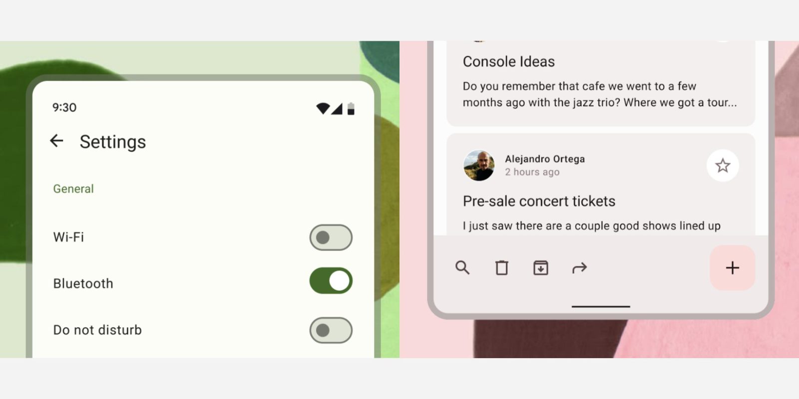
In Material 2, the bottom app bar (i.e., Google Tasks) featured a floating action button (FAB) that was centered and either floated above or had a cutout just for it. Material 3 sees bottom app bars contain the FAB directly at the right of the screen.
Meant for showing navigation and other key actions, bottom app bars are now taller as a result, while there’s no longer any shadow (for elevation) and the element is compatible with Dynamic Color.
Bottom app bars draw attention to important screen actions and the floating action button (FAB).


Meanwhile, Google has added articles for two more M3 button types:


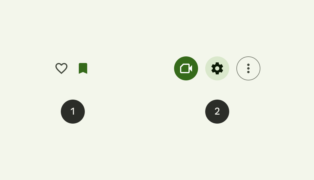
Icon buttons help people take supplementary actions with a single tap. They’re used when a compact button is required, such as in a toolbar or image list.
Previously known as toggle buttons, they are available in standard (1) and contained (2) types, while Google advises that they include a “tooltip that describes the button’s action, rather than the name of the icon itself” on hover.
Segmented buttons help people select options, switch views, or sort elements.
Sentence-case is now used instead of all caps in segmented buttons.
There’s also now documentation on text fields with the notable addition being theming compatibility.
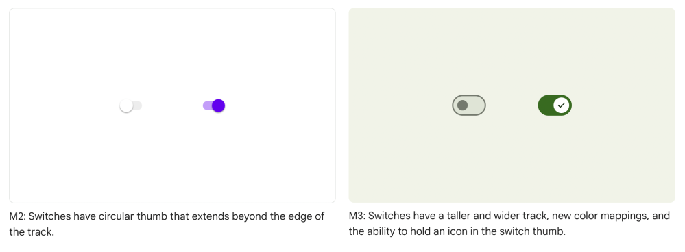
Lastly, Android 12 last year introduced a new switch design, but Material 3 today made it official. Compared to what’s already live on Android, the new design is narrower but slightly taller. The other big aspect is the ability for the round switch thumb to contain an icon.

More on Material:
- Google News is readying a Material You redesign [Gallery]
- Translate for Android rolls out two versatile Material You widgets [U]
- Android 13 Beta 1: 12 new dual-tone ‘Basic colors’ and Material You theme styles
Dylan Roussel contributed to this article
FTC: We use income earning auto affiliate links. More.


Comments