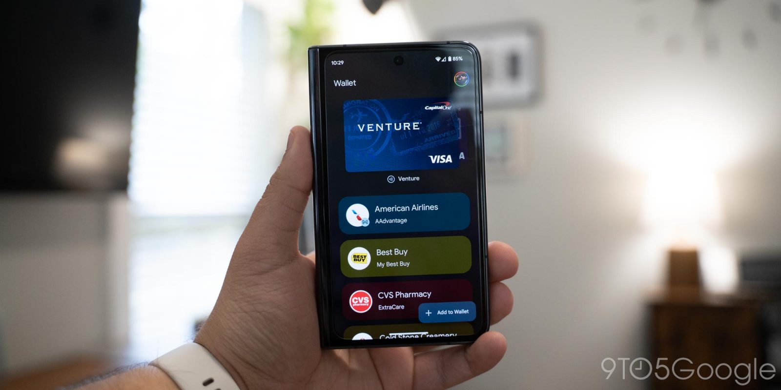
Depending on how you launch Google Wallet on your Pixel, you might see an older design instead of the redesign.
Update 4/1: Google has fixed this issue with a server-side update today. The lockscreen shortcut and QS Tile now open the Google Wallet app (instead of the Play services instance). You can tell from app launch animation and by checking the Recents menu.
Original 3/31: The old design features a large and superfluous NFC prompt at the top of the app, while the revamp shows a card immediately with a much smaller “Hold to reader” indicator. Additionally, credit and debit cards are no longer shown side-by-side with a more complex cover flow animation in use.
Meanwhile, you see more passes per screen as spacing has been reduced and because of a switch to a more standard list design rather than the original docking effect.


Old vs. new
That old version is appearing again on phones that had the new design rolled out. The old UI is back on Pixel when you open Wallet with the Quick Settings Tile or lockscreen shortcut. If you use the app icon, the new design remains.
In fact, you can see them side-by-side in the Recents multitasking menu. The old design places the Wallet icon on a dark background, while it’s just the app icon on the new one.
Up until a few days ago, there was no distinction on Pixel, with the new design always loading. A server-side bug with Google Play services could be responsible for rolling back the update. We’ve noticed the reappearance of this old Google Wallet design on several Pixel phones in the past 24 hours.


More on Google Wallet:
- Google Wallet adds ‘Verification settings’ on Android
- Google Wallet requiring device unlocks for every tap to pay transaction
- Google Wallet starts adding support for Apple Wallet pass files
FTC: We use income earning auto affiliate links. More.


Comments