Google acquired the company behind Snapseed in 2012 and later made the pro-level mobile photo editor free. Updates to the app are few and far between these days, but the latest one adds a useful dark theme.
Snapseed’s last major update in September 2017 completely redesigned the app with a bottom bar that made tools easier to access. Additionally, it switched from a predominately dark theme to a light one. The image editing background adopted the brighter look, as did various menu items.
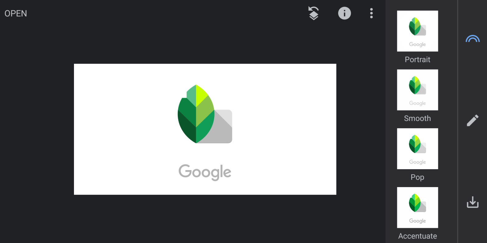
In version 2.19 rolling out this week, users are given the option of returning to that original darker look. There is a new Appearance section in settings where users can toggle on/off the “Dark theme.” This toggle is easily accessible and can be switched without interrupting your current edit.
The Dark theme is more gray in color, with menus to adjust various image options heavily transparent. Meanwhile, selected tools continue to be highlighted blue.
The other change in this update is support for Android Oreo’s adaptive icons. The Snapseed icon is now placed within a white shape and can conform to a circle, square, rounded square, squircle, and teardrop.
Despite the lack of updates, the dedicated app continues to offer a more powerful editing experience than the tools in Google Photos. Hopefully, Google will continue maintaining it in the future.
How to update?
Version 2.19 of Snapseed is rolling out now via the Play Store. We do not post APKs to download directly given the legal challenges associated with copyright and possibility of removal. Meanwhile, that model moving forward is perilous given upcoming system-level changes from Android App Bundles and Google Play’s Dynamic Delivery.
Check out 9to5Google on YouTube for more news:
FTC: We use income earning auto affiliate links. More.


Comments