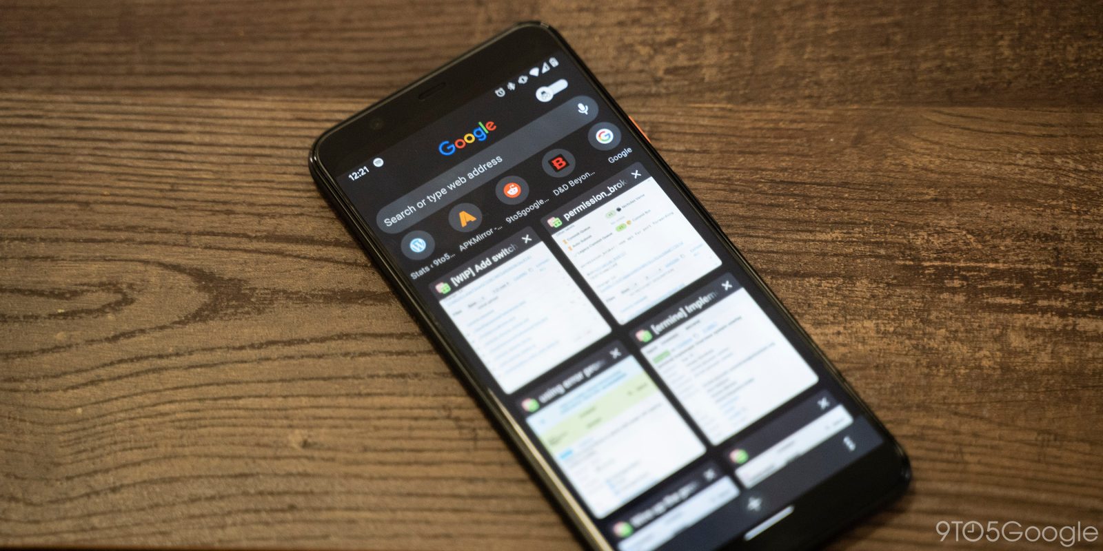
With just one look at some of Google’s apps — like Google Tasks and even the recently released Google Stadia app — and you can tell they have some of the best UI designs on Android. However, not every Google design is going to be a hit. Today, Chrome for Android is trying out a less-than-stellar redesign for the tab switcher, which tries to squeeze too many things on screen at once.
In the past year or so, Google has tried a number of redesigns for the tab switcher of Chrome for Android, before finally committing to the grid layout we have today. However, it seems Google isn’t quite done with radically shaking up the look and feel of the browser.
Following the most recent Chrome Canary for Android update, the tab switcher has been completely redesigned again, with its busiest layout yet. Above your normal tabs, there’s now a Google Search bar — complete with the four-color Google logo — and a row of your most commonly visited websites.
Critically, these all of these new elements have far too little space between them, making for an experience that’s much more difficult to visually parse at a glance.
- Chrome Canary (New)
- Chrome Dev (Old)
Admittedly, Chrome’s latest tab switcher redesign isn’t all bad, as it turns Incognito Mode into an on/off toggle, which feels more natural on Android. Simultaneously, though, the UI does not make it clear that your incognito tabs are still open in the background, even when you switch the new toggle to off.
To say the least, I’m not a fan of this redesign, but there’s some hope. When Chrome’s “Duet” redesign first appeared on Android, originally under the name Duplex, it looked very rough and was panned by readers. Hopefully, over time, Google will be able to iterate on this redesign and turn it into something great.
FTC: We use income earning auto affiliate links. More.


Comments