Windows 10X was originally intended to debut on dual-screen devices, like the Surface Neo, before later coming to laptops. Last May, Microsoft announced a “pivot” to “focus toward single-screen Windows 10X devices” amid the work-from-home surge. A “near final version” of Windows 10X has now leaked, and it reveals some key similarities to Chrome OS.
The Verge’s Tom Warren this evening shared a pair of videos on Twitter showing off the Windows 10X build. Per a ZDNet report last July, this OS is supposed to launch in the spring and targeted “primarily for businesses (especially first-line workers) and education.” Given the timing, what’s being shown off today is presumably the initial version that ships.
We first see that the Windows 10X homescreen consists of a taskbar and wallpaper. It’s not clear if files, folders, and apps can be pinned to a desktop, but Chrome OS also lacks such a capability. This approach is simpler to help maintain cross-device sync and not have files placed in more than one location. Meanwhile, the open or pinned apps in the taskbar are centered, like on Chromebooks, rather than being populated from left-to-right on Windows 10.


The first item below opens a fullscreen launcher that starts with a “Search the web or your devices” field. For comparison, the one on Chrome OS prompts users to “Search your device, apps, settings, web…”
This is followed by a grid that features both “apps and websites.” The former is presumably comprised of Universal Windows Platform apps as 10X is rumored (via Windows Central) to not natively support legacy Win32 software, while Progressive Web Apps make up the latter category. From this launcher, Microsoft, like Google with Android apps, is not distinguishing the nature of applications.
Only 15 apps are shown at a time, with a “Show all” button in the top-right corner. A “Recent” section below this surfaces files and is more dedicated than the carousel that Chrome OS has to highlight one or two Docs, tabs, and apps.


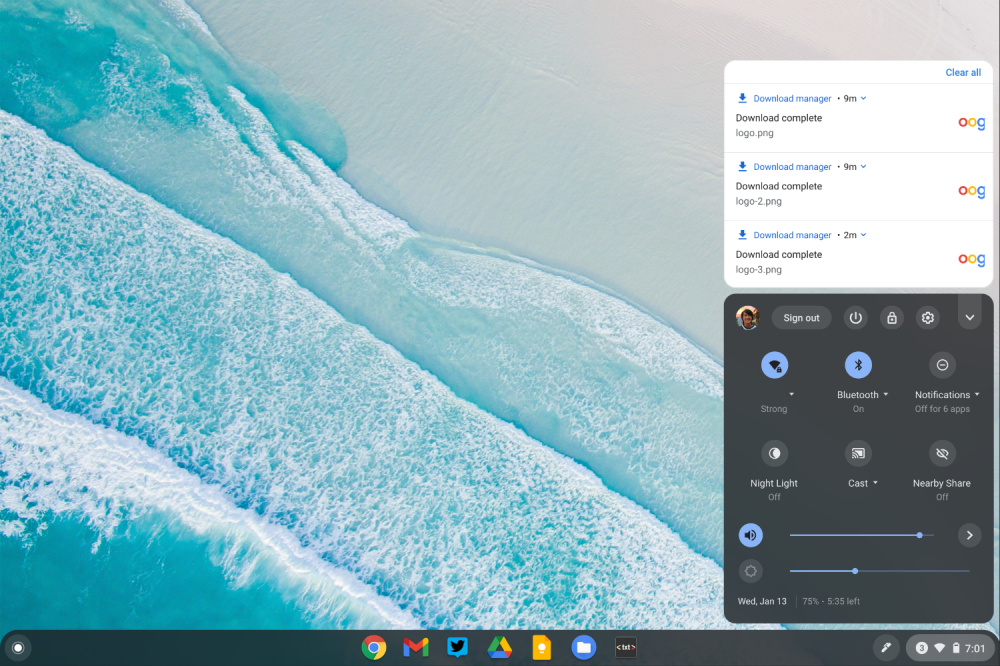
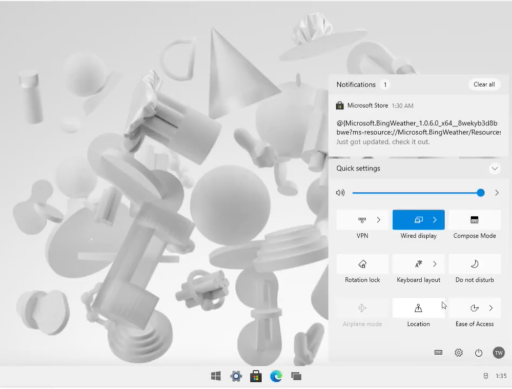
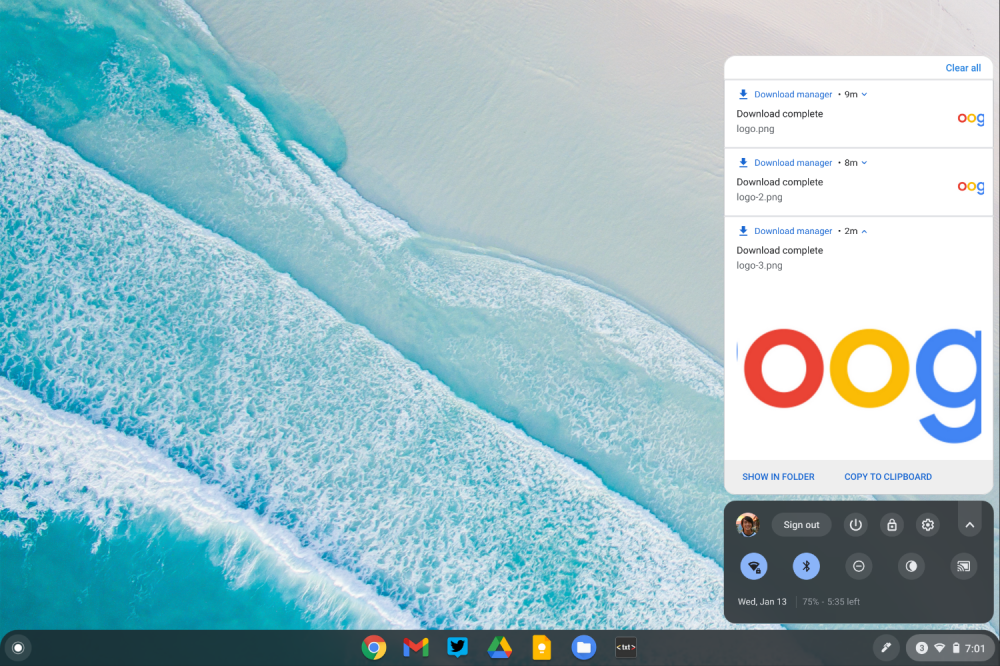
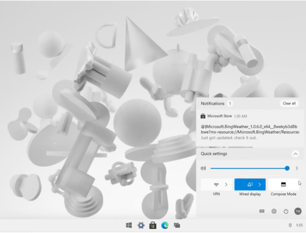
Meanwhile, tapping the time in the bottom-right corner opens “Quick settings.” Arranged in a grid, users can make changes without leaving this panel, while there’s one slider to adjust volume. Like Chrome OS, it can be shrunk down to only show key preferences, while your profile image also appears here.
Another key similarity to the Chromebook experience is how “Notifications” are displayed in cards just above Quick settings with “Clear all” in the top-right.
Visual similarities aside, the most important part of Windows 10X might be the set-up process. As of this build, Warren notes how a Microsoft account and internet access is required for registration. This is not too different from Chrome OS requiring a Google Account — though “Browse as Guest” is always available — to keep bookmarks, apps, files, and settings in sync across devices.
Coupled with the reliance on online apps, this path Microsoft is taking Windows further proves that Google had the right idea with Chrome OS. Google’s core conceit back in 2009 — with the first consumer devices coming two years later — was that a cloud-centric operating system would be the future.
The past decade has shown that online document editing, cloud-based photo/video storage, game streaming, and web apps are enough to fit most people’s needs. As part of this new reality, applications and services are not locked down to one platform but rather live online for any OS with a browser. This allows the actual computer hardware to be commoditized and highly affordable.
Microsoft is now following in the same path to offer those cheaper devices that better compete with Chromebooks. While “Windows 10” is still in “Windows 10X,” it’s clear that the cloud is the primary experience driver. Meanwhile, the visual similarities to Chrome OS — not Windows — more or less prove that people are familiar and comfortable with the web model, so much so that past interface paradigms can be done away with for something much simpler.
FTC: We use income earning auto affiliate links. More.


Comments