
The Android 12 Developer Preview 3 is set to be the last “full” developer build of the latest OS, and we’ve unearthed a treasure trove of new user-facing features.
We’re already starting to see Google make plenty of interface-related changes to Android 12, and Developer Preview 3 is enabling a number of those that we have actually had a glimpse of, thanks to teardowns and tinkering.
But some of you might be excited to sideload this third Android 12 taster session and try out some brand-new features. As we always warn, we DO NOT recommend doing so; as we have mentioned, this is not really meant as a user-facing build. Like almost every preview before it, it’s also still currently full of bugs and random issues that make it hard to recommend on your main smartphone. Open betas will come later down the line — as soon as next month — with added stability, and hopefully, a ton of extra features slapped on top.
Summary
- Video — Android 12 Developer Preview 3 hands-on: Top new features!
- Pixel Launcher ‘At a Glance’ widget gets slightly bolder text
- Rounder UI design choices and menu changes
- Tweaked screenshot editor and markup tool
- Settings menu overhaul and bounce animations
- Battery percentage Settings menu progress bar
- System-wide app splash screens
- Conversations widget (for some)
- Android 12 Developer Preview 3: What is your favorite new feature?
Video — Android 12 Developer Preview 3 hands-on: Top new features!
Subscribe to 9to5Google on YouTube for more videos
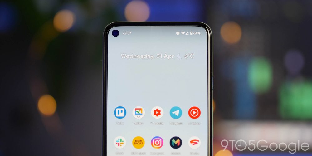
Pixel Launcher ‘At a Glance’ widget gets slightly bolder text
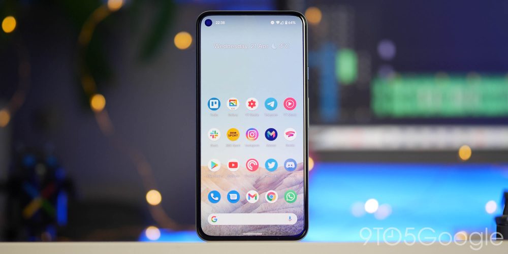
Possibly the most minor of changes in the grand scheme of things, but if you use the Pixel Launcher, then you’ll instantly notice the ever-so-slightly bolder text used on the At a Glance widget on your home screen. Given just how many changes there are elsewhere, this is one of the most notable right off the bat.
Rounder UI design choices and menu changes
Android 12 Developer Preview 3 not only adjusts the Pixel Launchers main widget, there is also tons of changes to almost all facets of the UI. If you hate rounded or “bubbly” corners, then you might actually hate this overhaul.
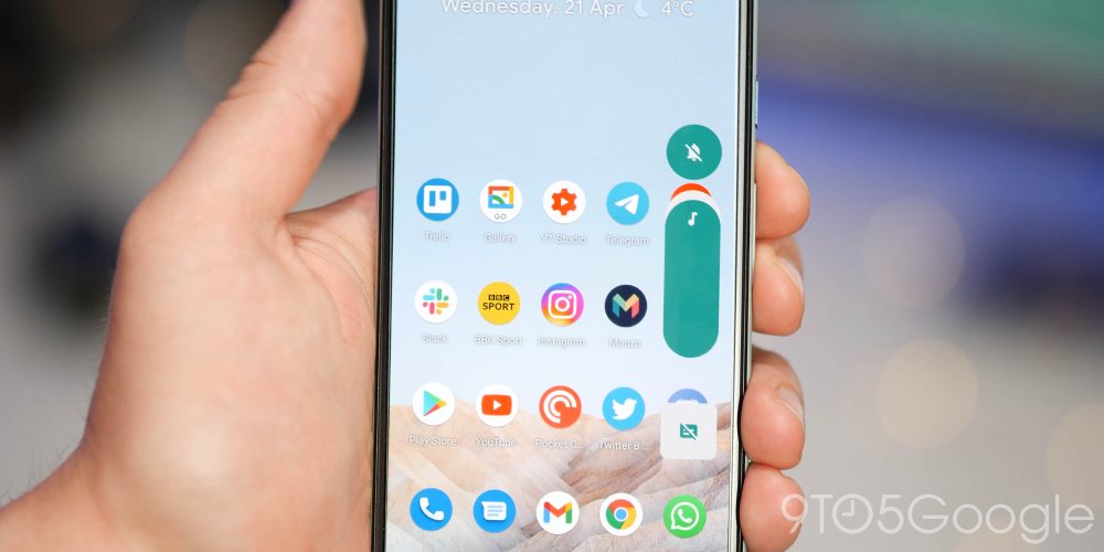
Most prominent UI elements including dialog boxes and menus now forgo sharp edges in favor of smooth curves. One of the biggest changes is to the pop-up side volume panel. Although it hasn’t necessarily increased in size, the larger bubbly pop-up feels very different to what you are likely used to. Boxed-off edges look as though they are off the menu in 2021.
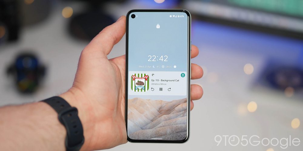
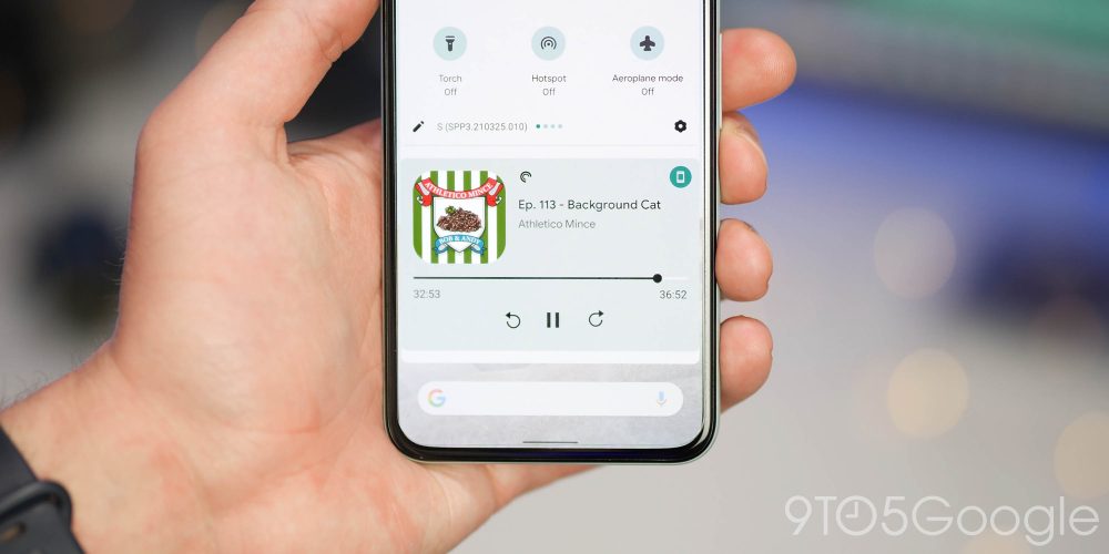
The UI tweaks also extend to the media player resumption controls and lockscreen player in Android 12 Developer Preview 3, as artist album art is now rounded to emulate the bubbly aesthetic used elsewhere. Changes extend as far as the Recents app menu, while the Pixel Launcher now has rounded corners when swiping up into the App Drawer.
Widgets too have not escaped Google’s overhaul, as many widgets that would ordinarily have square or “sharp” edges are now softened. A case in point is that of Gmail and Google Keep, but we’re sure there are tons of others that are falling foul of these changes. We can definitely foresee this as being a divisive change for Android 12.
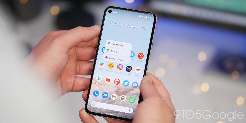
Meanwhile, the experience of adding widgets to your homescreen also had a minor a revamp in Android 12 Developer Preview 3, with a brand-new menu, complete with a search bar. Below the search bar, you’ll now find a pair of personalized widget recommendations — which we believe are based upon your most used or most recently used applications.
- Android 12 DP3: Rounded ‘bubbly’ corners now used with all key UI elements
- Android 12 DP3: Widgets get revamped w/ new menu, recommendations, forced rounded corners
Tweaked screenshot editor and markup tool
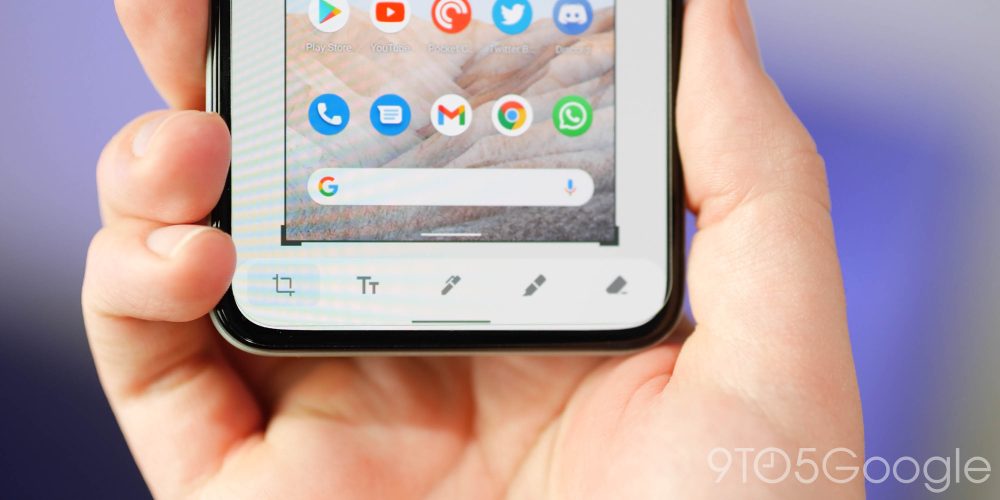
Sticking with the main home screen UI, Android 12 Developer Preview 3 includes a number of changes the in-built screenshot editor and image markup tool. For starters, the animation when selecting the “Share” or “Edit” buttons is vastly improved. Another notable here is that you can actually swipe screenshot previews left or right to dismiss, which is a neat update.
You might not notice at first, but when tapping “Share” you’ll notice a smooth movement into the Share Sheet. While when tapping “Edit,” the screenshot will animate into a full-screen view from the bottom left. These are undoubtedly quality of life changes that help improve the “buttery smooth” feeling that people associate with the Google Pixel series — especially for devices with 90Hz displays such as the Pixel 4 and Pixel 5.
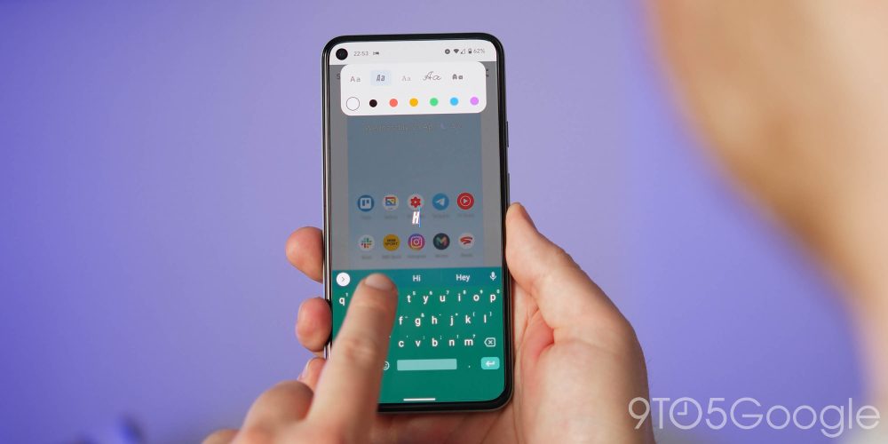
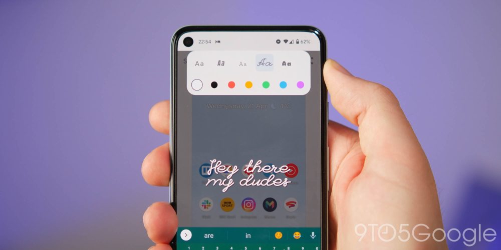
The actual markup tool has had some tweaks, too. It does look as though the ability to add stickers or emoji has been removed — at least for now — but there are now extra fonts to choose from. When adding text to an image you’re able to choose from a cursive handwriting, a bold, italic, typewriter, and bubbly style font along with the standard Roboto font.
Settings menu overhaul and bounce animations
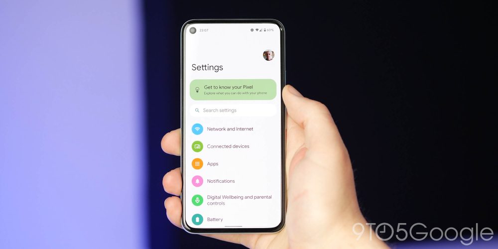
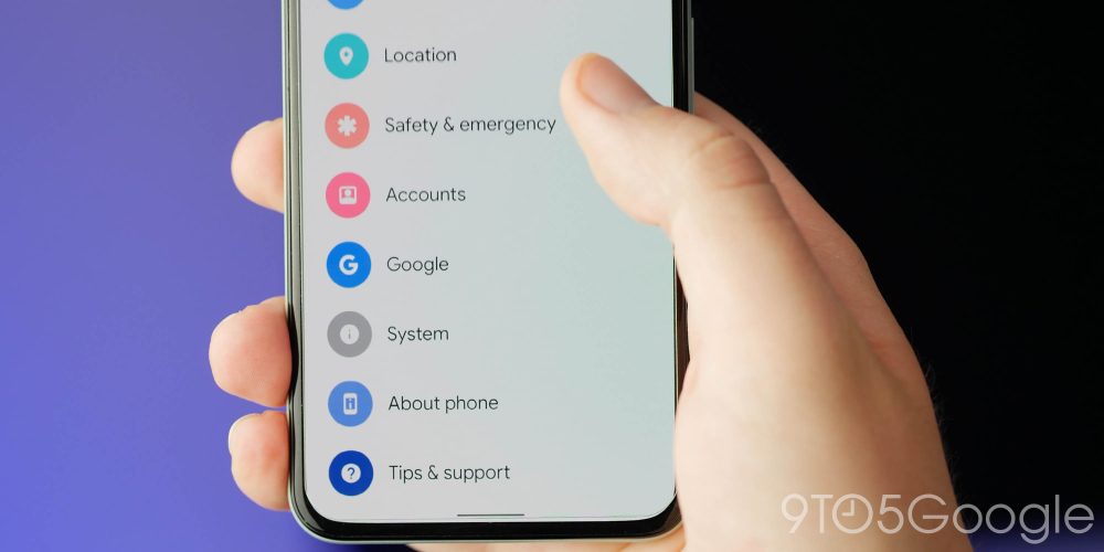
After being spotted in previous builds, Android 12 Developer Preview 3 brings the Settings menu overhaul to devices. For those out of the loop, the new look menus include larger text, and there is a lot more white space. This is very obviously inspired by One UI’s one-handed design, but this feels less wasteful with on-screen space.
Beyond the new design, Google has also added “bounce” or “wobble” animations to Android 12 as a whole. This is easily spotted when you start scrolling the Settings menu, with a “bounce” as you hit the top or bottom limit. It’s especially visible in the notifications tray that slides into place after being dropped down.
Battery percentage Settings menu progress bar
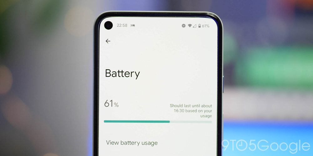
As part of the new Settings menu overhaul, the Battery section has also been on the receiving end of a notable change in Android 12 Developer Preview 3. No longer is there a prominent battery logo or icon. Instead, you’re getting a linear progress bar that contains some lifespan information toward the right side.
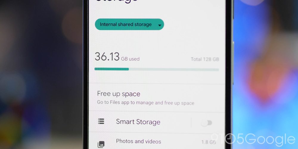
It’s also worth noting that the Storage menu has also adopted this progress bar design rather than the less obvious circular percentage chart used in previous builds. Neither change will make too much difference, but it helps save overcrowding in these commonly used menus.
System-wide app splash screens
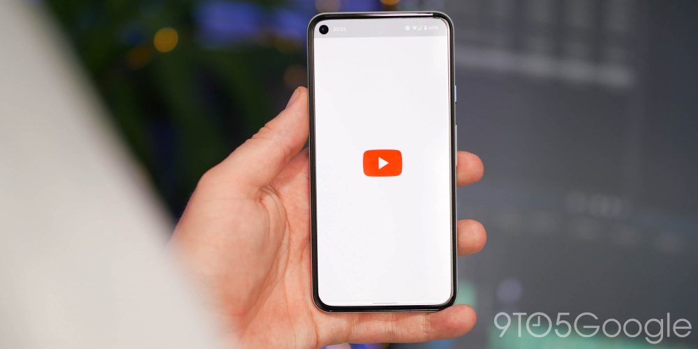
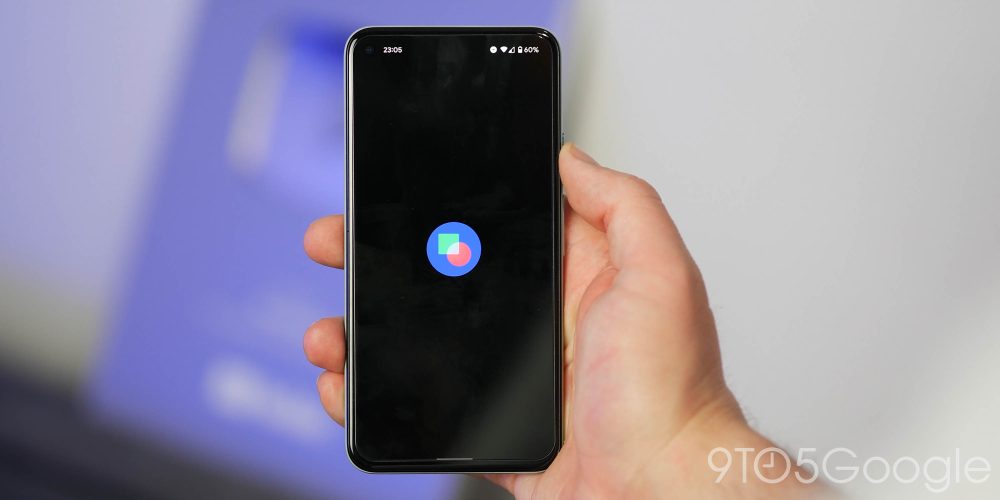
Not all apps have a splash screen, but clearly Google wants to change that in Android 12. This would certainly unify the look and feel of the OS but might annoy some of you out there. So, effectively when launching any app in Android 12 Developer Preview 3 regardless of whether said app has its own splash screen, you’ll see brief a system-generated icon pop-up.
Developers will be able to customize their own splash screen icon and will only appear when first launching or relaunching after an extended period where the app may have hibernated. Opening from the App Switcher shouldn’t produce a splash screen unless the app has not been launched for a while.
Conversations widget (for some)
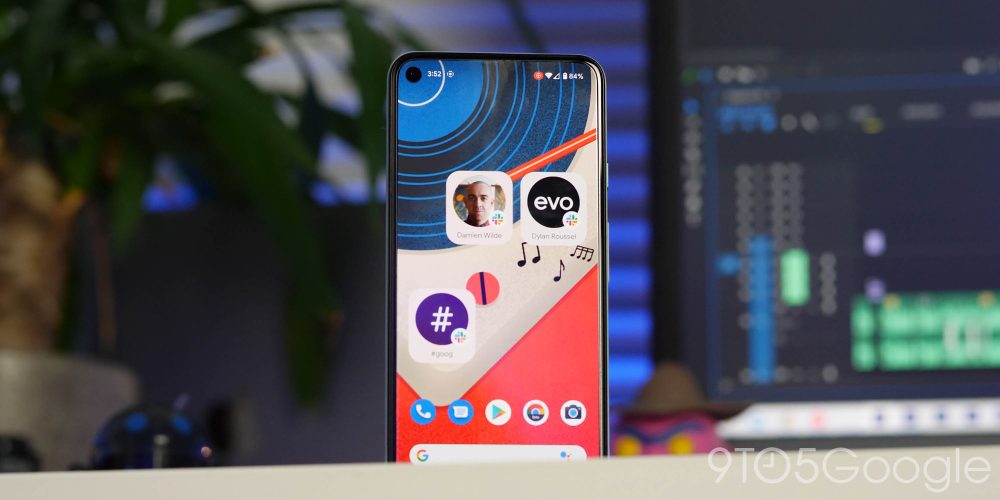
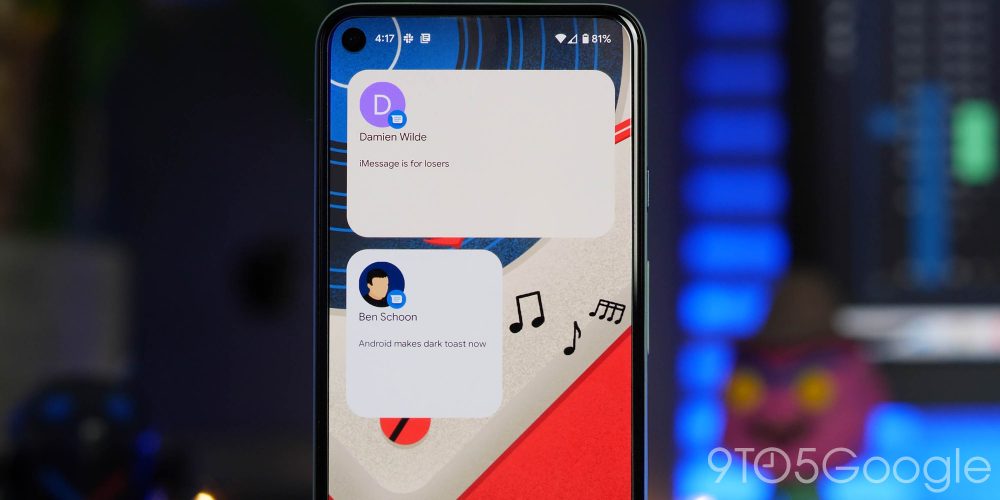
I was personally reluctant to add this as a top new feature in Android 12 Developer Preview 3 as the leaked Conversations widget option is only available to a select few. However, if you have performed a clean or fresh install of the latest preview, then you should be able to add the home screen widget.
Effectively, the Conversations widget lets you add quick access to a specific contact, chat or group chat in any messaging app on your device. It’s very much a work in progress as you should see messages no matter the chat app but we’ve only been able to get Google Messages working so far. The widget also dynamically changes color based upon your wallpaper or even placement/resizing.
Android 12 Developer Preview 3: What is your favorite new feature?

There are more than just surface-level changes in the Android 12 Developer Preview 3, making this fairly small selection the likely tip of the iceberg. With that said, these are the most prominent user-facing features that we’ve found after delving in.
We expect to see more little things that might slip through the cracks over the coming days and weeks. We have a deeper dive into everything that has been added, including some features that require a little work to get fully operational in our full overview.
What is your favorite new feature or features? Let us know down in the comments section below!
More on Android 12:
- Android 12 Developer Preview 1 hands-on: Top new features [Video]
- Android 12 Developer Preview 2 hands-on: Top new features [Video]
FTC: We use income earning auto affiliate links. More.


Comments