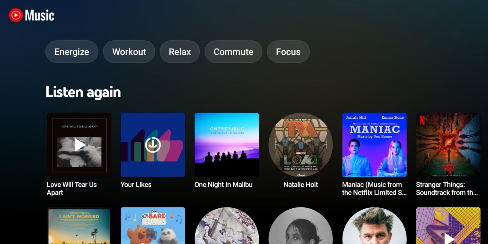
More than other streaming services, YouTube Music is defined by its algorithmic suggestions on what to listen to next. This feature is great in the Up Next queue but downright annoying in the Home feed. YouTube Music constantly juggles the order, if not the outright appearance, of carousels from one refresh to the next.
A core conceit of YouTube Music is that its main Home feed updates are based on context — like time of day, location, and previous playback — every time you open the app. This tab consists of various carousels that are roughly split between recommendations (similar artists, recommended playlists, and new releases) and your listening history.
The latter includes “Mixed for you,” “Your favorites,” and “Listen again.” That last shelf was recently revamped to use smaller cover art and show up to six works at a time instead of just two. (Up to 20 items can appear here, though annoyingly fewer sometimes.) This setup has been quite great for UI density and reducing how much vertical scrolling you have to do.
Since that redesign launched, I’ve found that the Listen again carousel pretty consistently appears at the top of my Home feed. Combined with the recent addition of a colorful background header, YouTube Music feels more vibrant and personalized, while it’s faster than ever to start audio, which should be the main objective of any streaming app.
However, the Listen again shelf doesn’t always show up first and is sometimes ranked second or third. This is despite it being the primary way I start tunes as of late. In fact, its tendency of appearing at the top only 90% of the time is even more annoying than if it appeared less often.


Therein lies my primary annoyance with YouTube Music’s UI: the lack of persistent shelf placement makes the app feel like it isn’t yours. That’s doubly infuriating for something as personal as a music collection.
My ideal solution would be the ability to pin YouTube Music carousels that are clearly intended to show past listens and are generated just for you. People would certainly appreciate having quick access to things they’ve explicitly liked (Your favorites) or their unique supermixes (Mixed for you), while another popular shelf is “Quick picks” for fast radio creation.
Besides letting people create muscle memory for app navigation, pinning would address the complaint of carousels sometimes disappearing for days, if not weeks, at a time. For example, the early rollout of the new Listen again carousel coincided with the disappearance of Quick picks (though that shelf seems to have returned now). If a shelf doesn’t appear in Home today, your best bet is to refresh until it appears.
Allowing users to pick what they see in the main tab would in no way impact how people would continue to use the rest of the feed for discovery. After all, YouTube Music still gets to pick what appears inside those shelves, and it’s often great at surfacing recent listens with tracks further back in your history.

The counter-argument would be that the Library tab exists for more consistent browsing, but it will never be the default view you open to and misses out on the recommendations that I do want occasionally – just not all or even most of the time.
YouTube Music’s Home feed has always balanced discovery and history. Giving users the ability to favor what they want would do a great deal to make the service much more personal and less algorithmic.
FTC: We use income earning auto affiliate links. More.


Comments