
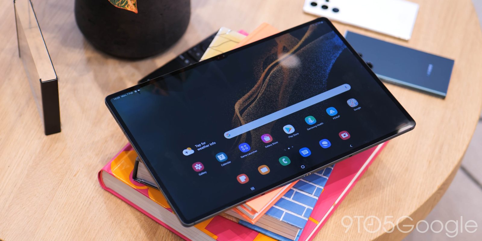
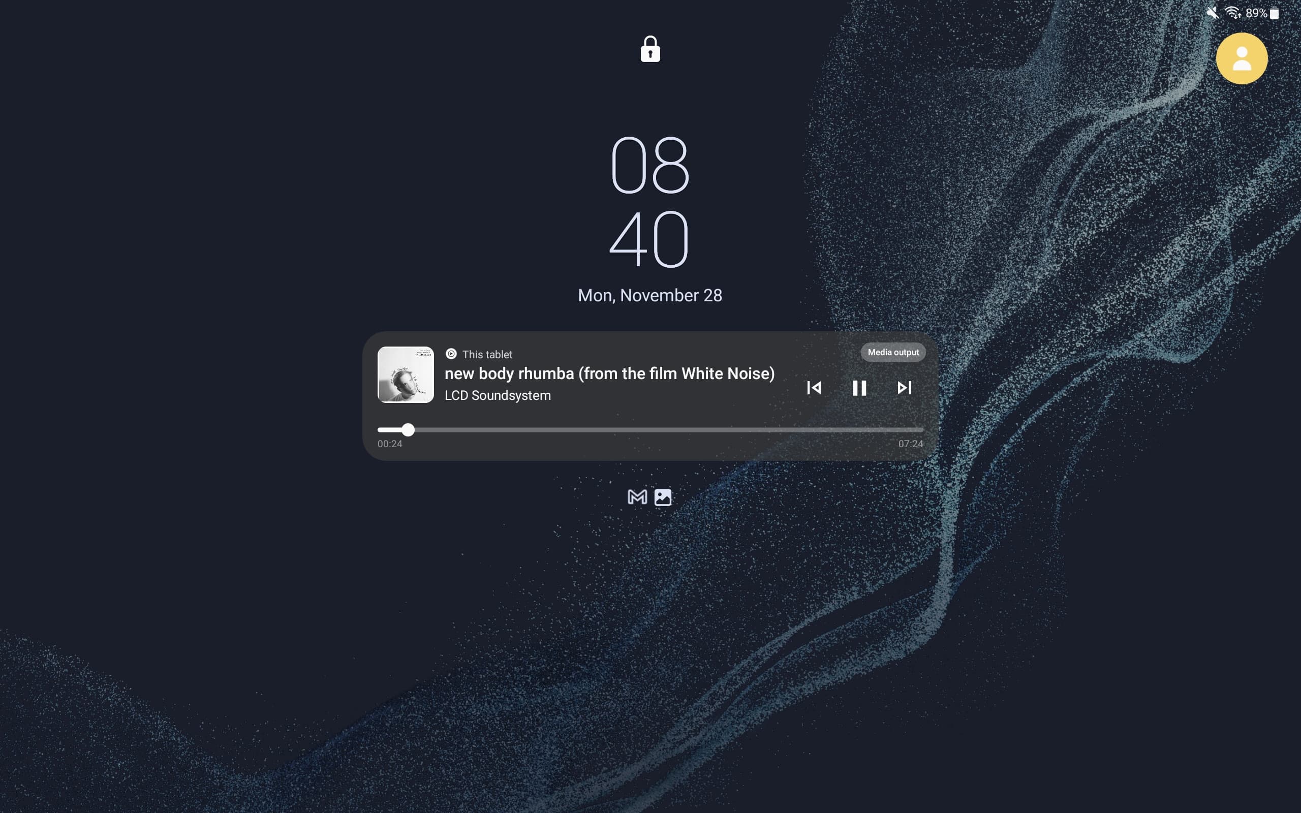
Android 13 is more widely rolling out on Samsung tablets and follows Android 12L earlier this year. The taskbar was that update’s biggest addition, and we hoped to see more tablet UIs — namely a two-column notification shade and lockscreen — but that’s not the case with Samsung’s Android 13 update.
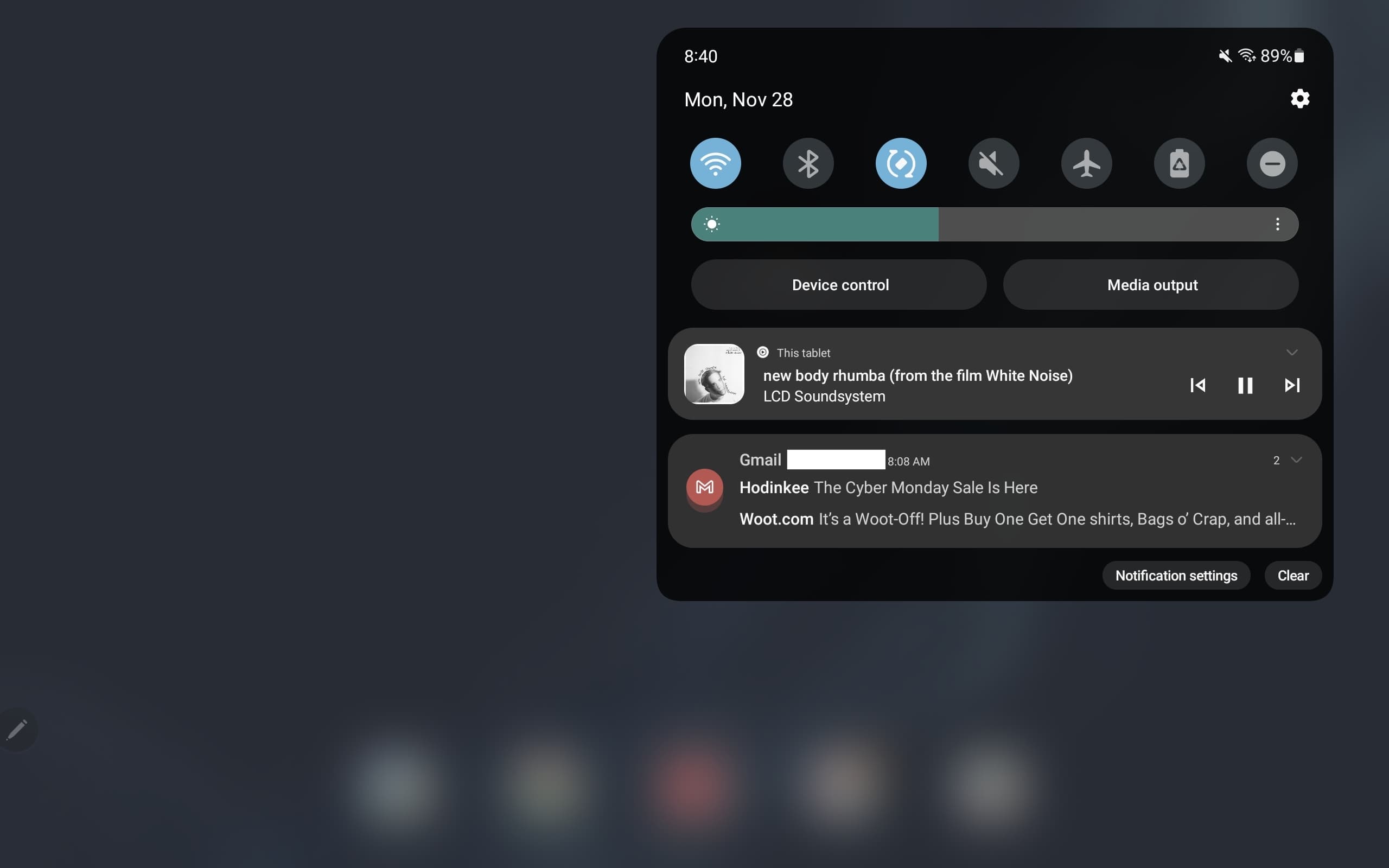
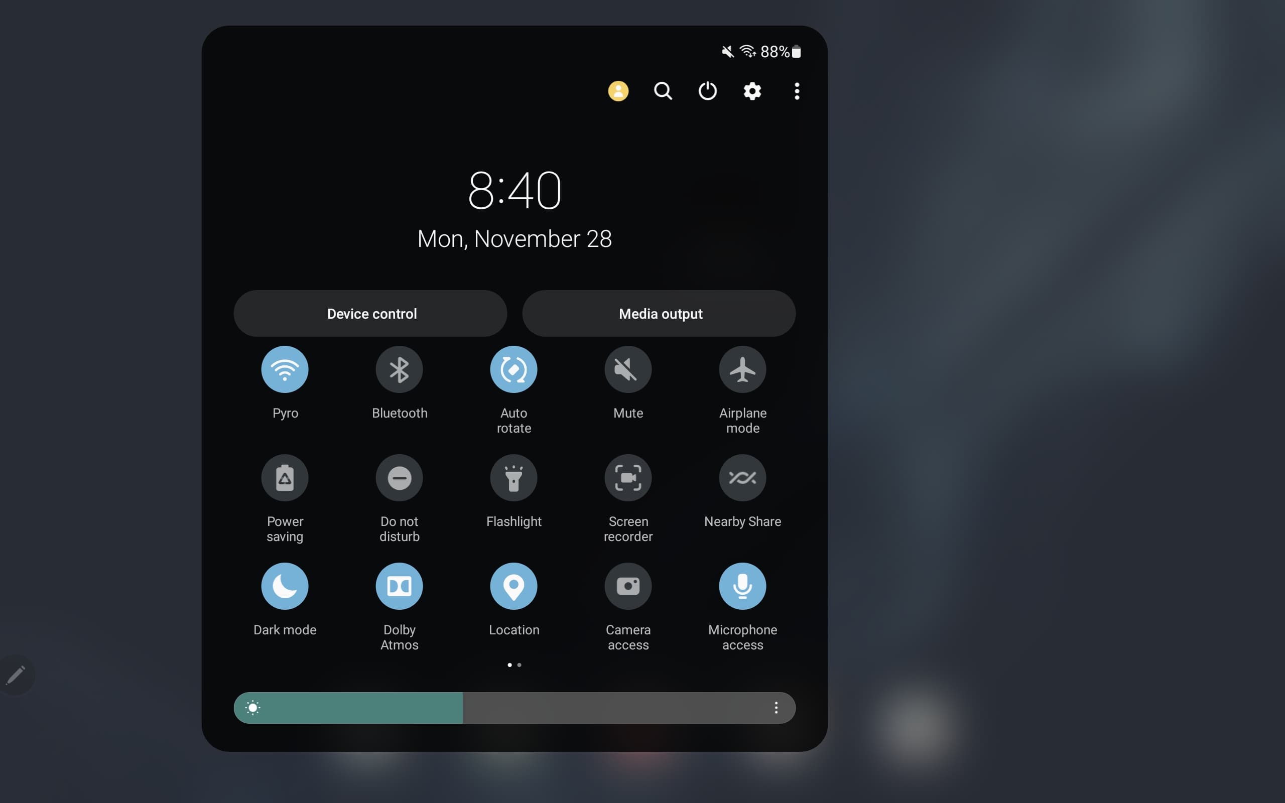
Samsung (11-inch Tab S8 shown below) continues to use its single-column notification shade that starts with the time/date and status bar icons. A row of seven Quick Settings toggles are next followed by the brightness slider and buttons for Device control and Media output. (Both of these Quick panel layout buttons can be hidden from initial swipe.) You then get the feed of notification with shortcuts for Notification settings and Clear in the bottom-right corner.
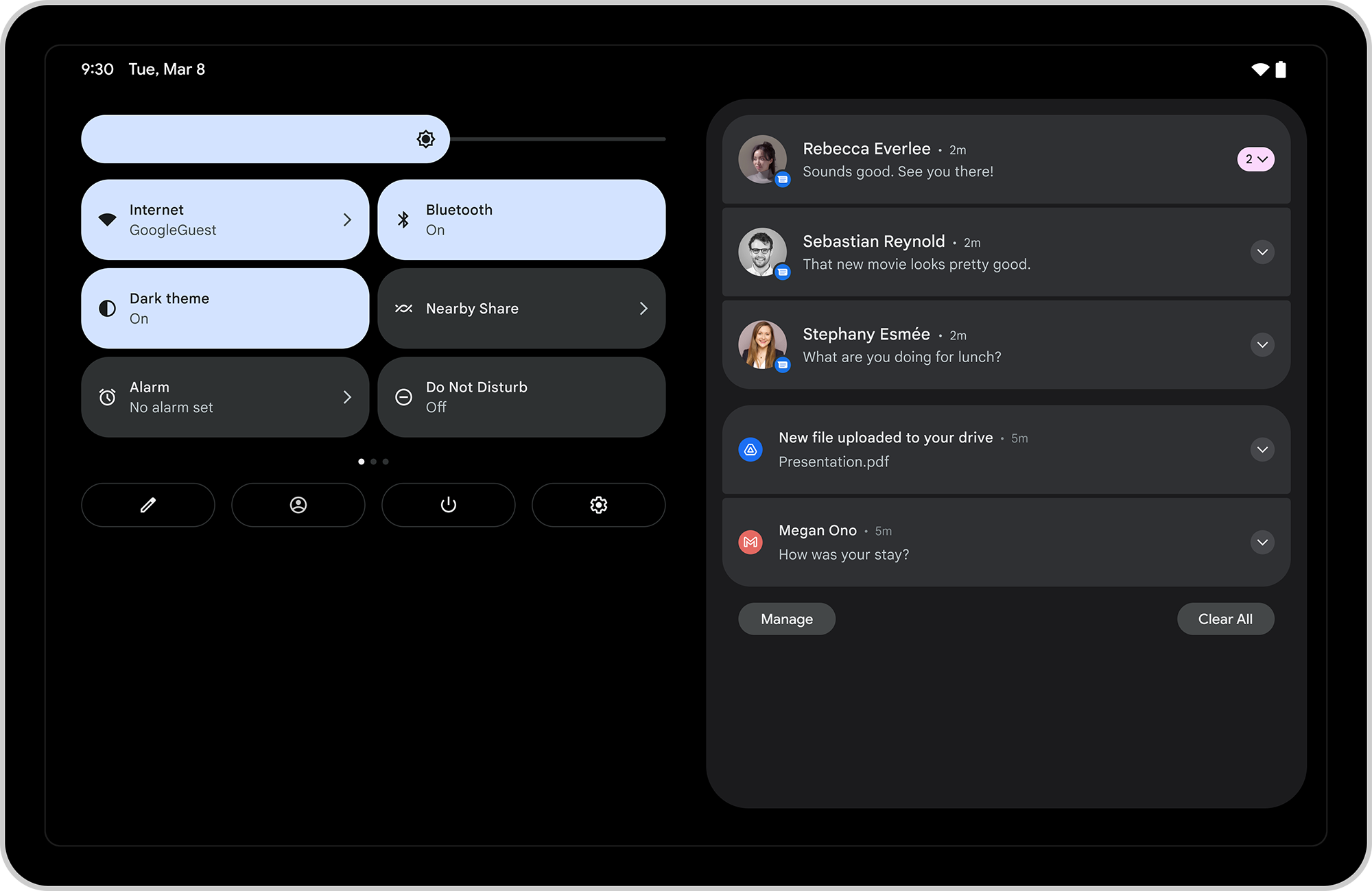
In comparison, Google — since Android 12L — has shown a two-column layout with QS tiles at the left and brightened just above that. At the bottom you get a row of buttons for editing, switching profiles, the Power menu, and opening Settings. You have a list of alerts at the right with the biggest behavior change being that one swipe shows you everything.
Top comment by Arthur
Had no plans on buying a Tab S knowing now that the Pixel Tablet is on the way. My fear now is if Google ends up being the only one to use these A12L/A13 large screen changes, that they don't continue this trajectory since everyone already knows the state of Android tablets and if the Pixel Tablet isn't a great seller, hoping that doesn't happen but this is Google we're talking about, you can never really get too comfortable with how things are that moment.
The two swipes required by Samsung to start scrolling through all Quick Settings increasingly reflects how those devices are not taking advantage of the larger screen available. Additionally, in landscape, the dropdown is still not centered.
Meanwhile, Android 12L introduced a two-column layout on the lockscreen where notifications appear on the right, while the left is received for a clock and large Android 13 media player — something else Samsung has yet to adopt. In comparison, Samsung’s single-column very much feels like a stretched out phone UI.
During the Android 13 cycle, Samsung clearly prioritized faster OTAs. It would have been nice if tablets got a bigger update especially since the taskbar in Android 12L suggested that Samsung was on the ball with Android’s large-screen optimization push. Two consecutive updates with new features would have been a big show of support.
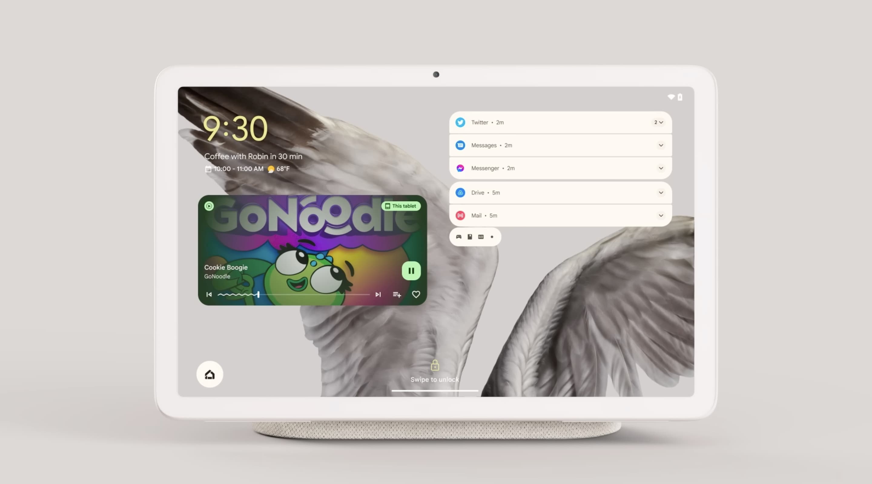
Looking ahead, it looks like the Pixel Tablet will be the first to debut all the large screen optimizations when it launches next year.
More on Android tablets:
- Every Google app with an Android tablet UI [U: Home, Search]
- What Android tablet & foldable apps would like in Google’s perfect world [Gallery]
- Here’s dual pane Google Keep on Chromebooks, but it’s hard to find on tablets & foldables


FTC: We use income earning auto affiliate links. More.



Comments