After nearly a year in development, Google’s Material You redesign of ChromeOS is finally taking shape, bringing dynamic colors, a quick settings revamp, and more.
We first spotted Google’s intentions to create a Material You redesign of ChromeOS back in January. Since then, Google has steadily worked on the massive visual overhaul for Chromebooks, with the beginnings of Material You dynamic colors appearing in June.
Given the sheer size of ChromeOS, it should be no surprise to learn that this Material You redesign is not one singular project, but multiple smaller ones happening in concert within Google. Here are just a few of the ones we’ve tracked down so far:
- Jelly / Jellyroll — Material You’s dynamic colors for ChromeOS
- CrosNext — Material 3 components for ChromeOS
- FilesGM3 — Material You enhancements for the Files app
Over the last few weeks, ChromeOS enthusiasts like Kent Duke, C2 Productions, and Futur3Sn0w (via Chrome Unboxed) have shown that Google has made significant progress toward a full Material You redesign. Our team has managed to forcibly enable these redesigns on one of our own Chromebooks, so here’s a closer look at what’s in store.
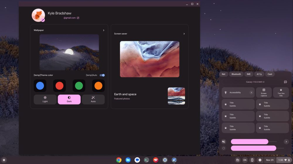
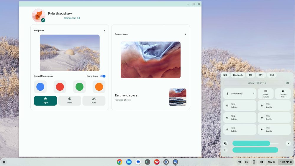
First and foremost, the feature many will be most excited for is the arrival of Material You dynamic colors — the ability to have your Chromebook re-hued to match your current wallpaper, as first seen in Android 12. Much of the framework for ChromeOS dynamic colors now seems to be in place, with the app shelf, quick settings, and Files app all now matching a particular color theme.
However, ChromeOS does not yet choose this theme based on your current wallpaper. Instead, there seem to only be two placeholder themes — burgundy red and mint green — that ChromeOS rotates through somewhat randomly. Each of those themes also comes with a light and dark variant, depending on which style you prefer.
In the corner of the screenshots above, you’ll notice a massively overhauled quick settings area. As the “Title” and “Subtitle” text should suggest, this is still very early in development. Setting that aside, quite a bit has changed from what’s live in ChromeOS today.
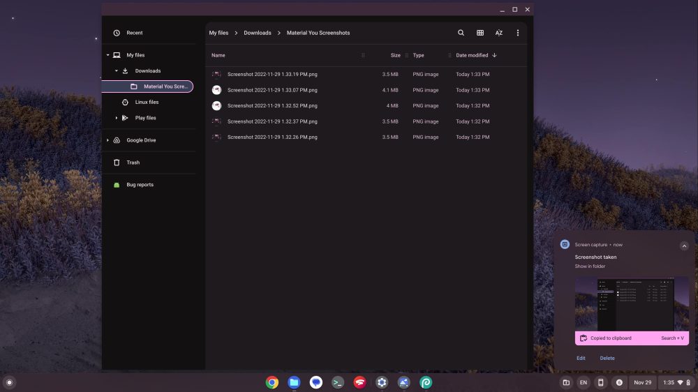
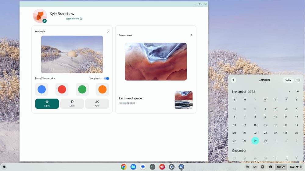
For starters, ChromeOS notifications now live in a separate area, to the left of the calendar, instead of being above quick settings. The quick settings themselves have also been redesigned to look almost identical to what you’ll find on Pixel phones today. Some simple, one-click options like “Screen capture” are half the size, to conserve space.
The new Material You-styled sliders for ChromeOS volume and screen brightness also look quite a bit like their Pixel counterparts. The main difference here is that the icon (the sun for brightness, or speaker for volume) appears to the side of the slider instead of inside of it.
Despite moving to a new location, notifications still look essentially the same as they did before, albeit using the new color scheme. That recolor also extends to the recently launched ChromeOS calendar view, which continues to match the color of the app shelf, offering a cohesive experience. Meanwhile, the ChromeOS Files app has been massively recolored, using two shades of background colors, multiple text colors, and a bright accent shade to indicate what’s currently selected.
Overall, the introduction of Material You into ChromeOS goes a long way toward making Chromebooks feel more like home for anyone who’s used to using a Pixel phone. It’s clear there’s still a long way to go — strikingly, the actual Chrome browser does not yet use the dynamic color theme from ChromeOS — but it’s clear Google has a vision for where it’s taking ChromeOS next and is executing on it rapidly.
At the rate things are going, I think it’s likely we’ll see Google complete this Material You overhaul of ChromeOS and launch it sometime in 2023, but only time will tell.
What do you think of this (work-in-progress) ChromeOS redesign? Let us know down in the comments!
Header image: Google
More on ChromeOS:
- ChromeOS isn’t ready for 120Hz Chromebooks even though cloud gaming is
- Soon, your Chromebook will make a fun sound when you plug it in
- ChromeOS may soon offer screen recording to animated GIFs
FTC: We use income earning auto affiliate links. More.


Comments