For the past few months, Google has been working on a “refresh” of Chrome on Windows, Mac, and Chromebooks. The efforts seem to be paying off, as Chrome’s Material You-based redesign for 2023 seems to be nearing completion – see for yourself.
While Chrome for Android received a significant redesign to coincide with the release of Material You, the desktop version of the browser has stayed relatively unchanged since its 2018 redesign – give or take newer features like the sidebar. At the beginning of the year, we learned that Google was working on a “refresh” of Chrome’s design for 2023, set to bring Material You to the desktop.
We were able to show a very limited preview at the time, but since then, the Chrome team has put in significant work on the redesign. With Google I/O – one of many great opportunities for the company to launch this refresh – just around the corner, let’s look at how Chrome will change in the near future.
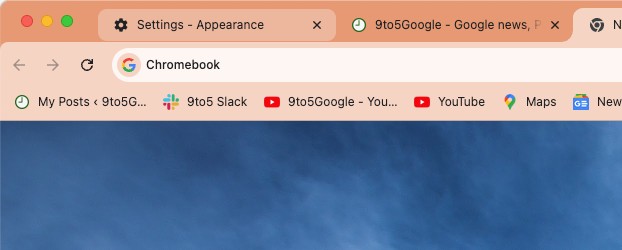
The most immediately noticeable change is to the address bar – or “Omnibox,” as Chrome calls it – which is now thicker. Meanwhile, the URL of the current page appears in a smaller font, while icons on either side are now larger. The address bar area also has curved edges, a small detail that helps sell the “Material” metaphor.
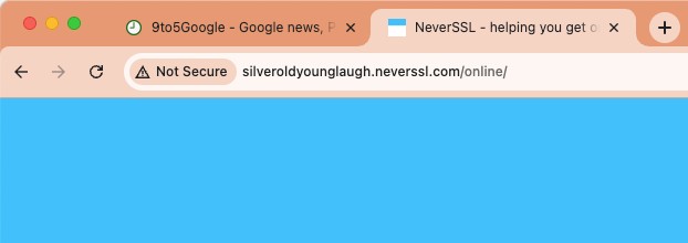
The lock icon that previously appeared to the left of the current URL, used to indicate that you’re browsing a site securely via HTTPS, has been swapped with an icon that indicates toggles. This change makes it more obvious that settings for cookies and web permissions are located there. If you browse an insecure website, the usual “Not Secure” warning appears in a colorful chip.
On the opposite end, if you’re on a page you’ve bookmarked, the star icon in the Omnibox uses a matching color rather than the usual shade of blue. Similarly, the blue shade that was used to indicate which autocomplete suggestion is selected has been changed to follow your theme.
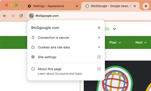
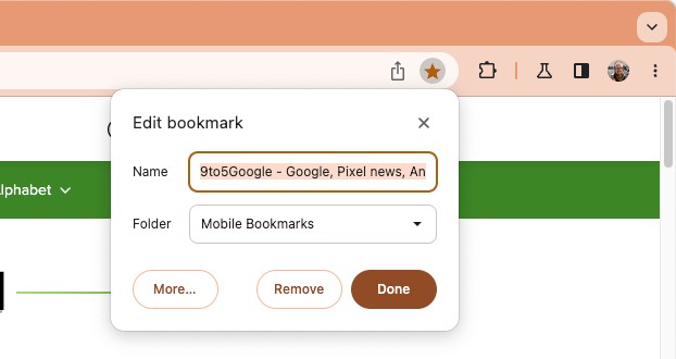
Elsewhere on the subject of icons, all of Chrome’s icons have been given a refresh to feature more curved edges. The three-dots menu in the top-right corner of the browser has also been reworked to include icons next to almost every option, making it a bit easier to find what you need at a glance. Most pop-up menus have also been tweaked to have a much more prominent curve on the corners.
Moving upward to the tab bar, the dividers are now a lighter color. Previously, when hovering over a background tab, you’d see an outline like that of the currently selected tab; this has been replaced by a rounded rectangle. Broadly, this portion of the redesign brings Chrome for Desktop in line with a similar change to Chrome on Android tablets and foldables.
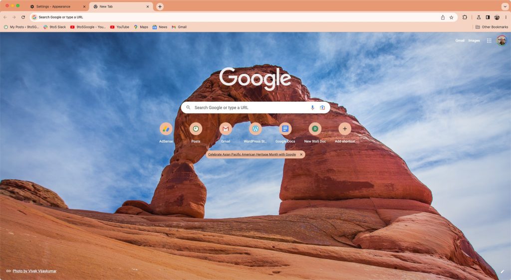
At the top-right of the browser, the usual buttons to open a new tab or search through your (too many) tabs are now brighter, making them a bit easier to spot. Curiously, the New Tab button is a circle, while Tab Search sits in a rounded square. The New Tab Page has also gotten a bit of a rework, moving the shortcuts to appear in a single line, if possible, rather than a tidy grouping on two lines.
Overall, Google seems to have nailed it by describing the addition of Material You to Chrome as a “Refresh” because this isn’t a major overhaul of Chrome. Everything about the browser still feels familiar and should be right where you expect it to be. Google has simply given its browser a new coat of paint to match its newer design language.
That said, it’s still possible for Google to have bolder plans for this redesign that simply haven’t been uncovered yet. Nothing should be considered final until Google formally reveals this “Refresh” later this year.
How to enable the Chrome Material You redesign
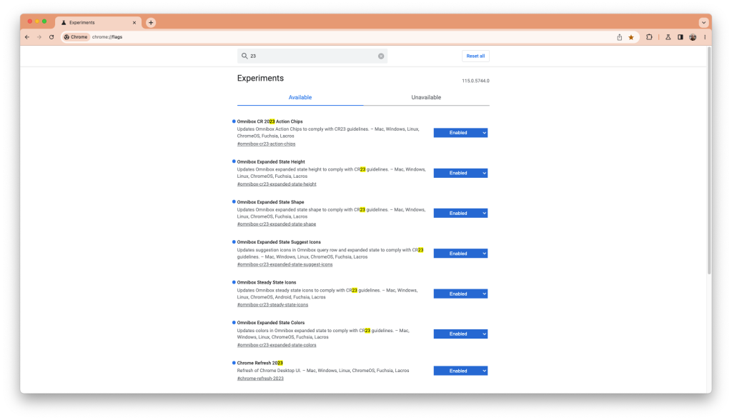
If you’re interested in trying the Chrome redesign for yourself before it officially launches, you’re in luck. All you need to do is enable a handful of features in the chrome://flags menu. For now, most of these flags are only available on pre-release versions of Chrome, and to see the absolute latest iterations of the design, you’ll want to use Chrome Canary.
- Chrome Refresh 2023
- Chrome WebUI Refresh 2023
- Omnibox CR 2023 Action Chips
- Omnibox Expanded State Colors
- Omnibox Expanded State Height
- Omnibox Expanded State Shape
- Omnibox Expanded State Suggest Icons
- Omnibox Steady State Icons
- Chrome Refresh 2023 Mac Font Smoothing – (Mac only)
As the redesign is still actively in development, the list of flags may change over the coming weeks. Searching for “23” should helpfully surface most of the relevant flags, as seen below.
FTC: We use income earning auto affiliate links. More.

Comments