Following the announcement earlier this month, Google Keep has rolled out the Single note Wear OS Tile, while making a few other visual tweaks to the Android app.
The Google Keep for Wear OS addition lets you “select one of your notes to display in the tile.” It follows the widget version for Android homescreens in March, while there’s also the Note creation Tile.
“Choose note” brings up the same feed with pinned ones appearing first. You get four lines of text per note or list, which is a little bit limited, while background colors are shown. In our testing, selecting an image works but just makes the Tile black, though tapping will still open Keep.
A tap opens the full note and lets you take action (Add reminder, Pin, or Archive) at the bottom, but it does not let you access the main feed afterward. Swiping back exits Keep and takes you to the Tile again.
Meanwhile, you’re able to add multiple Single note Tiles. It’s a nice addition, but could be better if Wear OS offered an always-on display(AOD) mode for Tiles. As is, putting your wrist down blurs the screen. This was a server-side rollout with the latest version (5.23.202.03.97) of Google Keep for Wear OS.
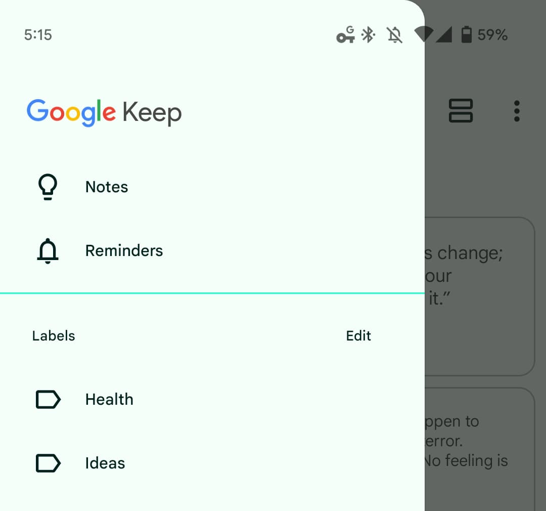
Elsewhere, Keep for Android sees some more Material You elements. The navigation drawer now features rounded corners, which is something that has also been appearing in other first-party apps as of late.
In settings, the toggles have been updated to the M3 components with a more pill-shaped design. This is widely rolled out.
More on Google Keep:
- Google Keep for Wear OS adds watch face complications
- Google Tasks auto-migrating Assistant reminders, Pixel At a Glance doesn’t open app
- Assistant’s 3rd-party Notes & Lists integration is shutting down
- Google previews a personal future for Material You tablet apps [Gallery]
FTC: We use income earning auto affiliate links. More.


Comments