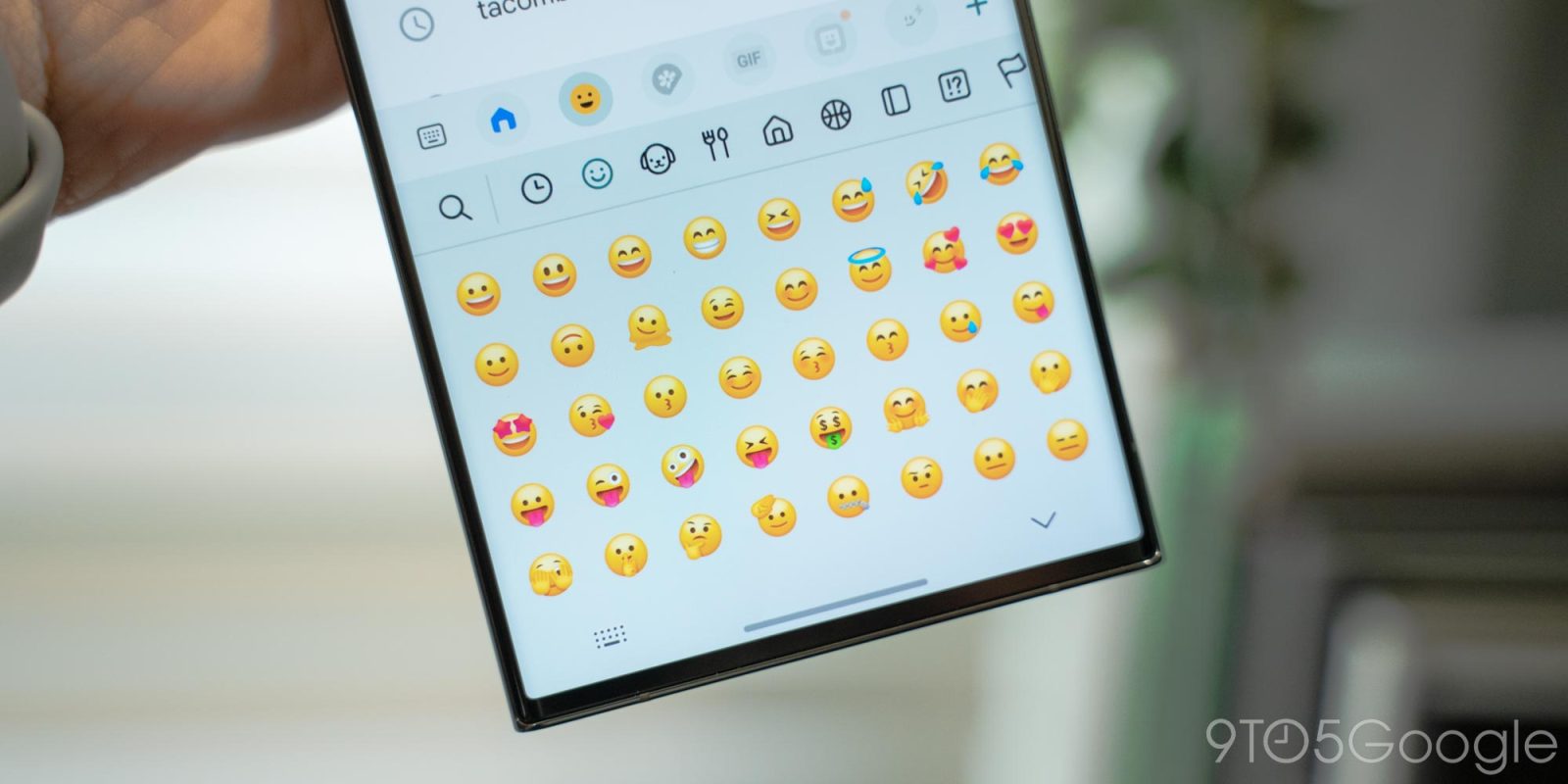
Emoji were once just a fun little addition to text messages, but at this point, they’re a very important part of how most of us communicate with one another. That’s why it needs to be said that, even after the latest update, Samsung’s emoji are just bad.
This issue of 9to5Google Weekender is a part of 9to5Google’s rebooted newsletter that highlights the biggest Google stories with added commentary and other tidbits. Sign up here to get it delivered to your inbox early!
The emoji you see and use on your phone, tablet, computer, or whatever else is built on top of the Unicode standard. That standard is what makes it possible for everyone to see slightly different emoji depending on their device. Apple, Google, Twitter/X, Meta, and many others have their own take on what emoji should look like, and so does Samsung.
Everyone has a style of emoji that’s their favorite, but as far as Samsung’s go, I’ve just never been a fan.
Samsung’s emoji style has, for years, felt like a cheap imitation of Apple’s emoji on iOS. The style is somewhat 3D and generally tends to take Apple’s style and tweak it, perhaps with a bit more color or slightly different positions.
That style persists in One UI 6, which launched in beta this week. The update brings a new version of Samsung’s emoji which updates the design language. It certainly feels a bit more like it actually stands out from others, but this new iteration almost feels worse to me. Colors feel more muted than in One UI 5.0’s emoji, which makes it harder to see the details (which is already a struggle when emoji are so small).
Let’s look at some examples.
First, the single-most used emoji out there: Face with Tears of Joy. Apple’s and Google’s looks have closed eyes, a fully wide smile, and big tears that extend out of the face. Samsung’s isn’t all that different, but I think it’s objectively worse. In One UI 5, the tears are much smaller compared to Apple and Google, and in One UI 6, the proportions feel all off – the eyes are too small, and the tears are too big.


Then, there’s the Face Savoring Delicious Food – or “Yum” – emoji with its tongue sticking out. This one tends to have a lot of use cases, which is why getting the tone right is crucial. Samsung’s One UI 5 design was pretty much on par with Apple and Google, but One UI 6’s design is just weird.


Another emoji I’ve always disliked on One UI is the Grimacing Face. While it gets the point across, I’ve always felt the tone is a little off. One UI 6 makes this better, but the tone still feels different.


And just look at how they’ve massacred Android’s adorable turtle.


Of course, it’s not like Samsung hasn’t made genuine improvements. The Thumbs Up emoji is now much closer to Apple and Google, as is the Raising Hands emoji. Loudly Crying is also way closer now to Google’s native Android emoji while not being all that different from Apple’s. It’s a great middle-ground.


I’m glad Samsung isn’t giving up on trying to improve, but I also wish the time that was taken to “improve” emoji in One UI 6 led to more meaningful improvements.
There’s a solution just sitting on the table too. #BringBackTheBlobs.
This Week’s Top Stories
AirTag alerts are now available on Android
With Apple’s help, Android can now detect and track unknown AirTags as a protection against unwanted tracking. It’s a nice addition – a better one would be Android’s own tracker network, which is ready and waiting for Apple to build this same protection into iOS.
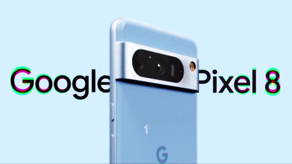
More Pixel 8 leaks
A couple more new leaks of Google’s upcoming Pixel 8 series came out this week, including that the Pixel 8 Pro will stick with a 128GB base variant instead of the 256GB minimum that many others have been adopting. Another report claims that there will be five different cases available for Pixel 8 and Pixel 8 Pro in a variety of colors.
- Pixel 8 Pro will apparently still start at 128GB of storage as 256GB becomes the norm
- Google rumored to continue five color case lineup for Pixel 8 and 8 Pro
And the big one, an early ad for the Pixel 8 has shown off the Pixel 8 Pro in an awesome blue color and revealed a new “Audio Magic Eraser” feature.

Galaxy Z Fold 5, Flip 5, Watch 6 launch
Samsung this week officially launched all of its new devices, including Galaxy Z Fold 5, Flip 5, Watch 6, and more.
Top comment by Benjamin Haube
The Google emoji look the best to me. It's nice that they are open source too. That way I can use them on my Linux machines.
Read our reviews:
- Review: Galaxy Z Fold 5 is as good as this foldable can get
- Galaxy Watch 6 Review: The same Wear OS story gets retold
- Galaxy Z Flip 5 Review: Near-perfect hardware just barely misses the mark on software
More Top Stories
- Google Messages turning on RCS by default, group E2E encryption launches
- GeForce Now Ultimate’s RTX 4080 upgrade is now fully available
- Google Calendar rolls out Material You widget redesign
- OnePlus now offers a lifetime screen warranty, but only in India
- In-progress Fitbit Guided Programs going away September 19
- Instagram finally has a tablet layout, but only on Samsung’s Galaxy Z Fold series
- The Motorola ThinkPhone can now stream an entire Windows computer
- ‘Watch only’ mode saves your Galaxy Watch 6 battery for weeks, how to use it
- How to turn off Chrome’s new download tray and revert to the bar
- We asked, you answered – YouTube Premium’s price hike isn’t enough to cancel
- BlueJeans, Verizon’s Google Meet competitor you’ve never heard of, is shutting down
- Google’s AI-powered code editor enables Android, iOS, and web dev online
- Google Account switcher on web gets larger Material You redesign
From the rest of 9to5
9to5Mac: iPhone 14 Pro users complain of major drops in battery health and capacity after less than a year
Electrek: A close look at Tesla Cybertruck’s monster wheels
9to5Toys: AOC AGON Pro AG276QZD OLED Review: Inky blacks with incredibly smooth 240Hz [Video]
FTC: We use income earning auto affiliate links. More.


Comments