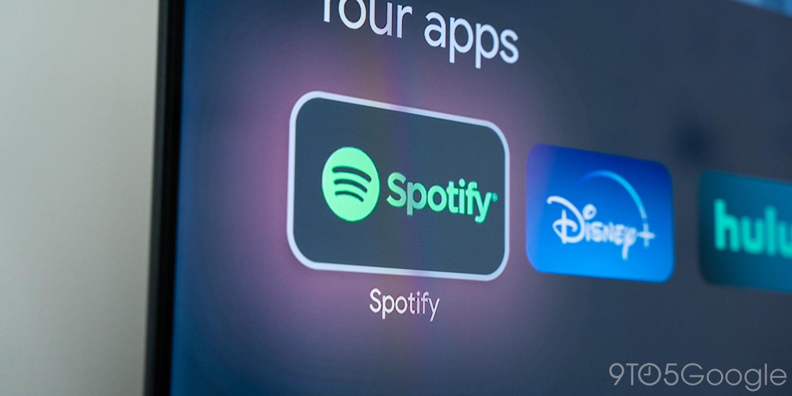
Launching today, Spotify’s TV app is getting a major overhaul with support for more features and a much more familiar interface.
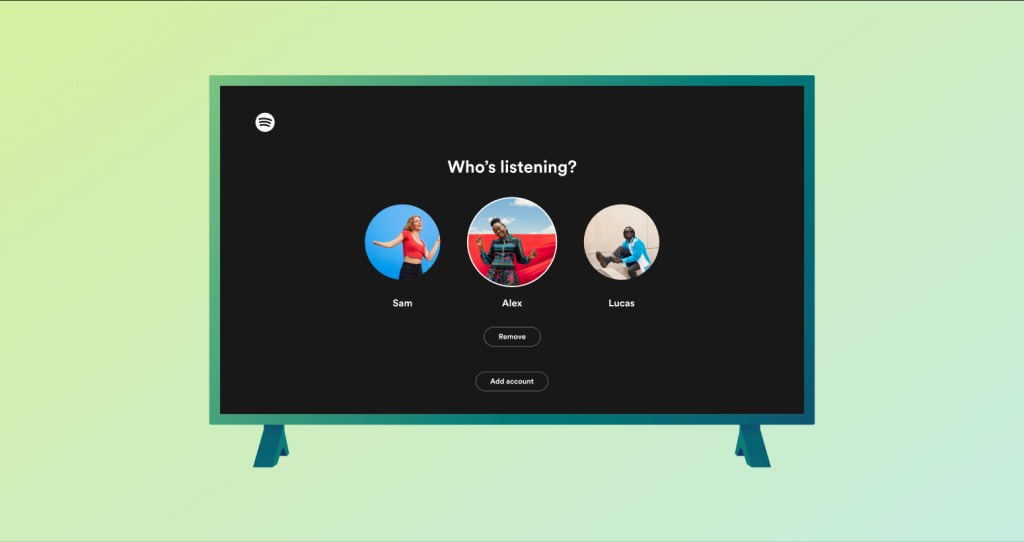
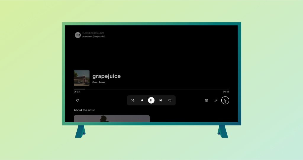
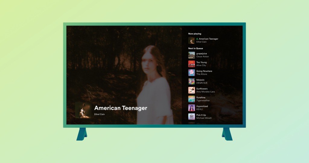
To better fit in line with Spotify’s mobile and desktop apps, the TV app across platforms such as Google TV, Roku, and more will get a new look with a Home tab, “Up Next” support, a dark mode, and better support for account switching.
Spotify explains:
Looking for a Spotify experience from the big screen? Whether you’re entertaining guests or watching your favorite video podcast, Spotify on TV delivers a rich visual and audio experience from the comfort of your room. And today, Spotify on TV is getting a revamp, with new features and improvements that make the experience even better and reflect our Mobile and recently updated Desktop apps.
Get ready for more ease when switching between household user accounts, better visibility on what plays next, a home page primed for discovery, and more control over your listening experience with these changes rolling out today
A few images and a brief video shared by Spotify offer a better look at the revamp.
At the time of publishing, the new design is already live on Google TV, presumably via a server-side change. A noteworthy change is that, when you open the “Now Playing” screen on the TV, music automatically starts on the TV even if it is playing on another device.


More on Spotify:
- Spotify now has ‘free’ audiobooks for Premium subscribers in the US
- Spotify for Android update makes it easier to access settings
- Spotify ‘Jam’ lets you collaborate with friends on the Now Playing queue
FTC: We use income earning auto affiliate links. More.


Comments