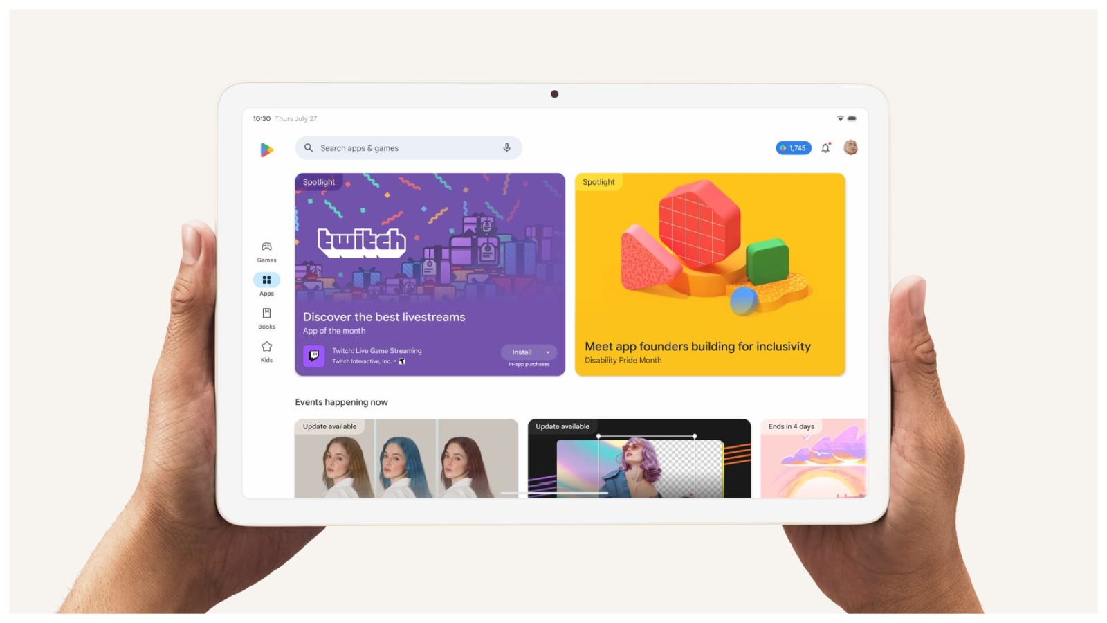
Following phones in August, Google is adding a Search tab to the Play Store on Android tablets and foldables in a design that completely misses the point of large-screen UIs.
The Google Play Search tab is now rolling out to large-screen Android devices after first launching on phones. It adds a fifth tab to the center of the navigation rail. There is no Offers tab on tablets, but you do get the “Kids” section for teacher-approved applications.
The new tab is optimized for the larger canvas by making use of full-width carousels.
Old

This addition removes the “Search apps & games” search bar from the top-left corner. A large stretch of that app bar is now blank, with the Play Points counter, notifications bell, and avatar menu located at the other end.
That empty gap is an incredible waste of space on tablets and foldables. For comparison, Google Photos, which also has a search tab, adds a dedicated lookup field in the app bar.
Like on phones, the complaint with the Search tab is that looking up apps in Google Play is now a two-tap process. (Tip: You can hit the magnifying glass in the nav rail/bottom bar twice to quickly jump into search with an open keyboard.) A Google app not having search at the top — even if it’s just a button rather than a full-width field — breaks a common convention.
Meanwhile, it’s not clear if people are finding much utility in seeing search suggestions grouped around “You might like” and “Explore games/apps” to justify a dedicated page for search.
New


More on Google Play:
- Dark theme-less Fitbit app hits 100 million Play Store downloads
- Some of the best apps not on the Google Play Store [Video]
- Android apps can now force Google Play download, effectively blocking sideloading
FTC: We use income earning auto affiliate links. More.


Comments