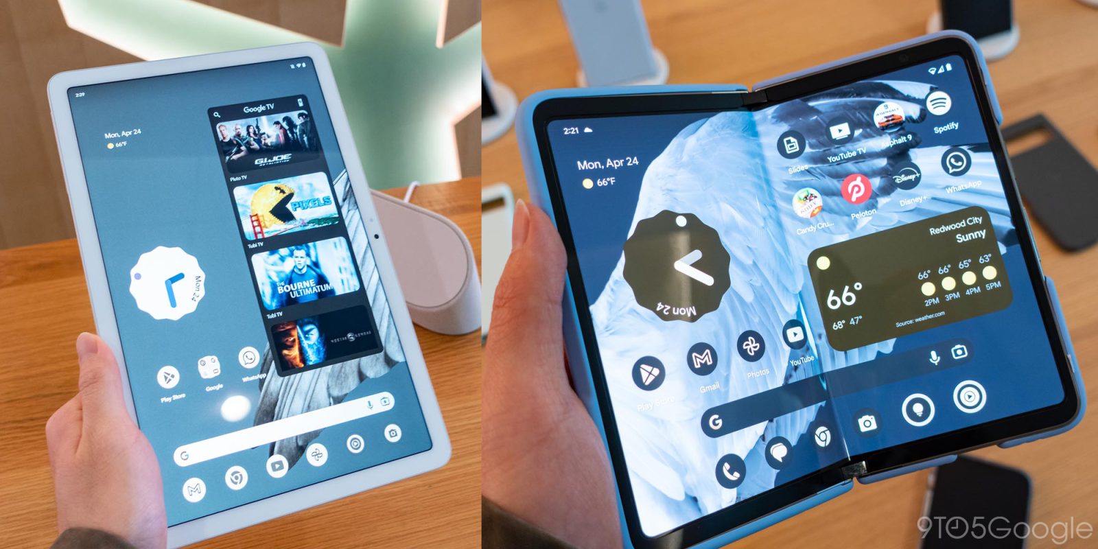
Ahead of Google I/O 2023, we went hands-on with the Pixel Fold and Tablet. Both are first-generation products, but one — surprisingly — ends up feeling less so than the other.
Pixel Tablet hands-on
While the 2018 Pixel Slate was well within the “Made by Google” hardware era, I wouldn’t really say the Pixel Tablet continues in that lineage. Rather, it’s a brand new start heavily inspired by the Nest Hub, and it of course runs Android rather than ChromeOS and is powered by Tensor G2 with 8GB of RAM.
That restart is very obvious when you hold the Pixel Tablet. When Google first showed off the Pixel Tablet in May of 2022, everyone said it looked like the screen portion of the Nest Hub Max. Personally, I don’t mind that soft, curved corners look and think bezels play an important role on tablets as it gives you somewhere to place your thumb.
The Pixel Tablet’s design might be utilitarian and functional all around, but it doesn’t feel very substantial or solid. Google’s proprietary nano-ceramic coating that covers the aluminum chassis does not feel very premium. It mostly comes off as plastic, and not at all like the coating of the Pixel 5, which was something I enjoyed and was hoping would return. One upside is that the Pixel Tablet is rather light and that greatly contributes – even with the bezels – to it feeling just like a floating screen.
Meanwhile, the Gorilla Glass 3 does not seem thick enough, and anything but the lightest taps can depress the screen. This is more of an issue when the tablet is laid flat on a table and less of a noticeable issue when it’s attached to the Charging Speaker Dock. Google says this has no impact on durability.
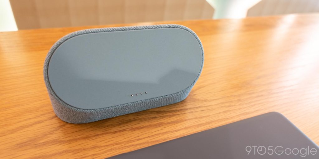
Speaking of the dock, the included accessory is what will encourage you to get more use out of your tablet, and this thoughtfulness/play to increase usage on Google’s part should not be dismissed.
I have long looked at the Nest Hub Max near my desk and wished it could do more. The Pixel Tablet takes everything that’s useful with Smart Displays and simply turns it into a layer on top of Android called “Hub Mode.” Besides the Google Photos slideshow, you get some fullscreen clocks as well as Froggy. There’s a Home Panel that’s basically the Favorites tab of the Google Home app, which is also entering general availability today.
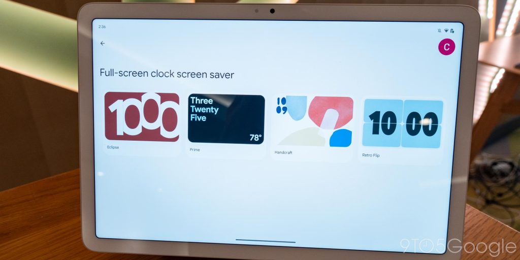
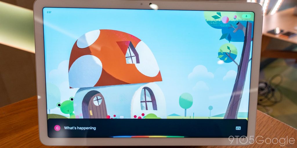
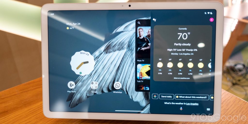
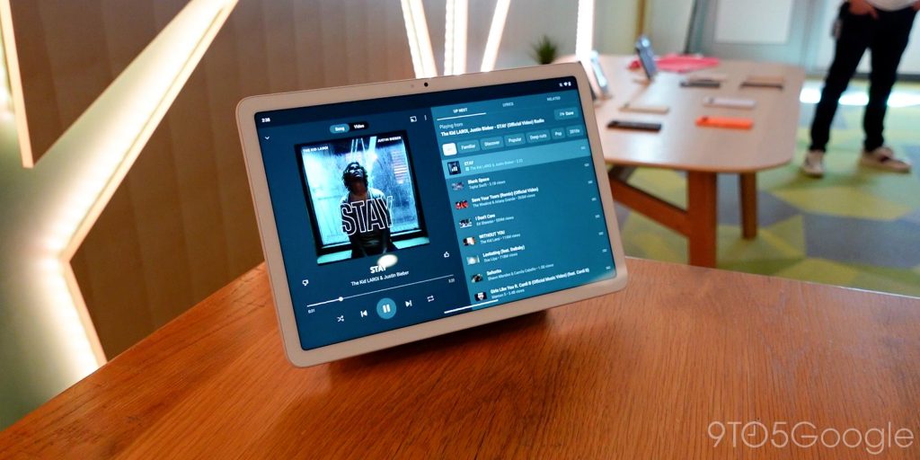
There’s no privacy switch, despite leaked near-final renders featuring it, but you can go into Quick Settings and enable/disable Camera and Mic access even without unlocking the device. Meanwhile, unlike any past Nest Hub, you can long-press on the power button to activate Assistant without the hotword.
It’s unfortunate that the Charging Speaker Dock cannot be used as a standalone Cast target when the Pixel Tablet is not connected, especially when you find out that buying a separate stand to place in different rooms around your Google Home costs $129. Speaking of audio, the audio transfer between tablet and dock is quite neat, with those pogo pins playing a role. You cannot use the speakers on the tablet and dock simultaneously.
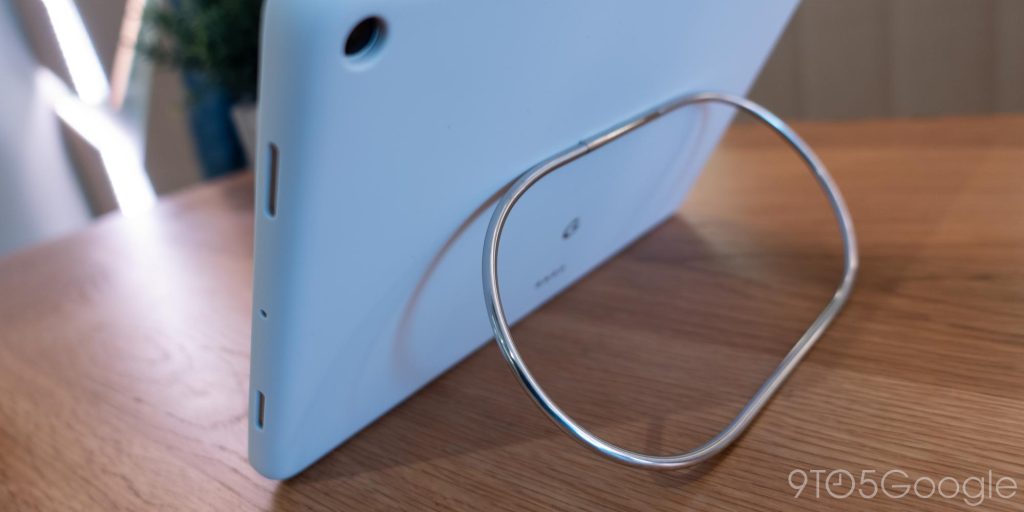
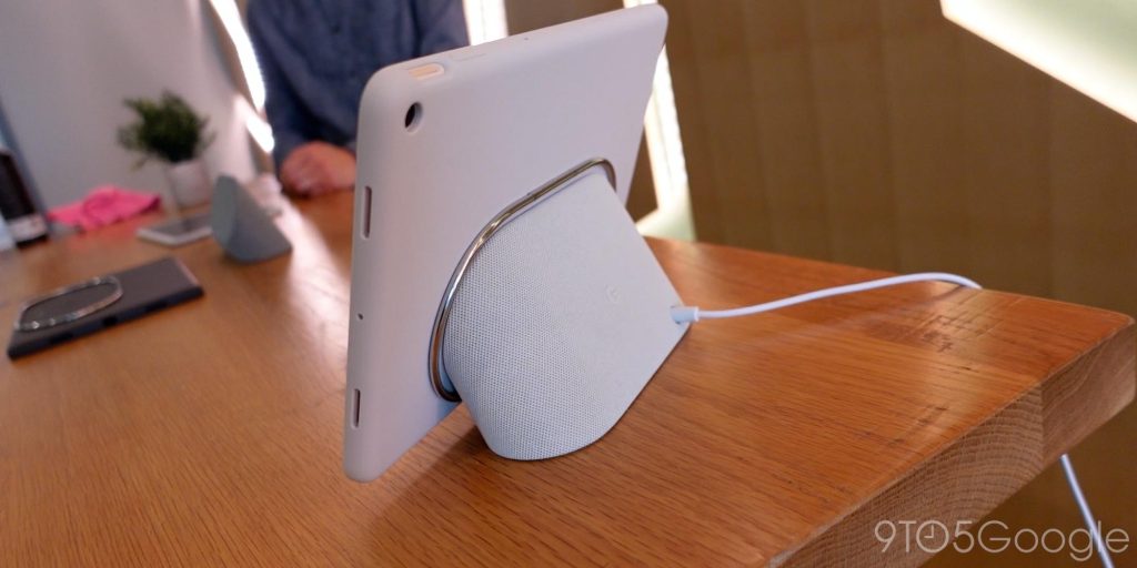
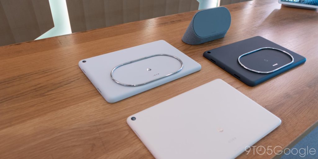
Speaking of accessories, the only other one Google is offering is a $79 case with a rather neat loop ring that doubles as a stand and alignment indicator for the dock. While the Pixel Tablet supports the USI 2.0 standard, Google itself does not have a stylus at launch.
With the best parts of a Smart Display just being a software experience and included accessory, everything else is full-featured Android that looks nice after two or so OS generations of tablet optimizations, as well as buy-in from over 50 first-party Google apps and several other third-party ones (Disney+, Minecraft, Spotify, etc). It’s finally time to give the OS a serious reexamination for tablet usage. That’s how much Android has changed.
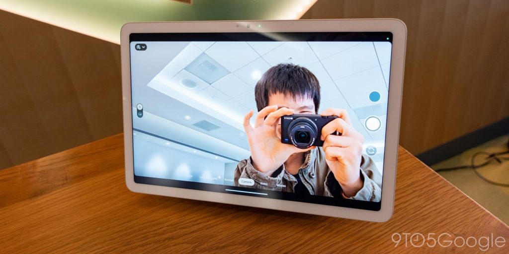
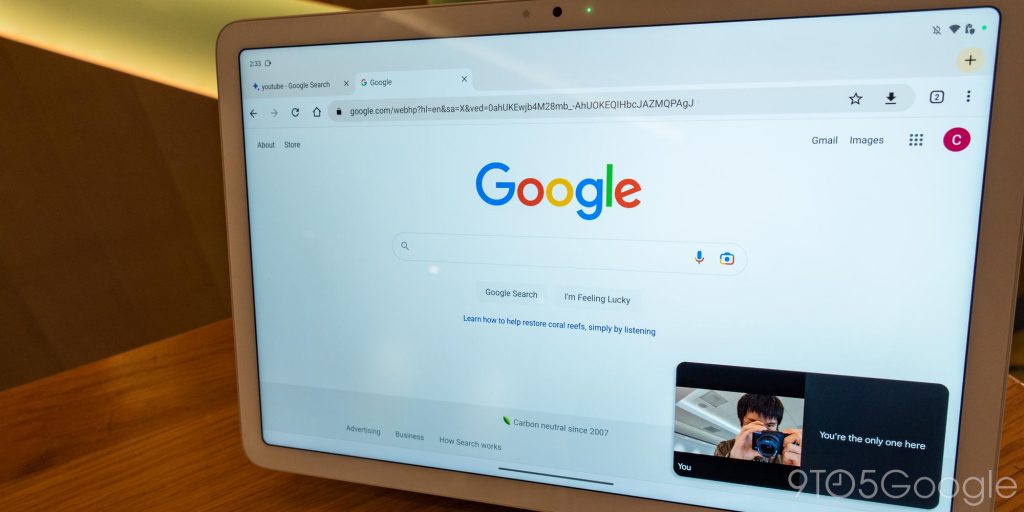
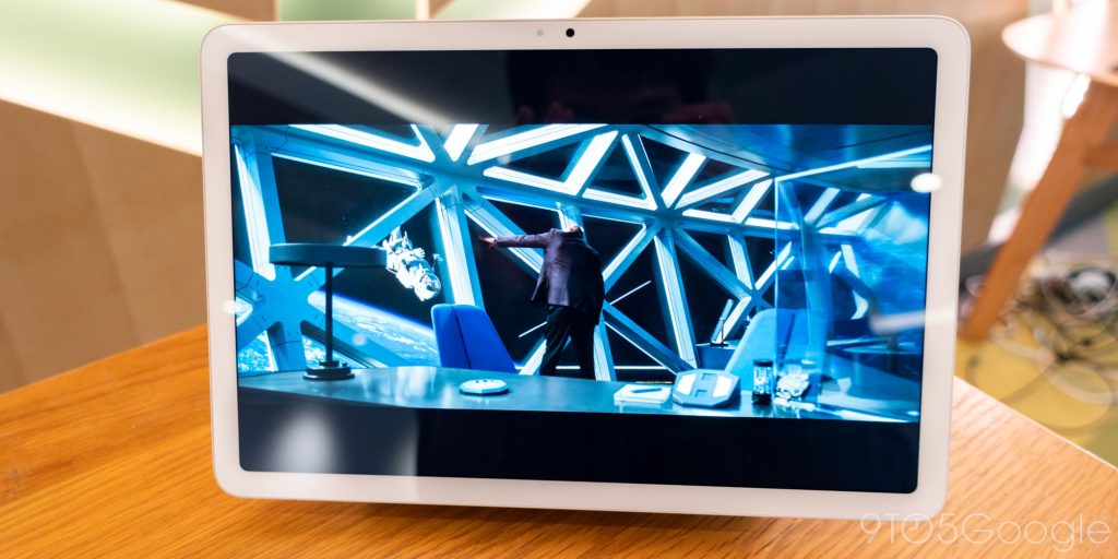
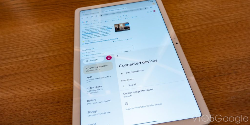
As I said, the Pixel Tablet is a restart and feels very much like a first-generation product. However, it should really feel a lot less like that as a retail device that otherwise has a solid software story.
The Pixel Tablet is launching on June 20 for $499 (128 GB or 256 GB for $599) in the US, Canada, UK, Germany, France, Sweden, Denmark, Norway, the Netherlands, Japan, and Australia.
Pixel Fold hands-on
In comparison, the Pixel Fold feels well thought out. Google had a clear vision for its foldable and waited until the hardware engineering could deliver. By our account, the Pixel Fold shown off today is Google’s third attempt, not that the company would confirm when we asked. The process of waiting and iterating is not always feasible in consumer electronics, but I feel that Google hardware would be much more successful and polished if it did so.
Google spent a lot of time engineering the dual-axis, quad-cam synchronized hinge to make sure there was no gap when the Pixel Fold is closed. Opening and closing the Pixel Fold is a smooth action made possible by what Google calls a 180-degree fluid friction hinge, with the various postures holding steady and tight magnets keeping it shut. Google is also proud of its stainless steel exterior, which is said to offer high scratch resistance. It matches the frosted back glass, which uses post-recycled resins and recycled adhesives.
For overall device thinness (5.8 mm), Google made it so that the hinge mechanism is not under the foldable display, but rather just at the top and bottom. This results in top and bottom plastic bezels on the 7.6-inch internal OLED (2208 x 1840 at 380 PPI, 6:5, 120Hz, 1450 nits peak brightness), which Google used to fit the inner 8 MP front camera instead of doing a hole-punch.
Besides the custom hinge, Google redesigned the battery (there are two, combining for 4821 mAh), speakers, haptics, and the camera (48 MP main + 10.8 MP ultrawide + 10.8 MP telephoto), including a folded telephoto. There’s even an IPX8 water resistance rating.
Google’s first tentpole is to build a good phone that could be used one-handed. The 5.8-inch cover display (OLED, 2092 x 1080 at 408 PPI, 17.4:9, 120Hz, 1550 nits peak brightness) opts for something much less narrow than Samsung’s Fold. Apps look natural here, and this was a good decision. Once opened, two full apps can very comfortably and naturally be shown side-by-side.
Google aimed at making an as-thin-as-possible device, but the foldable form factor will always be thick. It more than fits in front jeans pockets, even when equipped with the two-piece case. The bottom piece of said case uses adhesive that will remain sticky through several removals and placements.
The second tentpole is to have software that takes advantage of the big internal screen. This goes hand-in-hand with the third tentpole, to have a good camera in a more constrained package. The most delightful folding experience across software and hardware is the Google Camera app.
The form factor creates a natural stand on which to prop up the camera. When the internal display is open to a 90-degree angle (or Tabletop mode), you have the top half showing a viewfinder while the bottom shows controls. These realigned controls result in the Pixel Fold feeling oddly and delightfully retro, akin to dedicated camera hardware.
Additionally, when the camera timer is set, you can raise your hand and the Pixel Fold will look for your palm to initiate the countdown.
Top comment by Darren
I don't understand why they spent so long hyping up the tablet for the past year. It's... a tablet. Something that Google should have been making for years now, and certainly nothing to get overly excited about.
The Fold, on the other hand, is a new product category and definitely something they should have been talking about consistently.
The tablet looks like it is more for media consumption (as most tablets are), so they still need a new productivity device. That should have been filled by a new Pixelbook, which they sadly canceled.
There are other foldable advantages like opening the internal screen fully and flipping it around so that the outer display and main camera stack face you, allowing for very high-res Rear Camera Selfies. Similarly, Dual Screen interpreter mode, coming with Android 14, can show translated text to another person on the outer screen, while you continue to hold the Fold and read the inner one.
The pinnacle of software taking advantage of hardware is how the Pixel Fold offers the best way to capture astrophotography. The Fold is its own tripod.
Like the 7a, there is Face Unlock, but only on the external front-facing camera (9.5 MP). The main display does not support it, with Google working out that people will first unlock on the cover screen before doing anything on the internal one.
Again, I wish more Google products could be as polished as the Pixel Fold. From hardware to software, the signs are there. It’s too early to tell whether that justifies the $1799 price for 256 GB or 512 GB for $1919 in the US (also available in the UK, Germany, and Japan), but it’s a great start.
FTC: We use income earning auto affiliate links. More.


Comments