Google has redesigned the account switcher used across Google Search, Gmail, Docs, and more, introducing a larger UI with Material You styling.
While the Material You design language first arrived with Android 12 in 2021, followed shortly by numerous apps getting visual refreshes to match, Google is still gradually iterating on how to effectively and cohesively represent its apps and services across Android, ChromeOS, and the web.
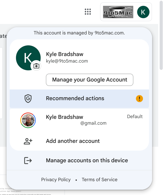
For instance, the Google Account switcher, ever-present in the top-right corner of most Google web apps, already had a design inspired by Material You, using rounded corners, an off-white background color, and limited use of shadows. However, it seems the company has seen fit to give the design another attempt, as a few members of our team have spotted.
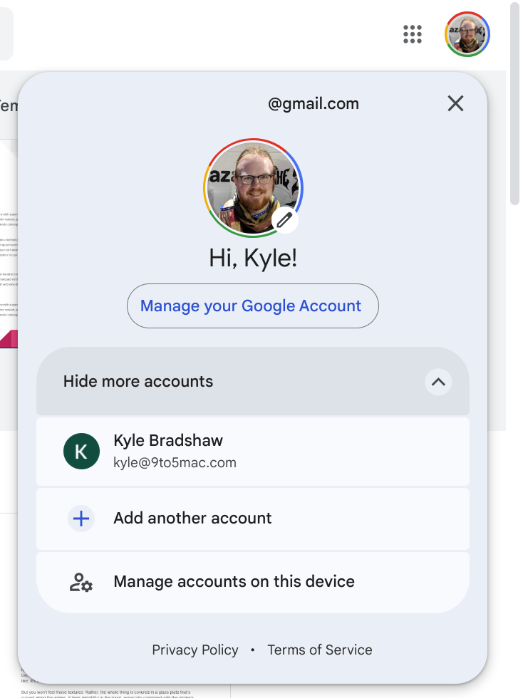
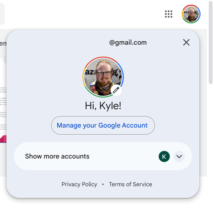
The redesigned Google Account switcher takes away some of the emphasis on switching accounts and shifts it to managing your account. Your currently selected Google Account is now front and center, displaying your profile picture below your email address. The “Manage your Google Account” button is now pill-shaped rather than a rounded rectangle.
Your other Google Accounts are listed below that button, and there’s even a way to collapse the list to conserve space. More broadly, all of the colors have shifted to be slightly darker, too.
The most immediately noticeable difference with the new design, however, is that the Google Account switcher is now a fair bit larger than before, both in height and width.
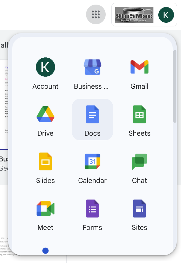
Alongside the new switcher, the company has also similarly adjusted the design of the app launcher, found by clicking the grid-like button next to your profile picture in the top-right corner. This now features steeply rounded corners and the same shades of light blue found throughout Google’s (non-dynamic color) Material You designs.
FTC: We use income earning auto affiliate links. More.


Comments