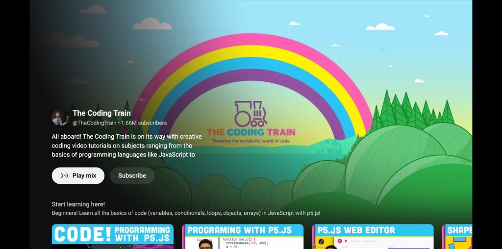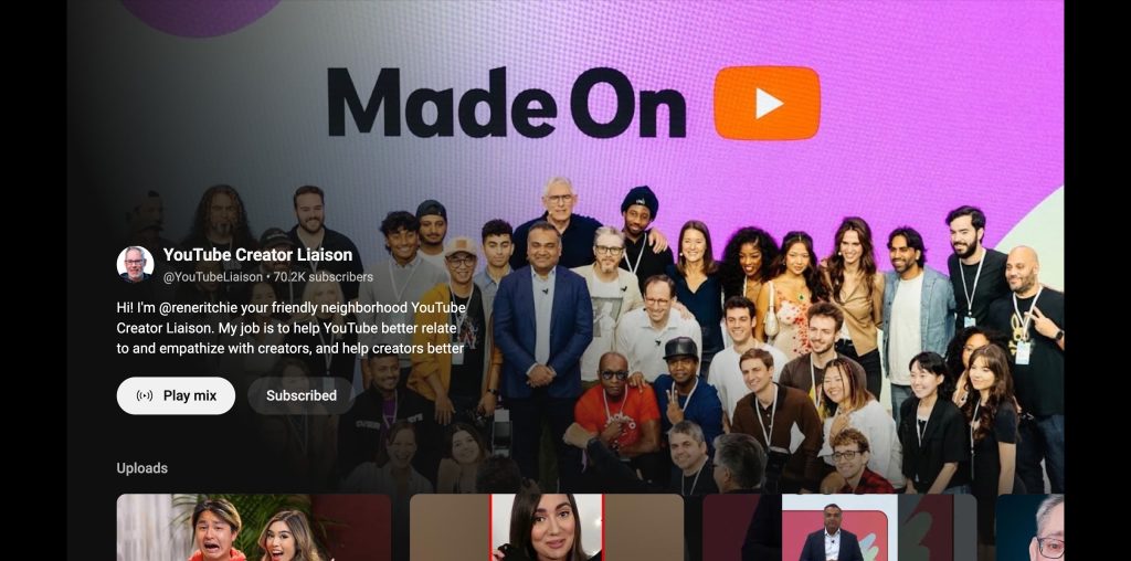
YouTube’s work on optimizing the viewing experience for connected/smart TVs continues with a redesign of channel pages for all Creators.
It starts with a large background that takes up most of your screen instead of just a sliver/banner at the top. The avatar, channel name, and handle is now joined by subscriber count at the left, while an About description appears below.

The “Subscribe” button is paired with “Play mix” to quickly start watching. This is followed by the various video carousels that you can scroll through.
YouTube first launched this more immersive layout for official artist (music) pages last fall, but the company tells us it’s now rolling out the channel page redesign on TVs for all Creators over the next few weeks.
It follows recent television launches like larger thumbnails on the homepage, more prominent voice search, and modernized menus.
Meanwhile, Nielsen said today that YouTube is the “#1 streaming platform by watch time for one full year” (12 consecutive months). This comes as people watch more than 1 billion hours on average of YouTube on TVs every day, while more top creators are receiving the majority of their watch time from televisions.
More on YouTube:
- ‘Last Week Tonight with John Oliver’ on YouTube will now be delayed
- YouTube Shorts can now include clips from an artist’s music videos
- YouTube shares 2024 priorities as YouTube TV hits 8 million subscribers
FTC: We use income earning auto affiliate links. More.


Comments