Material Design

Since the Pixel 10 and Android 16 launch, the pace of M3 Expressive updates has slowed down, but Google Maps is readying some tweaks.
Expand Expanding Close
After the initial wave of M3 Expressive, the Gmail for Android redesign continues by placing each email in a container.
Expand Expanding Close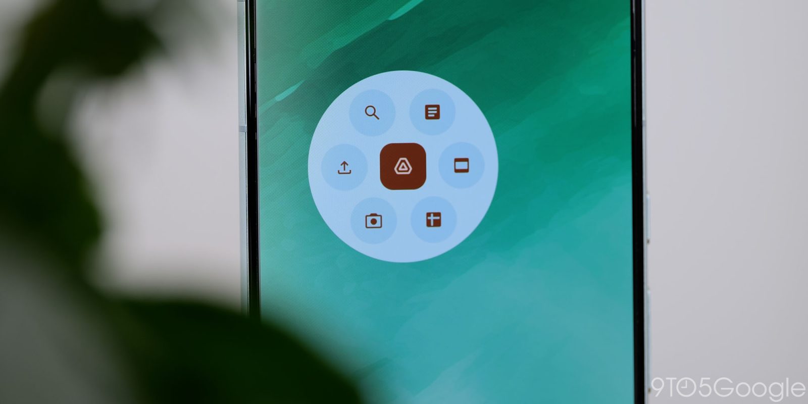
In addition to the broader Material 3 Expressive update, Google Drive is redesigning the editor you get after using the document scanner.
Expand Expanding Close
The Google Chrome interface has remained remarkably consistent over the years, and the Android browser is now getting Material 3 Expressive tweaks to match other first-party apps.
Expand Expanding Close
Google Drive started rolling out Material 3 Expressive earlier this month, with the redesign’s wider availability accompanied by a few more components.
Expand Expanding Close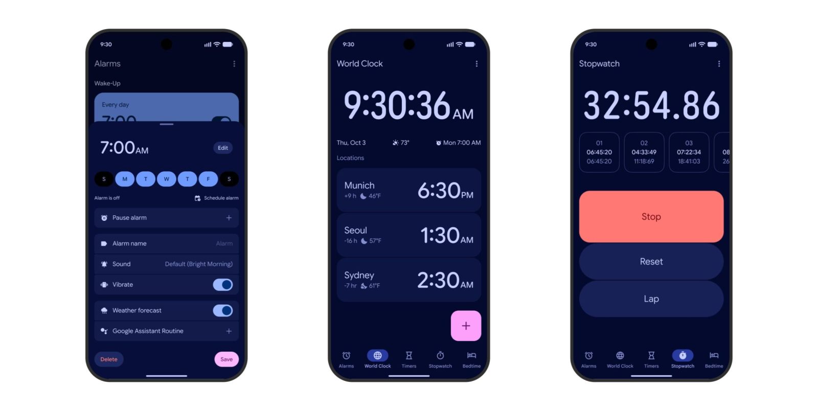
Google Clock 8.1 is now widely rolling out with a Material 3 Expressive redesign. Meanwhile, the last remaining Pixel apps are also getting their revamps.
Expand Expanding Close
The Google Messages redesign started widely rolling out to the stable channel last week, and Material 3 Expressive is now available on the actual chat screen.
Expand Expanding Close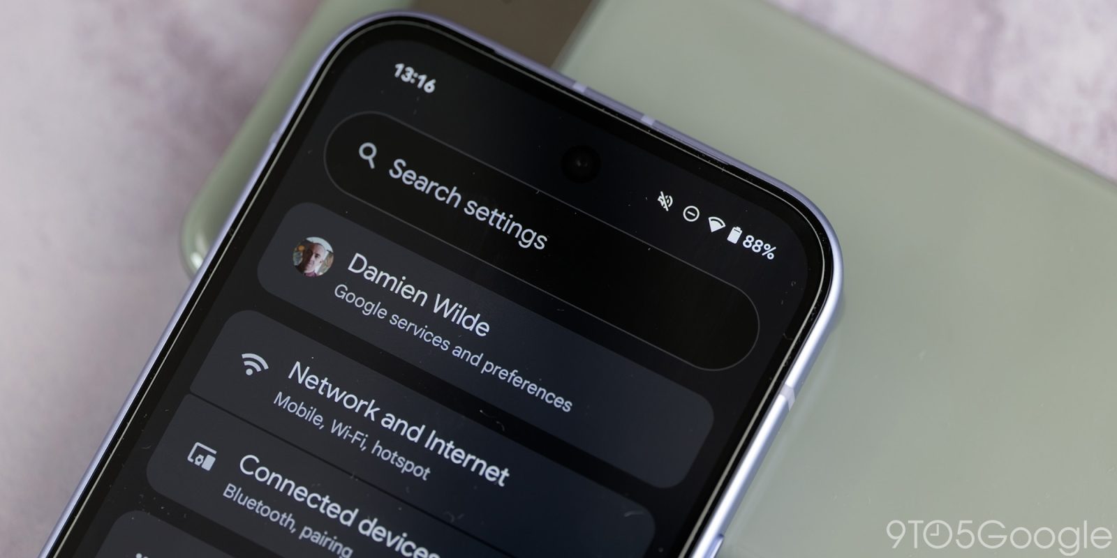
Google has been updating various Android Settings pages with Material 3 Expressive, and the “Backup” redesign brings a rather drastic simplification.
Expand Expanding Close
Gmail was one of the first apps to start testing Material 3 Expressive in June and the redesign is now widely rolling out.
Expand Expanding Close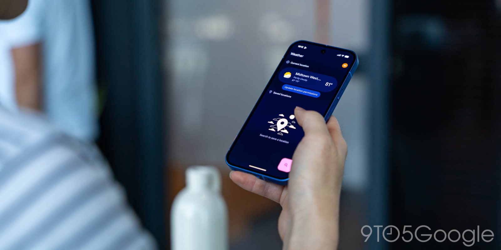
For Pixel owners, today is a big day for Material 3 Expressive redesigns with wide rollouts for Weather, Studio, My Pixel, Buds, and VIPs, while Calculator is also seeing full availability.
Expand Expanding Close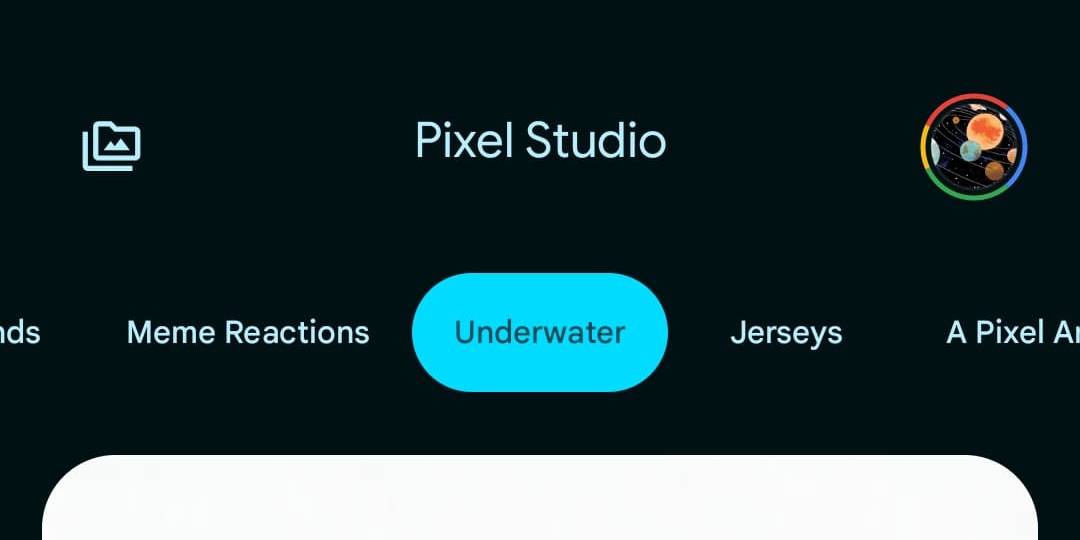
With version 2.0, Pixel Studio is now out of “Preview” and adds a versatile image editor that can replace the existing Markup tool.
Expand Expanding Close
The Google TV app is rolling out a new update on Android that delivers a Material 3 Expressive redesign that also causes some problems for the phone-based remote.
Expand Expanding Close
Google is rolling out a Material 3 Expressive redesign that tries to really simplify Pixel Recorder. It comes as the Pixel 10 series debuts a new music creator.
Expand Expanding Close
Following Calculator, Google is rolling out a Material 3 Expressive redesign for Android’s Clock app.
Expand Expanding Close
Google is rolling out an update to Pixel Weather on older phones that finally brings homescreen widgets into the app.
Expand Expanding Close
Ahead of the big Pixel Buds Pro 2 update next month and Pixel Buds 2a in October, Google is giving the companion app a M3 Expressive redesign with the Equalizer interface getting a nice modernization.
Expand Expanding Close
Google Calculator is getting a Material 3 Expressive redesign that moves some elements around.
Expand Expanding Close
After the redesign started rolling out last month, Material 3 Expressive is now widely available for Google Keep on Android.
Expand Expanding Close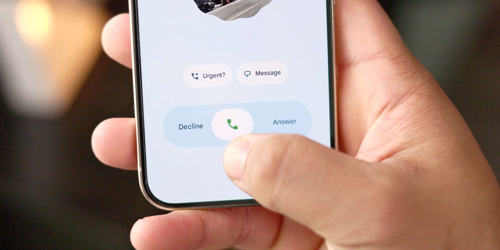
Compared to the other redesigns, Material 3 Expressive for Phone by Google thoroughly updates how you use the app.
Expand Expanding Close
Google Password Manager on Android is widely rolling out a Material 3 Expressive redesign that is mostly updated components but with one genuinely useful addition.
Expand Expanding Close
With the in-app redesign widely available, Google Calendar for Android is now rolling out M3 Expressive homescreen widget updates.
Expand Expanding Close
After testing since June, Google Messages is rolling out its Material 3 Expressive redesign, including an updated homepage, to the stable channel.
Expand Expanding Close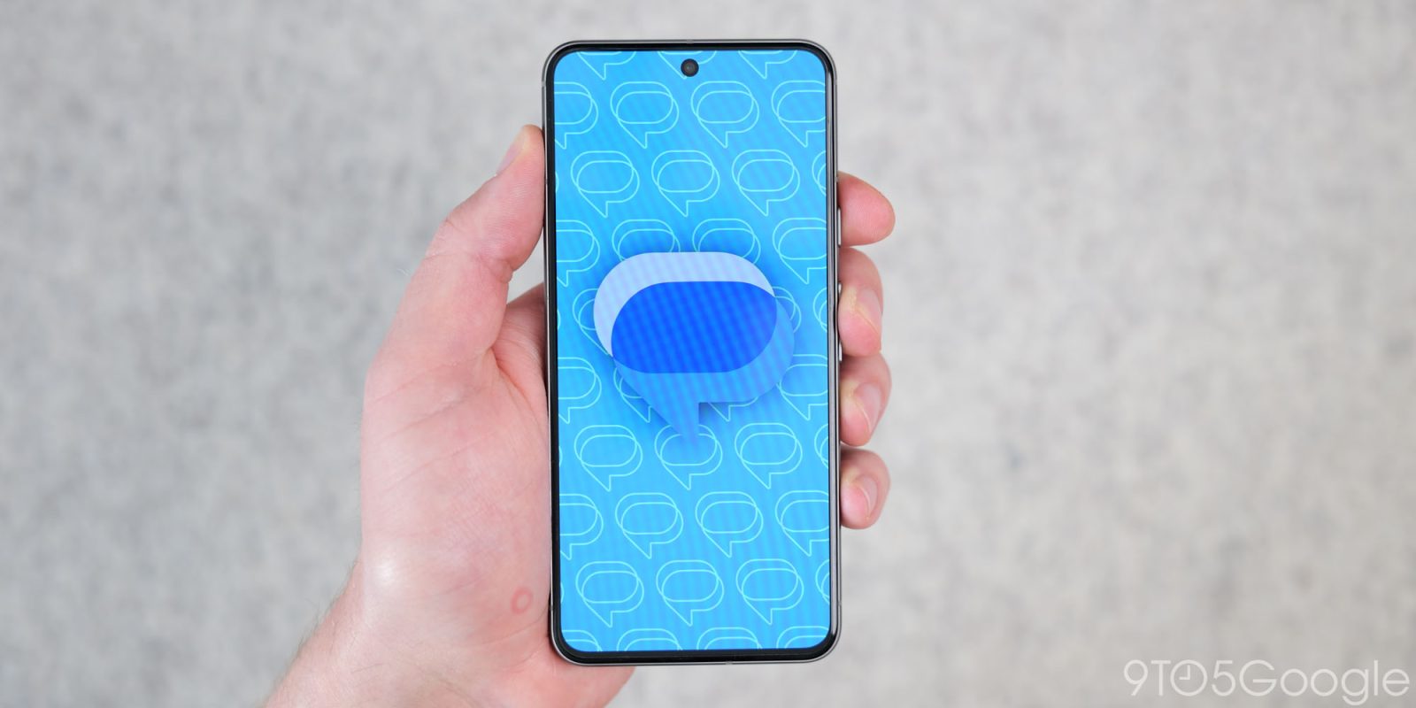
Google Messages was one of the first apps to beta test Material 3 Expressive, and the redesign is now making its way to the stable channel.
Expand Expanding Close
Following Calendar, Drive, and Keep, Google Tasks has received a solo M3 Expressive tweak on Android.
Expand Expanding Close