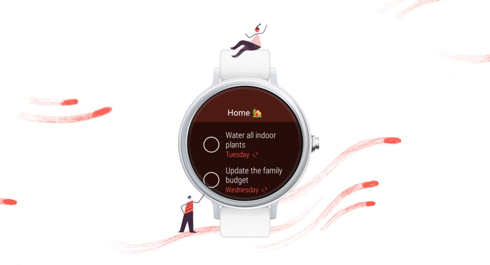
Since Wear OS 3 last year, more developers have released apps for the wearable platform. At I/O 2022, Google teased that Todoist is redesigning its Wear OS app to be more modern.
The current version of the to-do and list app dates back to 2018 (as seen above). It adopted many original Android Wear design conventions, including the WearableDrawerLayout that involves swiping down/up for fullscreen pages. In the case of Todoist, swiping down from the top of the screen let users browse through the Inbox, Upcoming, and other sorting views.
Todoist is now switching to one central list that starts with a big “Add task” button. This is followed by the default Inbox, Today, and Upcoming sorting options, as well as a list of Favorites. You can then dive into a task.
Overall, this interface is much more straightforward and simpler to navigate. No availability timeframe for the Todoist Wear OS redesign was provided today.


As a part of their app refresh, Todoist used Compose to redesign all of the navigation and move away from WearableDrawerLayout towards a Wear Material Design guidance for a flatter app structure. You can also see in this video how they have embraced Material Design for Wear OS by embedding the Wear Compose Material library and using inline actions.
Looking forward, Google said to expect “many more from apps like SoundCloud and Deezer later this year.” It follows new devices from Samsung, Fossil Group, Montblanc, Mobvoi, and others.
More on Wear OS:
- Pixel Watch raises what Android version Wear OS requires, iPhone support not specified
- Numbers from Google I/O: 3x growth for Wear OS, 3 billion active Android devices, more
- Wear OS is finally getting a Google Home app for smart home controls [Video]
- Google expands earthquake detection and Emergency SOS on Wear OS
FTC: We use income earning auto affiliate links. More.


Comments