Google Drive, Docs, Sheets, Slides, etc. is rolling out a new share prompt UI on the web that the company touts as being “simpler.”
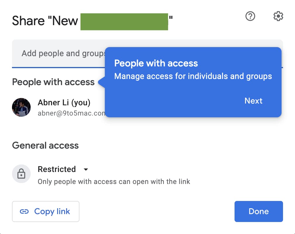
Everything is now physically housed in one box after you tap the blue Share button in the top-right corner of every Google document. The “Sharing is simpler” banner will walk you through what’s new.
“People with access” is the first thing Google highlights to “manage access for individuals and groups.” You (the owner) are listed first and others follow with the field for entering email addresses at the very top.
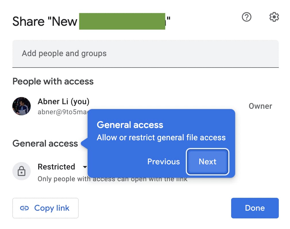
“General access” is the next section to “allow or restrict general file access.” On personal Google Accounts, you have “Restricted” and “Anyone with the link,” while there’s a domain option for those using Workspace. After that, you can select their Role: Viewer, Commenter, or Editor.


Old vs. new
Compared to the previous design from mid-2020, this is easier to access, while the “Copy link” button is much more prominent in the bottom-left corner. Keeping everything in a static, confined box that doesn’t move around is a plus.
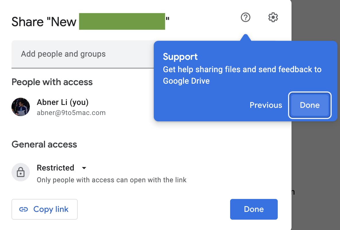
Lastly, there’s a support shortcut in the top-right corner with settings letting users determine whether:
- Editors can change permissions and share
- Viewers and commenters can see the option to download, print, and copy
Putting everything in one window does a great deal to simplify Drive’s share process. As of this afternoon, we’re seeing the new Google Docs/Drive sharing UI rolled out to several personal and Workspace accounts we checked.
More on Google Docs:
- Google Docs will let you select multiple pieces of text for faster formatting
- Drive adding cut, copy, and paste shortcuts to greatly speed up file management
- Chat adding AI summaries, Meet getting portrait lighting, and more
- Google Duo is becoming Meet to cover every single way you video call
FTC: We use income earning auto affiliate links. More.


Comments