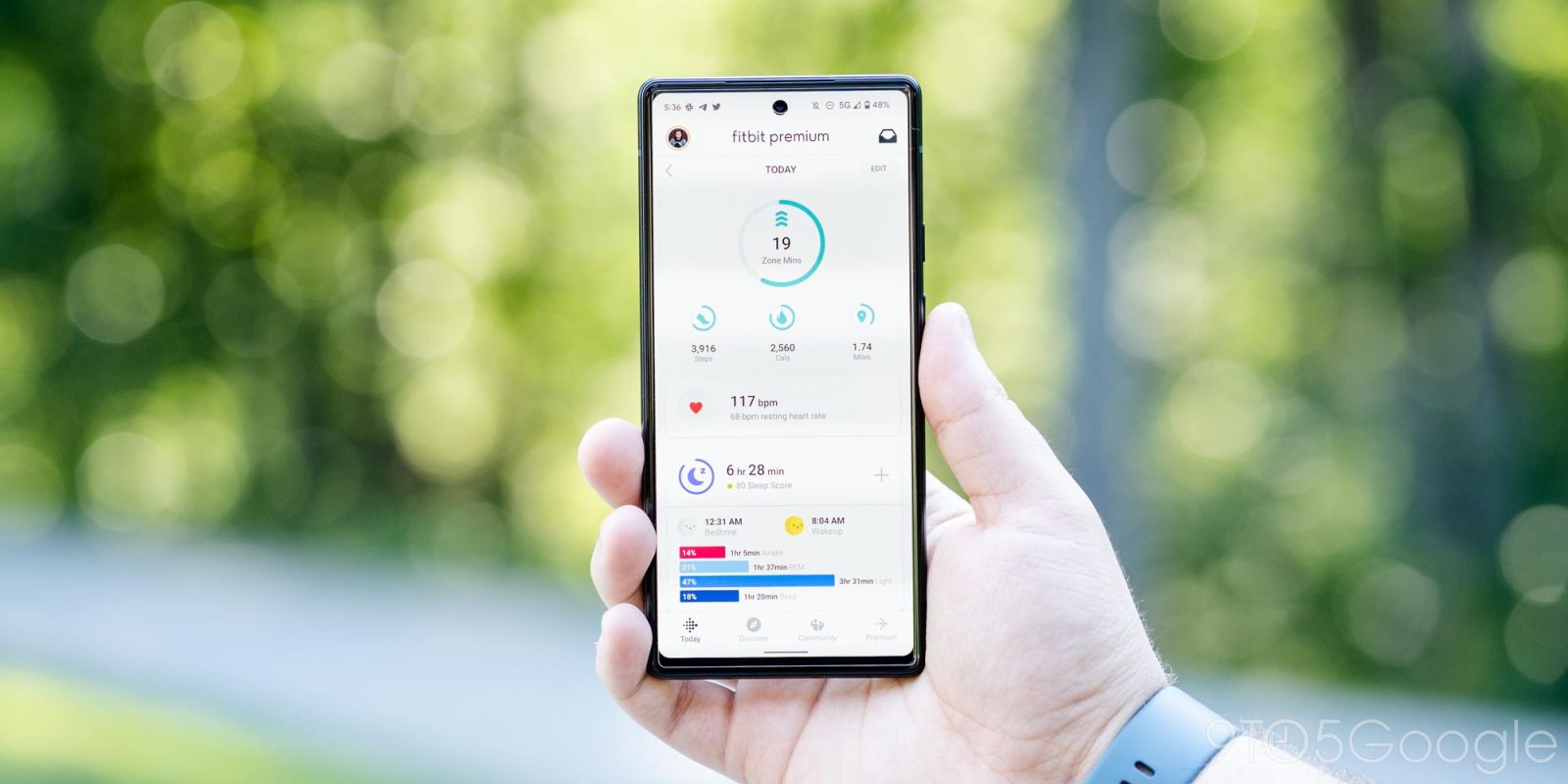
The Fitbit app has remained visually unchanged in recent years, but a redesign of charts shakes up how the mobile client presents distance, sleep, and other data.
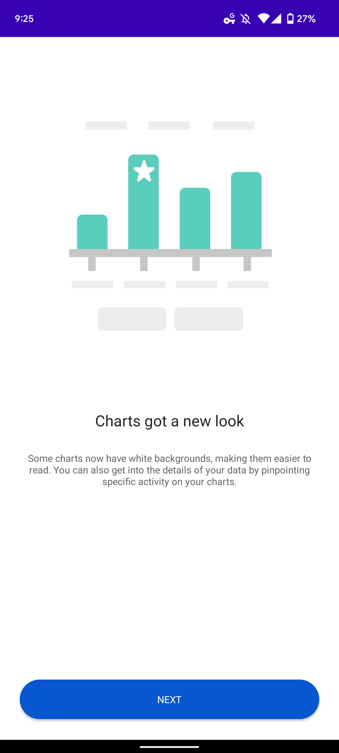
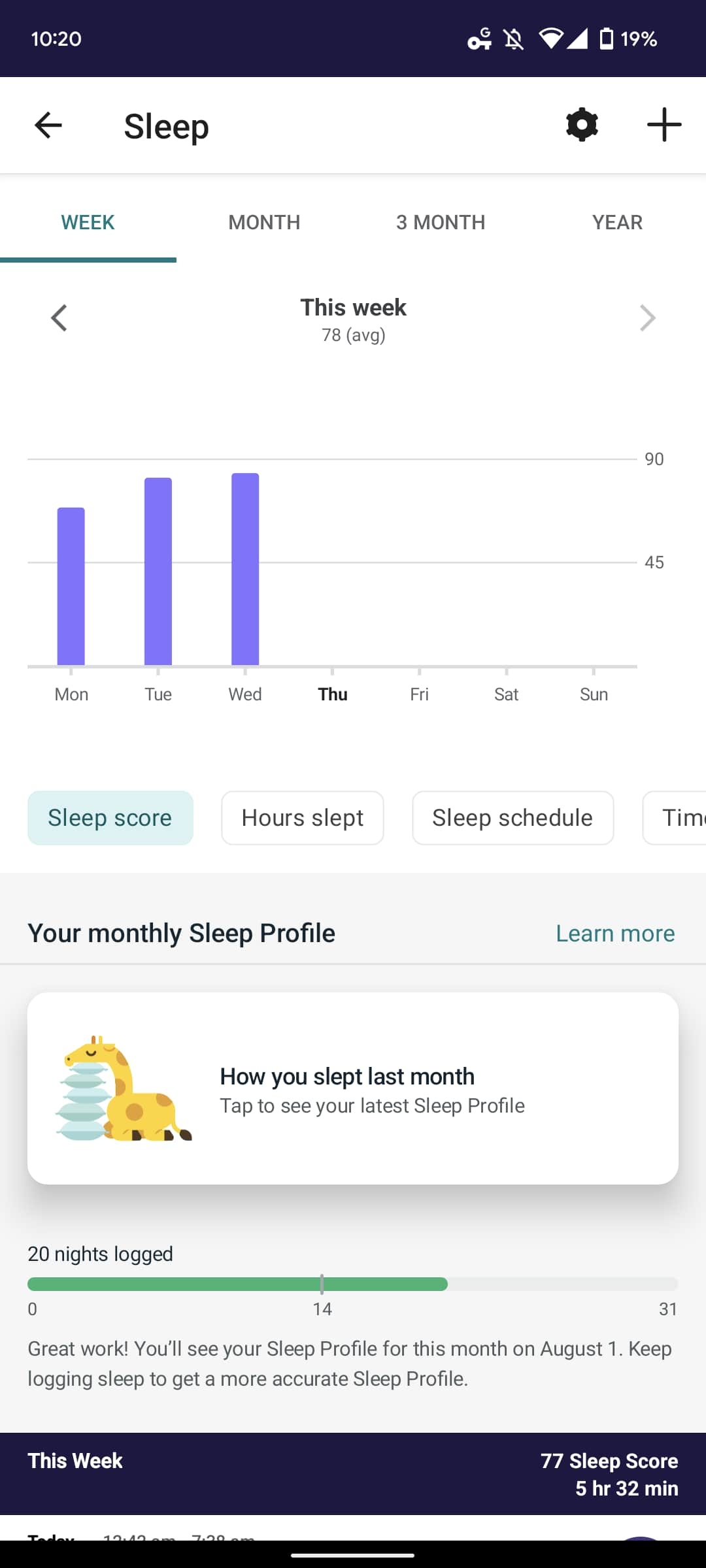
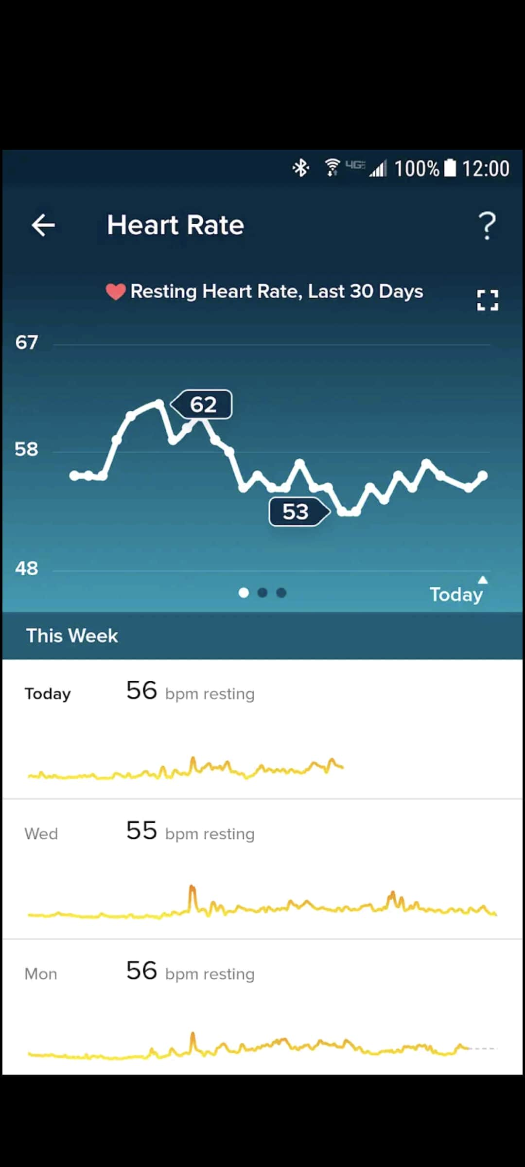
You’ll be greeted with an introductory prompt when opening a chart once the redesign is rolled out to your device. This revamp sees most charts – steps, miles, calories, zone minutes, sleep, heart rate, stress, etc. – adopt a white background that Fitbit says is “easier to read.” Individual/daily data points that appear underneath are mostly the same.
That background change has the downside of making the different stat pages feel identical and quite generic. The background color was a recognizable differentiator that people associated with different health metrics. However, this new design could possibly lay the groundwork for Fitbit finally introducing an app-wide dark theme.
You can also get into the details of your data by pinpointing specific activity on your charts.


The second tentpole is meant to improve navigation by always showing top tabs that let you quickly view by month (single and three) or year. Previously, you’d have to tap through a chart to get those longer time periods. That fullscreen view appears to be gone today, and was not the most obvious design. Fitbit has also replaced the carousel of different charts with labeled buttons/chips for various data types.
Lastly, Fitbit is encouraging historical browsing with left/right arrows underneath the tabs.
We encountered this chart redesign after updating to version 3.64.4 of Fitbit for Android. It’s not on an iOS device we checked, while nothing here is particularly inline with Google’s Material You design language.


More on Fitbit:
- Fitbit updates Charge 5 with GPS battery drain fix and ‘Find Phone’ app, Fitbit Luxe too [U]
- Here are the stats that Fitbit Sleep Profiles track, rolling out now
- Fitbit has over 2 million users already enrolled in its AFib detection feature
- Google Pixel Watch: Specs, bands, Wear OS, and everything we know so far
FTC: We use income earning auto affiliate links. More.


Comments