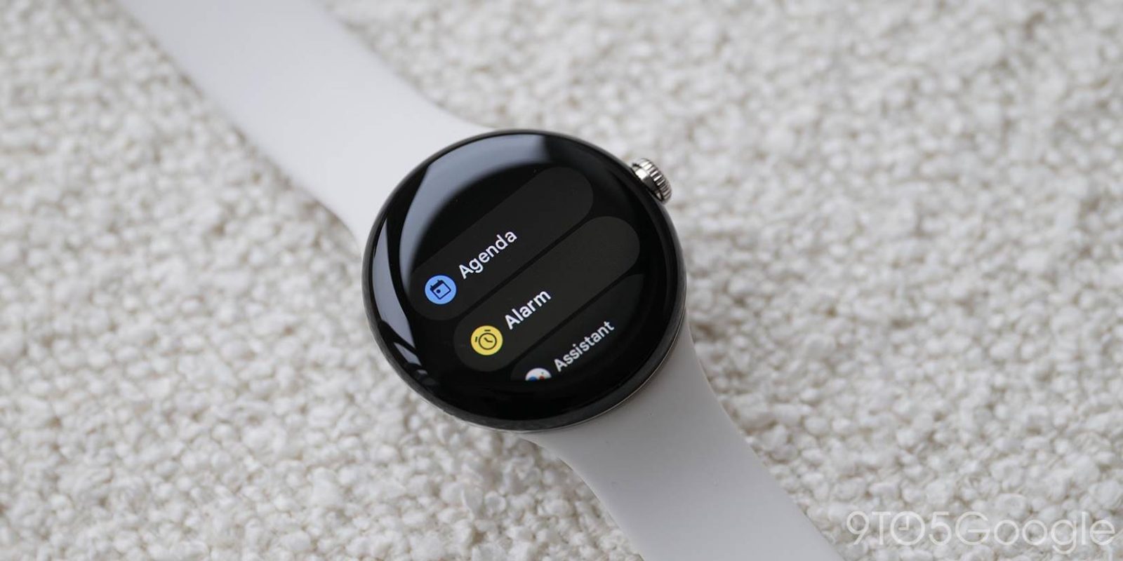
One constant between Android Wear to Wear OS 3 is the lack of dedicated Gmail or Google Calendar applications on watches. Amid the flurry of new devices and hardware advancements, it’s increasingly worthwhile for Google to rethink its reliance on rich notifications for key actions.
With the first iteration of Android Wear, Google was dead set on a feed being the primary way you interact with your watch. Besides contextual cards from Google Now, you’d also have notifications, like those from Gmail which you could expand to read.
Today, Gmail notifications let you read the full email, send an on-watch reply (via keyboard, voice, or emoji), archive, delete, or open on the phone. On the Pixel Watch, you swipe up to see emails and they coexist alongside every other alert.
There is no “Gmail” app that you can open to see your inbox and other folders, which is the case on the Apple Watch. Google tells developers to “keep the following principles in mind when designing apps”:
- Focused: Focus on critical tasks to help people get things done within seconds.
- Shallow and linear: Avoid creating hierarchies deeper than two levels. Aim to display content and navigation inline when possible.
- Scrolling: Apps can scroll. This is a natural gesture for users to see more content on the watch.
Its first-party apps very much reflect that, and they are simple to use as a result with most wearable apps taking the form of a feed instead of offering anything more complex (or tabbed). The most basic of email apps would more or less match the complexity of a note or to-do client, and Wear OS would be better for it. A list of folders, email list, and body of a message is more or less three levels with users already familiar with that hierarchy.
A dedicated list is surely simpler than having to compete with the main notifications feed, while a watch face complication showing how many unreads you have would be great. There’s also clear precedent from Microsoft and the Outlook Wear OS app, which even has a watch face.
Meanwhile, Wear OS offers a somewhat more dedicated calendar experience. An “Agenda” app is available that shows three days worth of events with the ability to see all associated details. It can be accessed from various complications or as a useful tile that shows immediate appointments.
Expanding the list to show at least a week’s worth of events is the bare minimum Google could to improve the Calendar experience, alongside adding week and month views. Calendar apps are harder design-wise on wearables with Apple and Samsung having their own approaches, but the stock experience offered by Wear OS today is just too barebones. For both email and calendar clients, a basic compose/creation UI that isn’t just Google Assistant would be helpful.
Another personal ask would be for Google to either integrate to-dos (especially with the upcoming Google Tasks elevation) into Agenda, or offer its own app so that there’s a dedicated list view. The former seems more likely given the integration found on the phone app.
While it’s understandable why the team is more invested in large screen optimization, buy-in from wearables by Google Workspace would make an appreciable difference. I think enough user feedback will eventually cause Google to acquiesce and introduce more complexity in Wear OS. Smartwatches are certainly reaching that state of advancement.
FTC: We use income earning auto affiliate links. More.


Comments