
Google has steadily been preparing for the upcoming Pixel Tablet launch, and we’re now able to show a fun video recreation of what it’ll be like to use the tablet.
Next year’s Pixel Tablet is Google’s first Android-powered tablet since the Pixel C in 2015, which preceded the entire Pixel phone lineup. With Android having changed so much since then, particularly with the large-screen advancements of Android 12L and 13, Google has had to adapt quite a few areas of software to be ready for a tablet.
Our team has been watching these changes build up over the last year, dutifully covering the changes in Android Beta releases and watching for new tablet-ready designs for Google apps. That said, it’s also important to step back and look at the bigger picture that the company’s many teams are painting.
- I prefer the phone version: The underwhelming state of Google’s first-party tablet apps on Android
- Every Google app with an Android tablet UI
- Android 13 Beta 3: Pixel Launcher gains 6×5 app grid in prep for Pixel tablet
- Enabled: Android 13 QPR2 preps desktop mode, new Back gesture, separate ringtone volume, and more
The most recent Android Beta release — Android 13 QPR2 — is currently estimated to reach stable in March. Considering the next plausible launch event for the Pixel Tablet would be Google I/O (typically held in May), it’s likely the tablet will also launch with Android 13 QPR2 out of the box. That means the Pixel software we can preview today may be relatively close to what the final tablet experience should be.
To get a closer look at the Pixel Tablet experience, we’ve made some major modifications to a Pixel phone’s settings, and our APK Insight team has forcibly enabled some additional features in apps that may not otherwise be visible today. More specifically, we did more than just increase the screen’s DPI to make this reenactment possible.
As many of the things we enabled are still works in progress, we can’t guarantee that everything shown in this video will be ready in time for the Pixel Tablet’s launch or look exactly the same. In short, take this with a grain of salt. Without further ado, on with the video!
First thing to notice is the lock screen, which features a clock that slides to the left to reveal a list of notifications on the right. Much like Pixel phones, the Pixel Tablet lock screen features the ever-present At A Glance widget in the top-left, as well as a Google Home shortcut in the bottom-left. In the top-right corner, there’s a new user switcher button that makes it easier for a family to share the Pixel Tablet.
It’s likely the actual Pixel Tablet will have some extra features on the lock screen that we can’t preview today. For instance, Google has confirmed that you’ll be able to cast videos and music to the Pixel Tablet just like you would to a Nest Hub or Google TV.
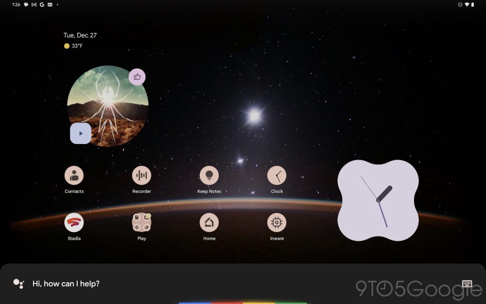
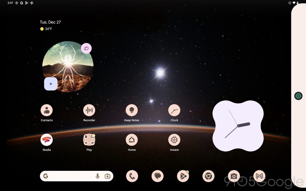
Once unlocked, you’ll find a new tablet-ready layout for the home screen with a wide, 6×5 grid for apps and widgets. At A Glance is still permanently affixed to the first page, but it doesn’t use the entire top row as we see on smartphones, rather only the left half. Beneath the grid, there’s a permanent row with the Pixel Launcher’s search bar and six spots for pinned apps.
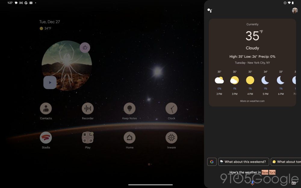
The Google Assistant is always at the ready on Pixel devices, whether by tapping the microphone icon or saying “Hey Google.” Invoking the Assistant on the Pixel Tablet brings up the same UI seen on phones today, but now the response is shown in a sheet on the right-hand side of the screen.
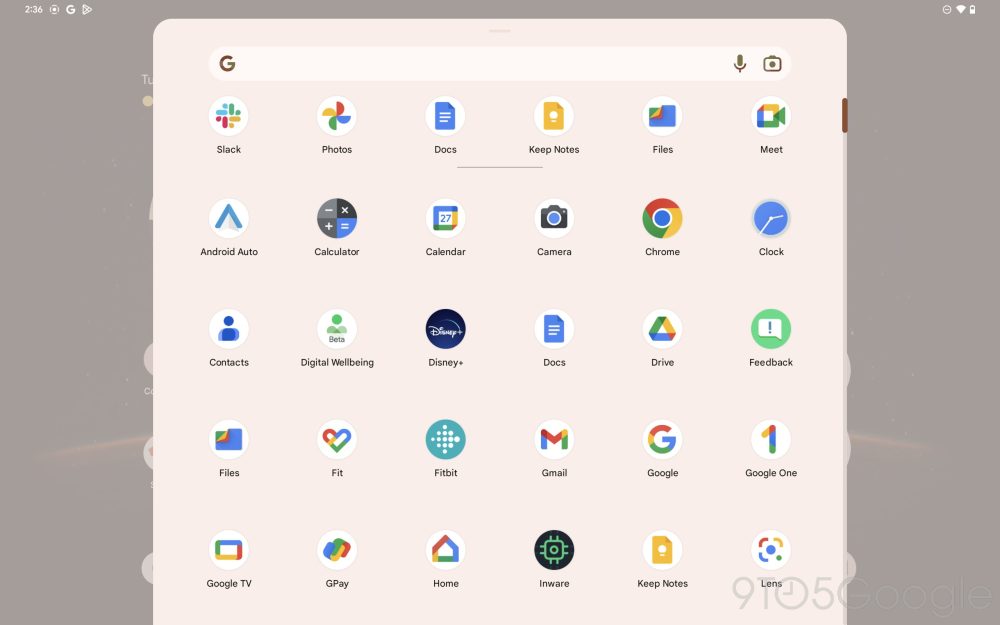
As always, swiping upward on the launcher reveals the full app drawer, which slides up as a sheet in true Material Design fashion. Pixel Launcher also uses this same design for browsing home screen widgets.
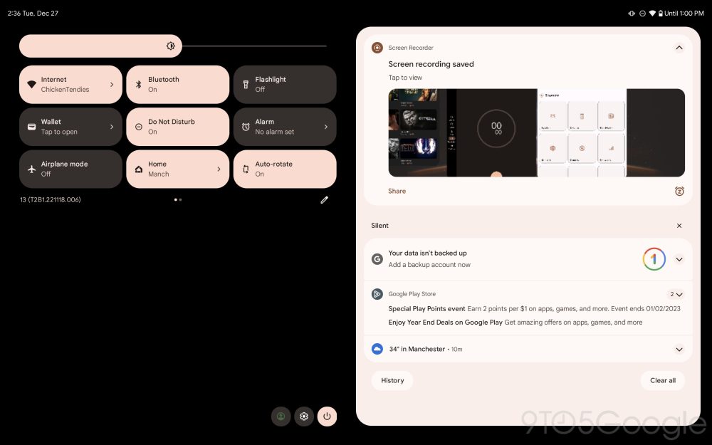
Swiping downward, you’ll find a revamped notifications shade and Quick Settings area. Similar to the lock screen, notifications are on the right-hand side, while a 3×3 grid of Quick Settings tiles are on the left.
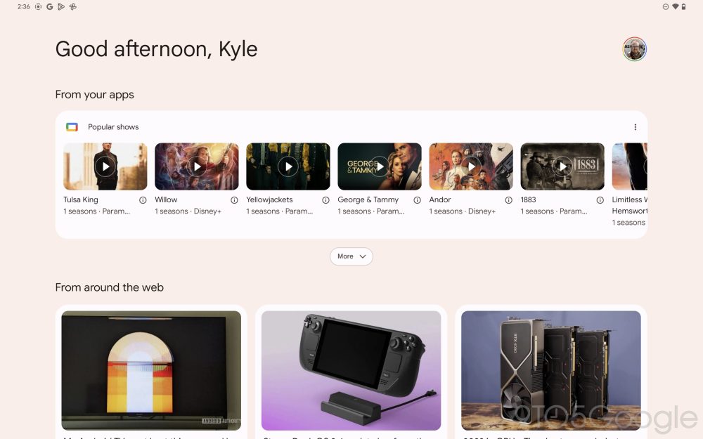
Scrolling past the leftmost home screen page, Google Discover has been given an overhaul for the tablet. As it stands, large screen Android devices already get multiple columns in Google Discover, with tablets even getting a third column. For the Pixel Tablet, Google has enhanced this with a welcoming message such as “Good afternoon, Kyle.”
As an exclusive feature for the Pixel Tablet, Google Discover is also now separated into two distinct sections. “From your apps” shows movie and television recommendations from Google TV and other apps, filling a similar role to Android’s “Entertainment Space.” Meanwhile, “From around the web” is Google Discover’s usual collection of news articles and YouTube videos.
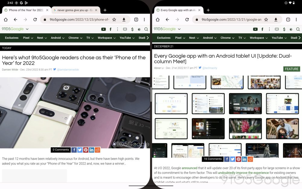
Back on the home screen, you can long-press on an app to see two new ways to open it: “Split left” and “Split right.” Choosing one will place the app’s icon on the appropriate edge of the screen, leaving plenty of screen real estate for you to choose a second app. Once you’ve opened that second app, the two will appear in a vertical split-screen.
Notably, the inside corners of each app are given a steep, Material-like curve, likely intended to match the curve of the Pixel Tablet’s own corners. A thin bar appears between the two apps, allowing you to allocate more space to one or the other. In the Recent Apps view, these two apps are treated as one single activity that can be returned to or closed.
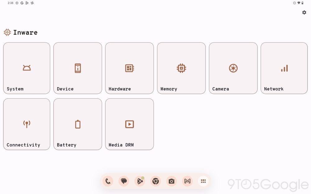
While in an app (or multiple), a small swipe upward reveals a new design for the taskbar that was introduced in Android 12L. As always, you’ll find your current pinned apps and a shortcut to open the app drawer. Cleverly, the drawer can even be opened over your current app, without returning to the home screen. By using the same “Split right” option from before, you can add another app to your current one.
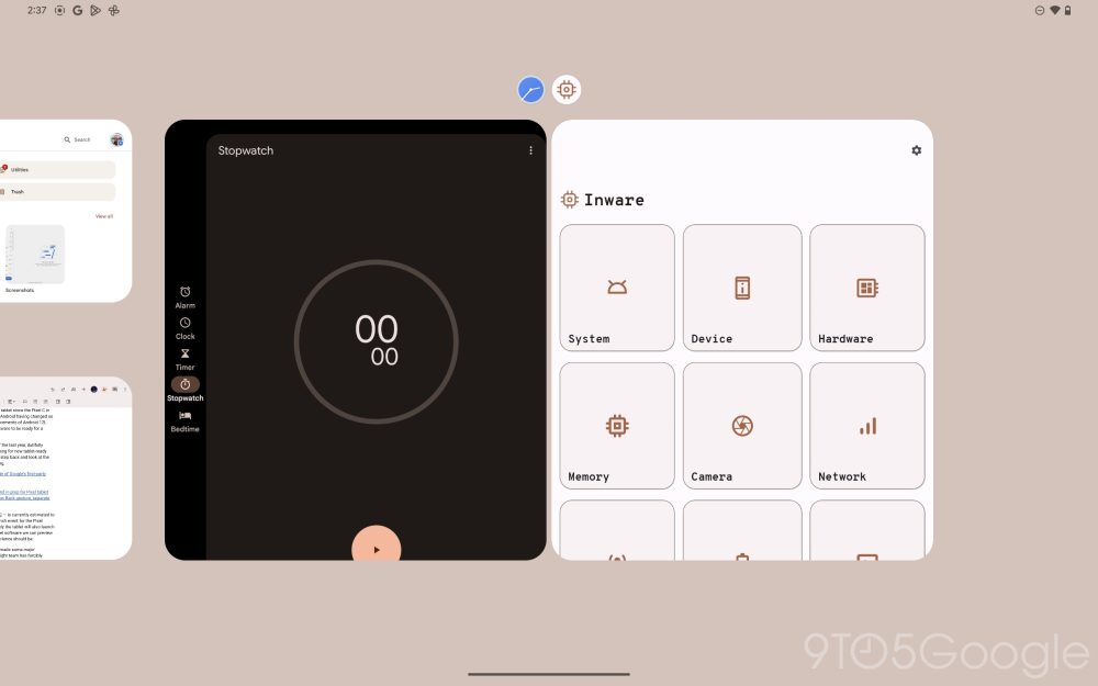
Swiping a bit further upward brings up the Recent Apps view, which features an enlarged view of your current task and two rows of past activities you can quickly return to. Next to the usual options for “Screenshot” and “Select,” there’s a more prominent button to “Split” the app and join it with another.
Moving on to individual apps, Google has made quite a few preparations over the years, both for its own Pixel Tablet and for the broader market of large-screen Android devices. A commonality you’ll likely notice is the repeated use of dual-pane design, putting separate content on the left and right sides of the screen, perfect for tablets and foldables alike.
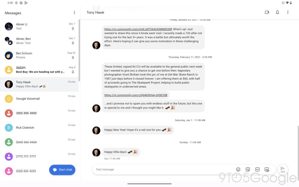
For starters, Google Messages on tablets is able to match the web app’s ability to mirror your phone’s full message history, receive notifications, and reply to conversations. Just like the web app, there’s a list of conversations on the left and a view of an individual conversation on the right. This is already possible today on all Android tablets, but it certainly helps to make the Pixel experience feel cohesive.
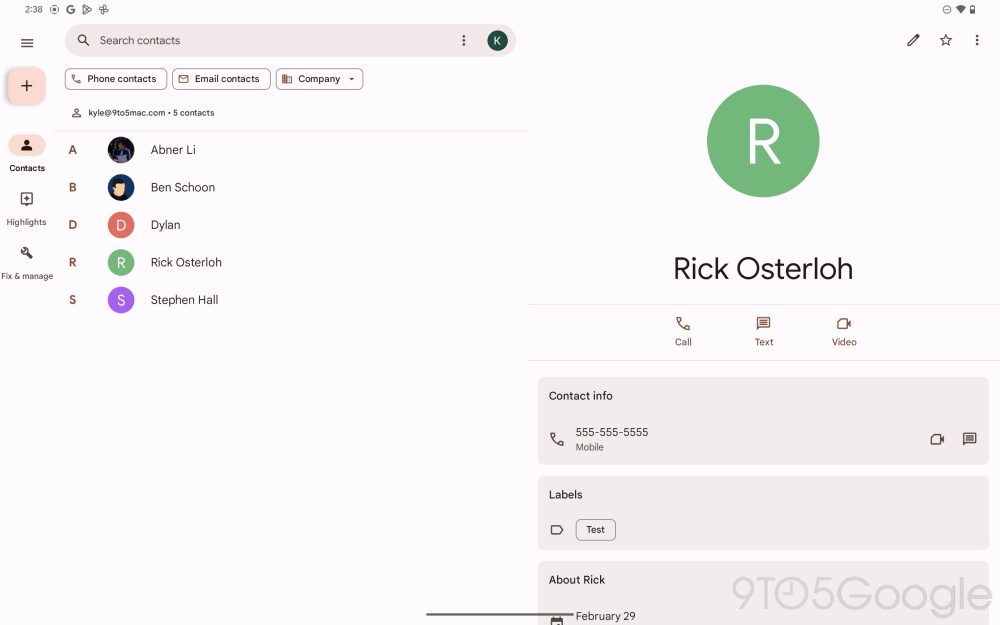
Meanwhile, Google Contacts is preparing its own design overhaul ahead of the Pixel Tablet launch, with similarly separated columns for your contacts list and a particular person’s information. Keep Notes uses a similar approach on tablets and foldables, making it easier to cross-reference notes.
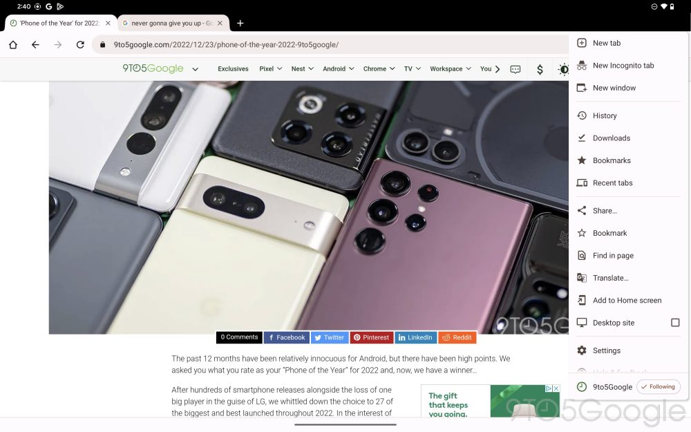
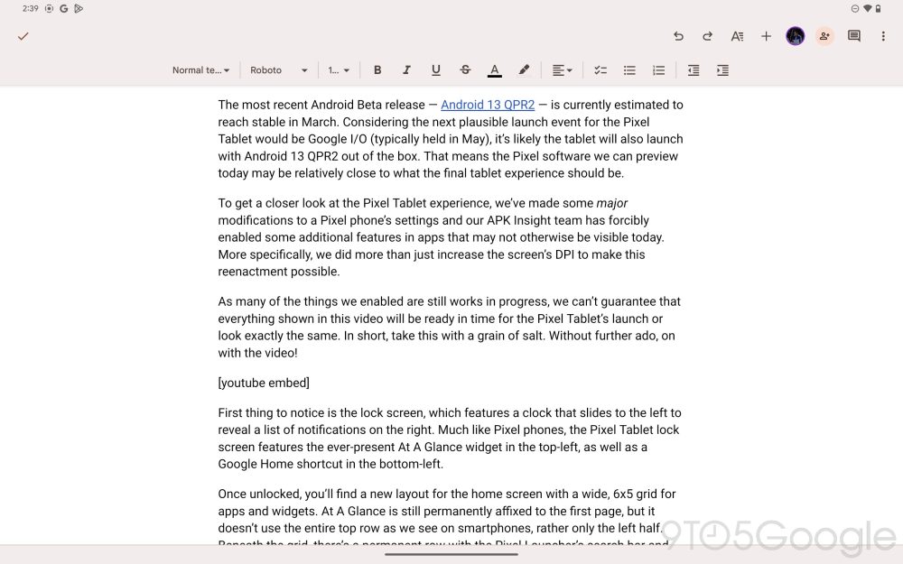
Other apps, like Chrome, are opting to make the most of the additional screen real estate of the Pixel Tablet. There, you’ll find a full desktop-like experience, including the familiar tab bar at the top. You can even open a “new window” of Chrome like you would on a desktop. Less excitingly, Google Docs uses the additional width to offer more options for the text editor.
Putting it all together, it’s clearer than ever that Google has put quite a lot of effort into getting ready for the Pixel Tablet. Thankfully, much of this effort will also benefit other Android tablet makers like Samsung and Lenovo, between improvements in Android itself and redesigns of Google’s library of apps.
Top comment by SubZeroPT
Great work!
Just out of curiosity, is there any floating window functionality?
It's a practical feature that I use on my Galaxy Tab all the time.
With any luck, the Pixel Tablet will help push Android tablets forward in the same way that Google did before with Pixel phones. And, if nothing else, the Pixel Tablet should make an excellent companion to Google’s phones, with handy split-screen tools for getting work done and delightful new ways to stay entertained.
What do you think of this early recreation of the Pixel Tablet experience? What do you want to see Google improve before the tablet is released next year? Let us know down in the comments.
Dylan Roussel contributed to this article.
Header image: Google
More on Pixel Tablet:
- Why is Google making a Pixel Tablet Pro?
- Google Pixel Tablet and speaker dock prototypes leak on Facebook Marketplace [Gallery]
- The Pixel Tablet’s Assistant Ambient Mode forerunner & iPad smart display dock threat
FTC: We use income earning auto affiliate links. More.



Comments