9to5Google has a rebooted newsletter that highlights the biggest Google stories with added commentary and other tidbits. Sign up to get it early in your inbox, or continue reading 9to5Google Log Out below:
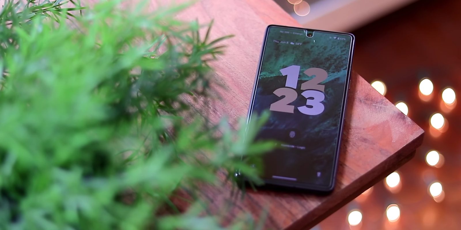
I absolutely love the Android 14 lockscreen clock in which the day and date appear vertically on the left edge. You also get the current weather condition next to it, while the temperature is on the right edge.
The arrangement just seems like a good use of space, with the previous always-on display being the exact opposite of that, putting everything in the top-left corner.
It took Google some time to finally implement these clocks, but this first stab is solid, with nice animations throughout. Another unique addition is the analog Material You clock, while some of the other ones feature nice fonts. As these clocks are customized in Wallpaper & style, that applet is getting a bit messy and would ideally get an overhaul before launch. At the very least, it should fall in line with Material You more. It would also be nice if Google named each clock as it does for watch faces on the Pixel Watch.
My big question right now is whether Google opens this up to third-party developers with a section on the Play Store. It seems like an obvious win, including financially, for everyone involved, but I wonder whether clocks are ultimately intended to represent an OEM’s design sensibilities and something the Pixel team would want to control.
The other big addition in Android 14 Beta 3 is the ability to customize lockscreen shortcuts. I immediately changed Wallet to the flashlight, while the ability to jump immediately into video recording is convenient.
It got me wondering whether this is the extent of how Google makes the lockscreen more feature-rich. At the end of the day, a lockscreen is supposed to be a very temporary UI. When Android allowed you to place widgets there several years ago, the lockscreen felt like another UI layer.
The existing music player and the new ability to choose two shortcuts are enough for me personally, but I very much see the appeal of even letting existing widgets appear on the lockscreen. The weather forecast or battery widget would be incredibly useful and glanceable. I wonder if Apple landed at the ideal middle ground with what are essentially complications on the iOS lockscreen. It can be info-dense but not overly so.
Chime in below on what else you want to see on the Android lockscreen.
From 9to5Google
Android 14 Beta 3 for Pixel phones rolling out, 7a included
Here’s everything new in Android 14 Beta 3 [Gallery]
- More color to themed icons, for better or worse
- Lockscreen shortcuts require a long-press
- New charging indicator
- Beta 3 breaks the fingerprint sensor entirely on some Pixel phones
- Google’s Emoji Wallpapers are rolling out
Google releases Android TV 14 Beta, ditches Android 13
- Everything new in Google TV on Android 14 [Gallery]
- Google TV prepares a customizable remote button and call notifications with Android 14
What (else) is happening
Google Assistant adds two new voices with Lime and Indigo
Reddit’s API changes kill Android’s best third-party apps, including RIF and Sync
June Google System Updates: Wallet UI for foldables, Find My Device network
New Google Play Books icon rolling out
Chrome adding full Google Password Manager UI complete with desktop shortcut
Top comment by Nitramon
-3rd party support for the Lockscreen clocks and shortcuts.
-Android 11 customisations like the Quick Toggle styles and icon shapes.
-Transparent Navigation bar for every app.
-force every app icon to use Material you (if activated in the wallpaper and styles app)
YouTube Music redesign adds a carousel to Now Playing
Google Meet lets you do more with upgraded Picture-in-Picture for Chrome
From the rest of 9to5
9to5Mac: Here’s the list of which iOS 17 features will work with your iPhone
Electrek: Volvo’s tiny EX30 changes the game with 3.4 sec. 0-60, starts at $35K
FTC: We use income earning auto affiliate links. More.


Comments