Android app developers have a tough job in optimizing their apps for many different screen sizes, and really, it’s understandable why many just choose to focus on the core layout. But as new screen sizes continue to hit the market, the new Google Home app is a goal to follow for all Android apps.
The new Google Home app rolled out widely in May, and with that also came another slight redesign that included a proper tablet mode.
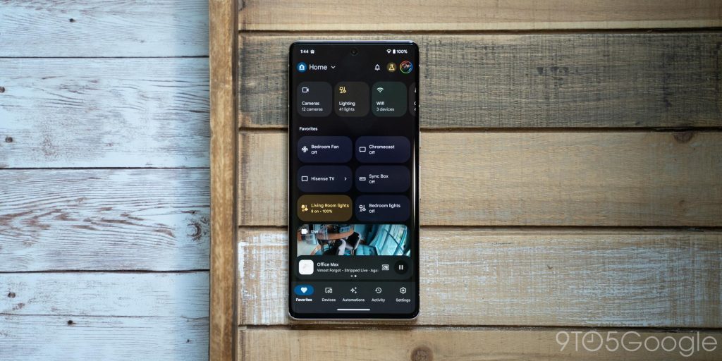
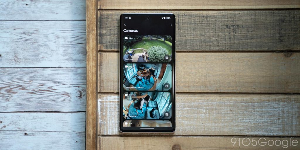
On a typical phone display, the Home app shows a top bar with the ability to switch homes, switch accounts, and access your “Inbox” notifications. Below that are shortcuts for cameras, lighting, climate, and Wi-Fi controls, and then a customizable list of favorites. The tabbed interface then has a bottom bar, which leads to your full list of devices, automations, and more. You’ll also find a media player at the bottom of any Home-integrated devices that are playing videos or music.
The whole UI works really well on a typical phone, but what’s been really impressive to me is how it adapts.
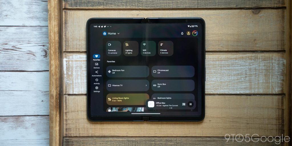
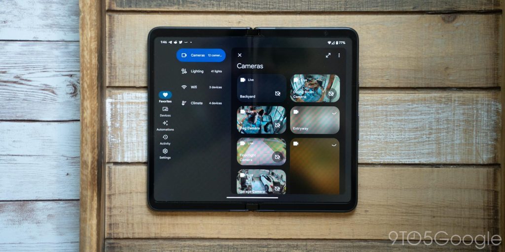
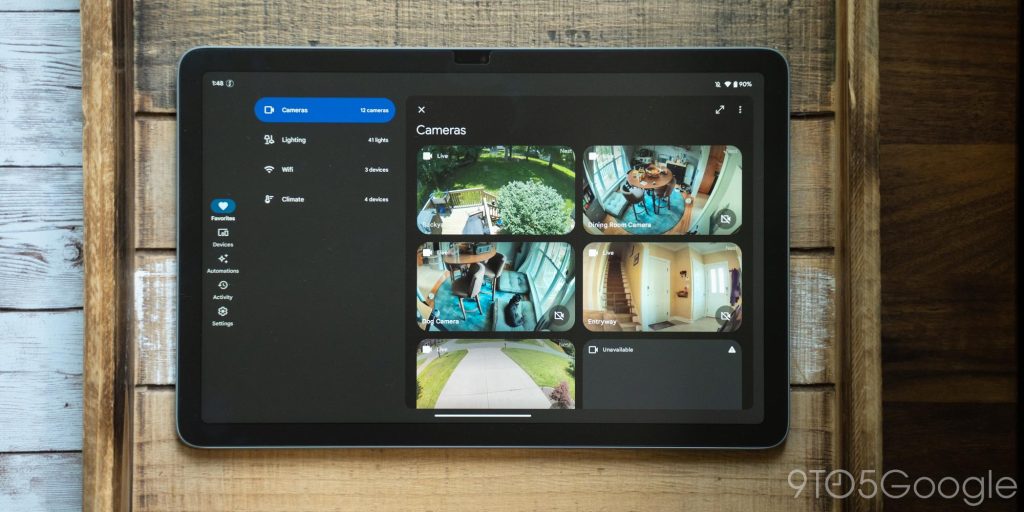
Moving up to a bigger screen – the Pixel Fold’s inner display – the Home app adjusts to throw its tabs on the left side, makes shortcuts on the “Favorites” and “Devices” tabs bigger, and pushes the media player off to the right side. Accessing the cameras or lighting tabs also adds a second sidebar so you can easily switch between those categories, or you can just make the page fullscreen with a button. It’s a great use of space.
Top comment by Omega192
Adapting so well to the Razr+'s outer display might not have been specifically planned for but I agree it is a byproduct of well thought out design and implementation. Seems they're wisely using the display aspect ratio to decide between bottom tabs or side rail rather than solely the width. Then everything else is just standard scaling/flowing the layout and hiding/showing additional elements given the available space. Stuff like this has been around since I started doing webdev about a decade ago now so it's really nice to see mobile apps now benefitting from the lessons learned there.
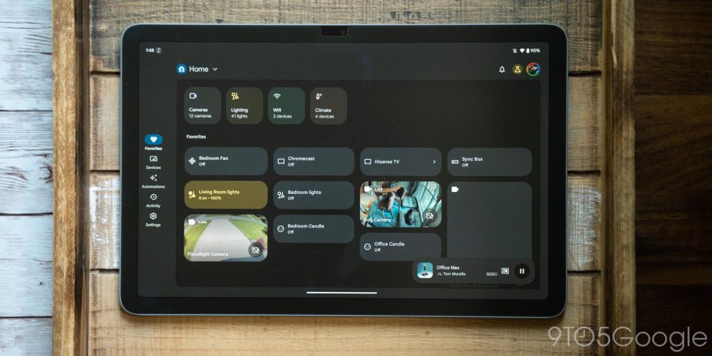
That same basic UI is also in place on the Pixel Tablet, which has an even bigger display. But with that additional space to work with, the Google Home app is smart enough to keep the device buttons pretty condensed and, instead, shows more rows to let you see and control more things at once.
The app is able to seamlessly adapt to all of these sizes, take advantage of the space it’s given, and not feel like you’re wasting space or just inflating the original design. You’ll also never get lost because all of the core elements of the app are simply moved, not changed.
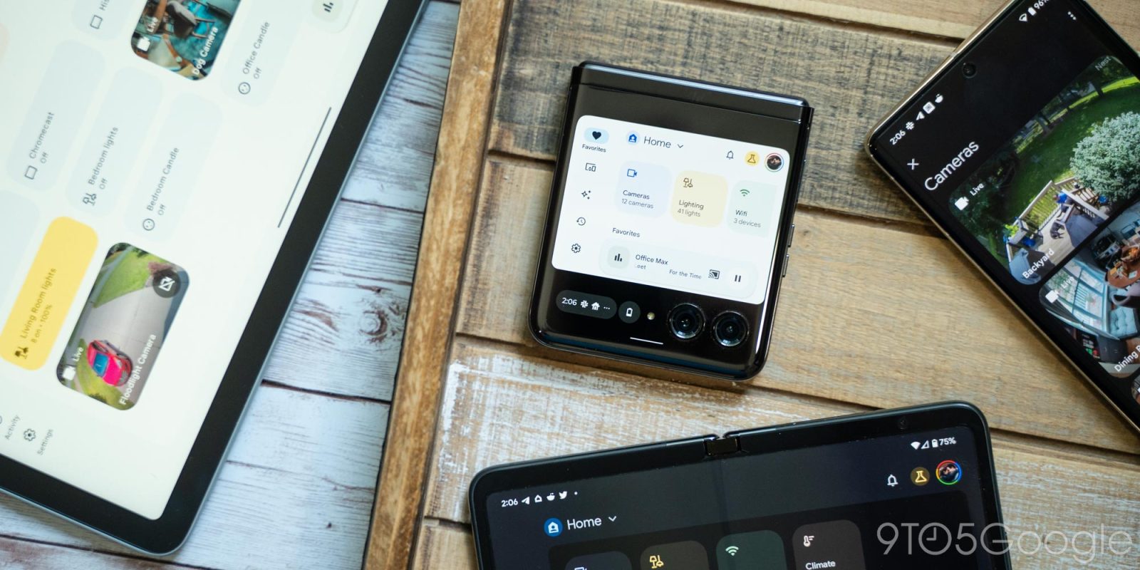
Beyond that, the new Google Home app really threw me a curveball by working incredibly well on the Motorola Razr+’s outer display. That mere 3.6-inch display works great in many cases, but there are many apps that clearly struggle to adapt. The Home app, meanwhile, will show its sidebar interface like on tablets, but with things condensed down to where they’re actually usable on this tiny display.
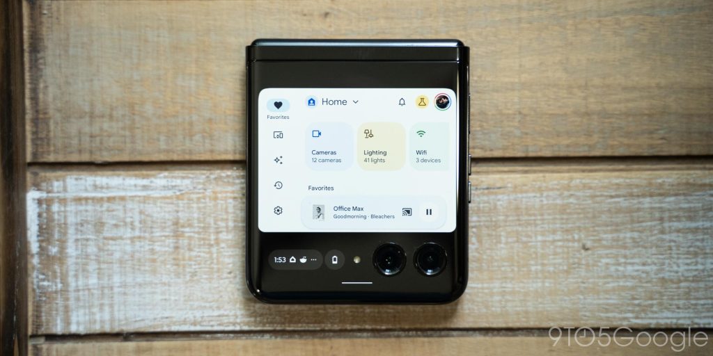
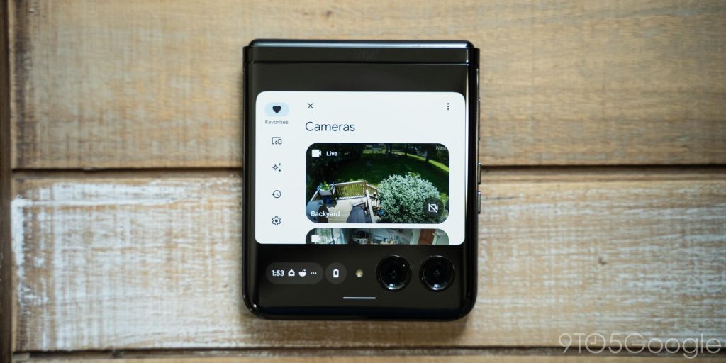
This surely wasn’t intentional on Google’s part – why would it be? But it just goes to show that this is just good design. Using the tools at hand on Android, the Home app adapts beautifully to any screen it’s tasked to run on. This should be the example developers turn to going forward, in my opinion. As Android continues to expand to more screen sizes and new form factors, design like this should become the norm. And if something as complicated as a smart home app can do it, anything can.
More on Android Apps:
- Google on what makes a good foldable app and five Pixel Fold highlights
- Telegram, the messaging app, is adding Stories in July
- New Google Weather adds ‘Nowcast,’ bests Dark Sky with 12-hour ML predictions
FTC: We use income earning auto affiliate links. More.

Comments