Google seems to have a few new features in the pipeline for ChromeOS, which includes a brand new settings menu with Material You as well as Google Tasks integration in the quick settings tray.
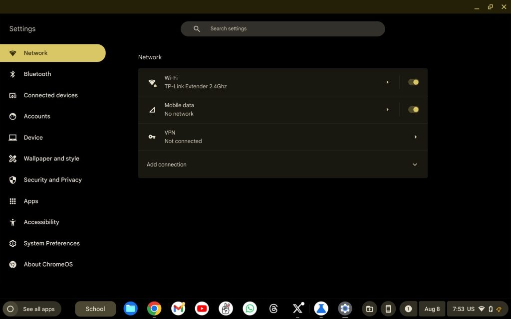
ChromeOS and Android have long shared elements of their respective designs, but it seems Google’s desktop OS is going to dive further into Android’s look and feel. As spotted by C2 Production on Twitter, the Settings menu on ChromeOS is preparing a new Material You redesign. The updated look is a mix between classic ChromeOS and the modern look of Android, but it’s the functionality that’s the biggest change.
This new settings menu in ChromeOS updates how the different sidebar tabs work. In existing versions of the platform, those tabs are simply used as section shortcuts, with everything ultimately appearing in the same long list. This new design splits each section up, which is more how Android, iOS, Windows, and basically every other platform handles this. It’s certainly a welcome change.

The new design is showing up as a part of ChromeOS 117, but it’s unclear when it will become the default for everyone. That version is also currently testing updated global media controls and a new welcome tour.
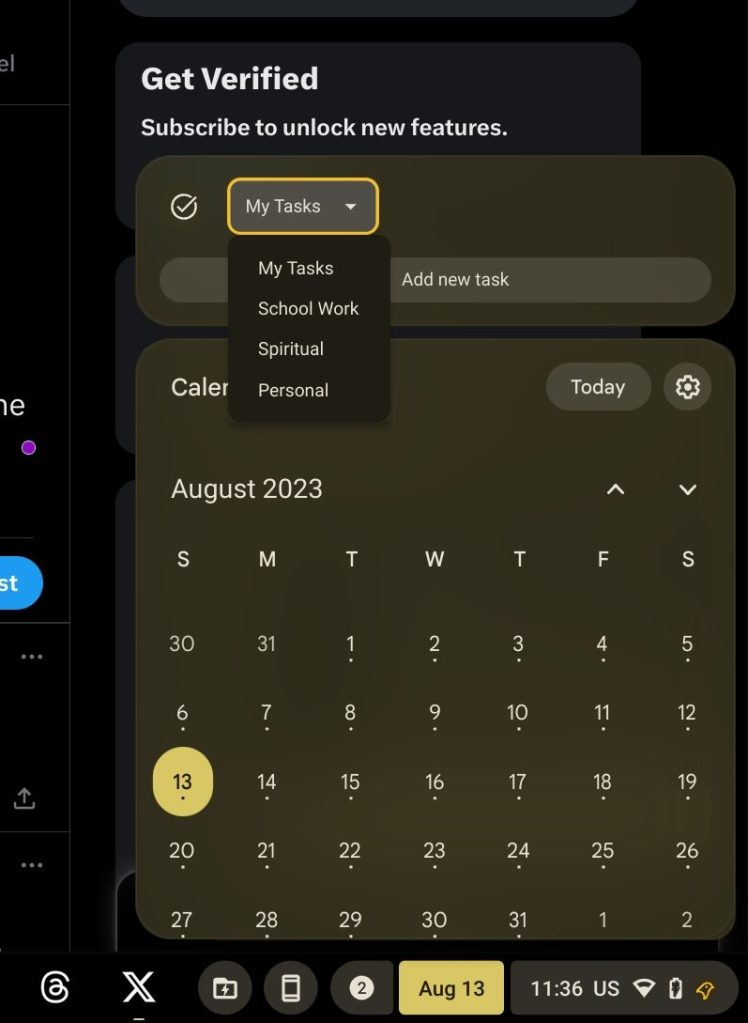
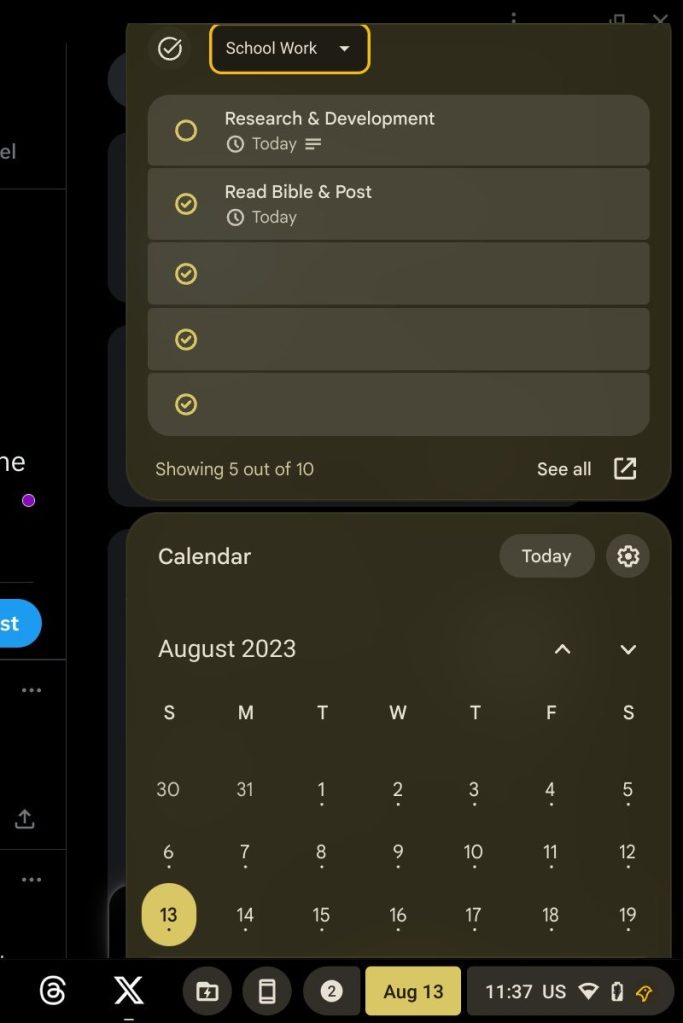
Also coming in the future is a new Google Tasks widget in ChromeOS that appears alongside the calendar. When tapping the date on ChromeOS’ bottom bar, you can currently see Google Calendar, but with this new update Google Tasks would also appear. It’s a logical addition, and in line with a feature request we made last year.


These features are currently live in developing versions of ChromeOS behind flags, but should make their way to the stable OS in over the weeks and months to come.
More on ChromeOS:
- ChromeOS might split the browser from the OS starting later this month
- Google working with Mongolia to provide Chromebooks to all its students and teachers
- Google appears to be readying an AI writing tool for ChromeOS
FTC: We use income earning auto affiliate links. More.


Comments