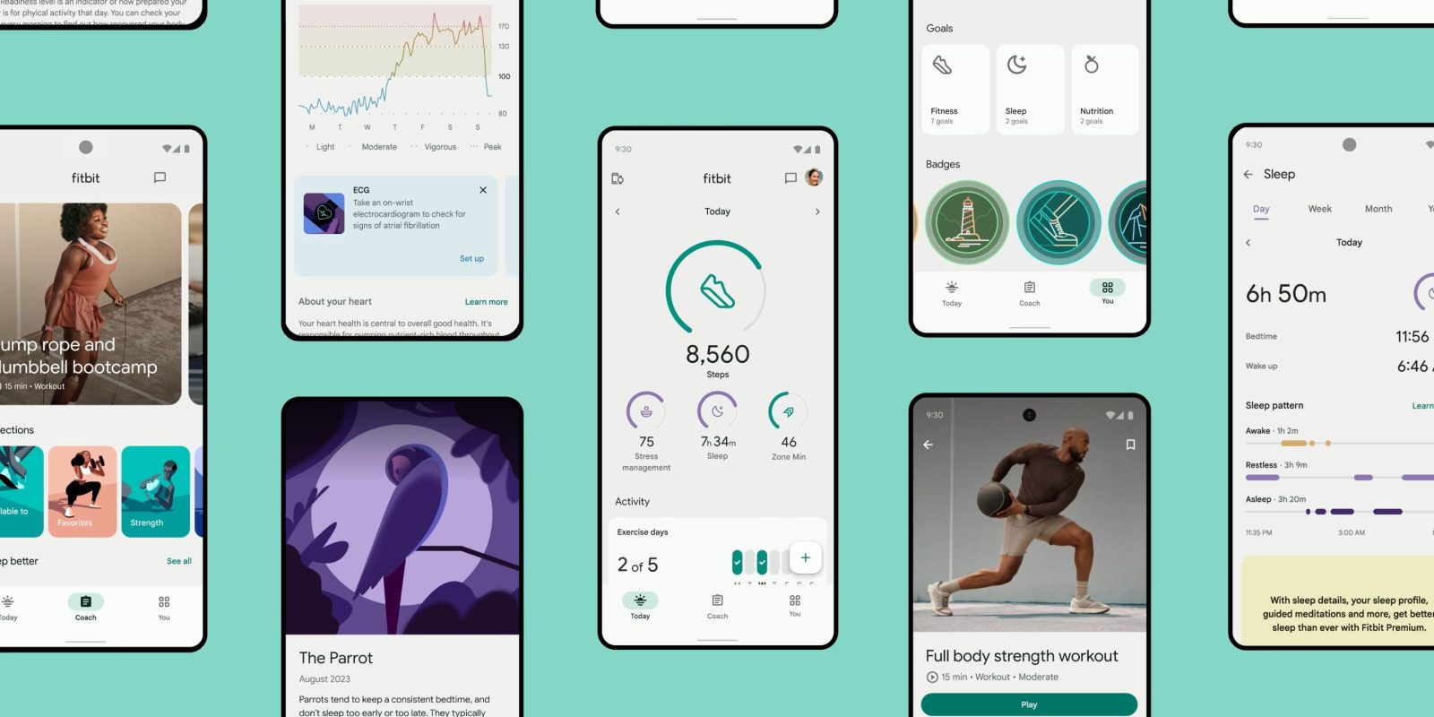
Following last month’s announcement, the Material You redesign of Fitbit for Android and iOS is rolling out starting today.
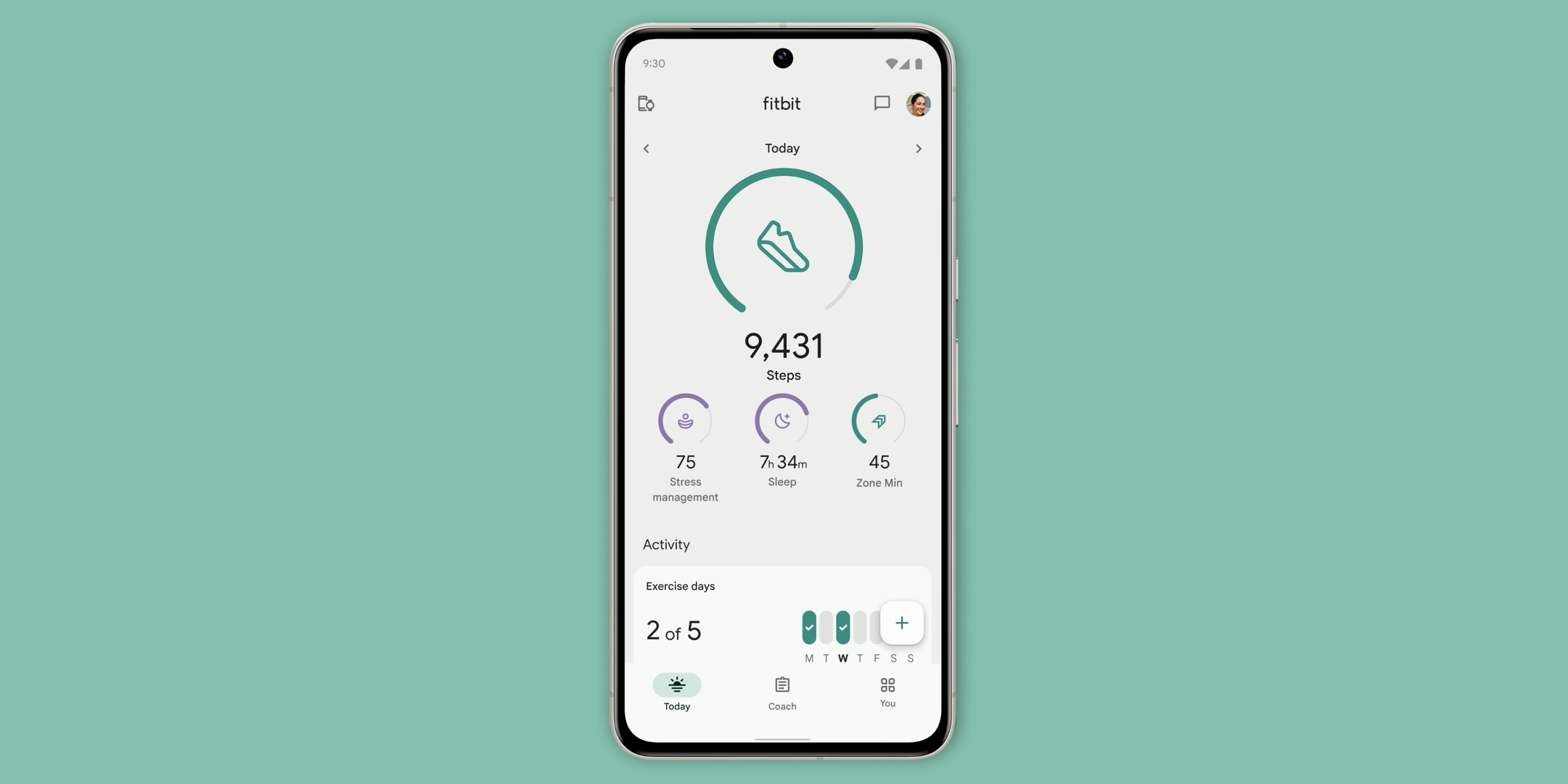
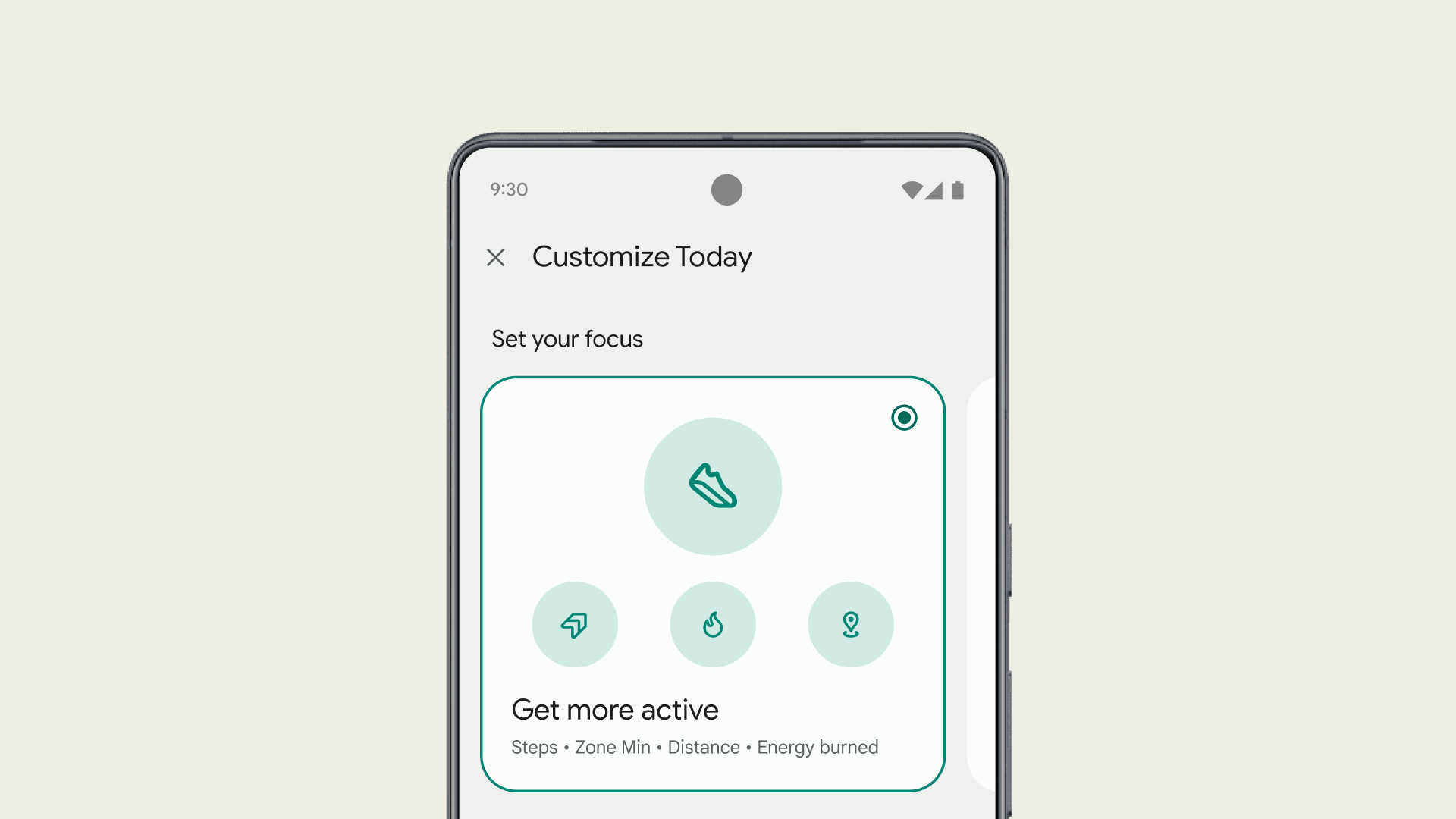
This revamp starts with the “Today” tab and the continued ability to prominently see four main stats at the top. You can customize each slot, while Fitbit provides a handful of presets: Get more active (Steps, Active Zone Minutes, distance, calories burned), Reduce stress, Sleep better, and Improve heart health. To “Customize,” scroll down to the bottom of this feed, which is also how you show/hide other metrics.
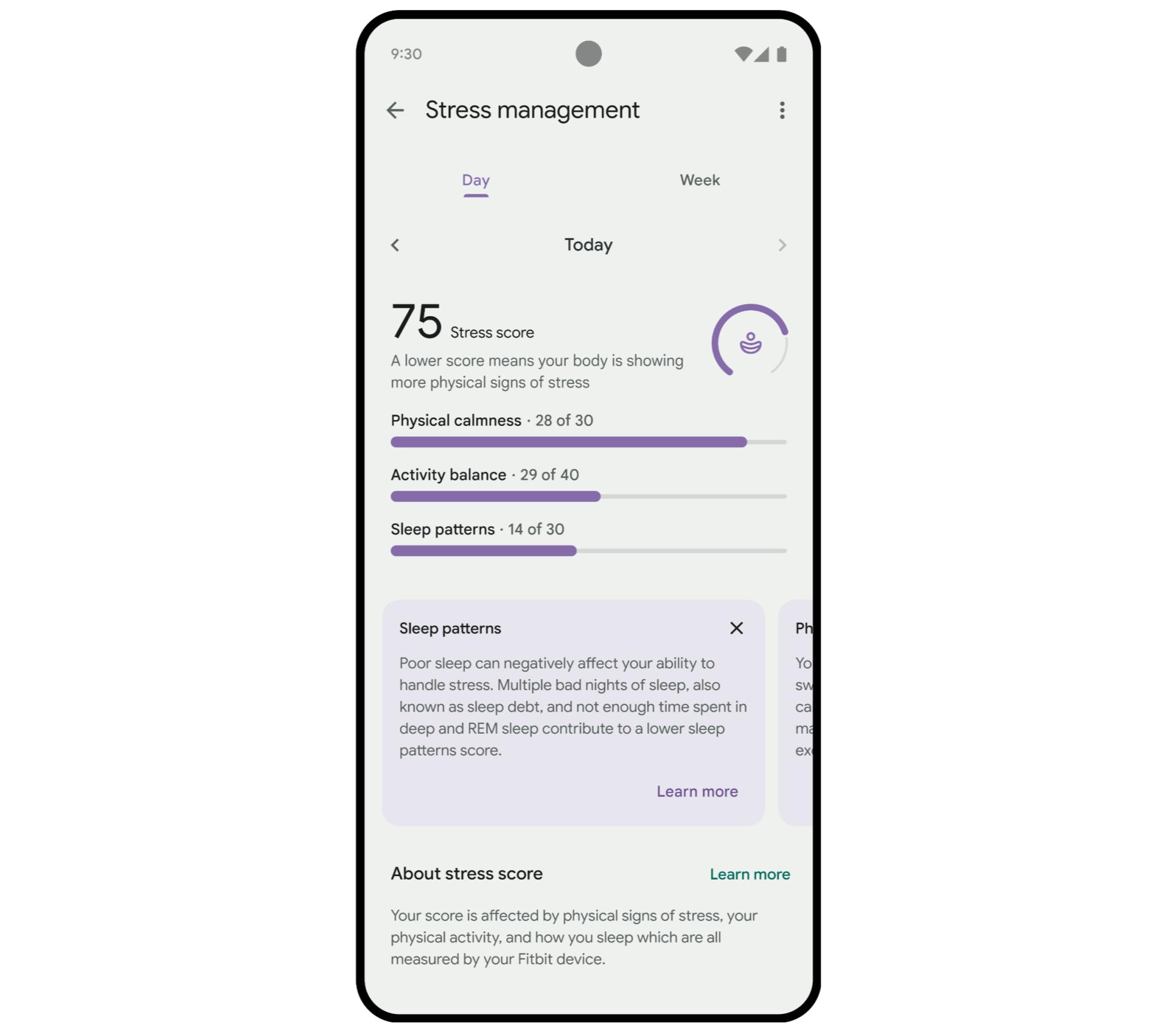
Stats are organized by Activity (AZM, floors, etc.), Health (heart rate, HRV, etc.), Nutrition, Sleep, and Stress & Mindfulness. You can arrange in what order those groups appear, with the ability to toggle individual stat cards.
The FAB slides up a panel that lets you “Track a session” of exercise or sleep or “Log an entry” for things like activity, weight, and water.
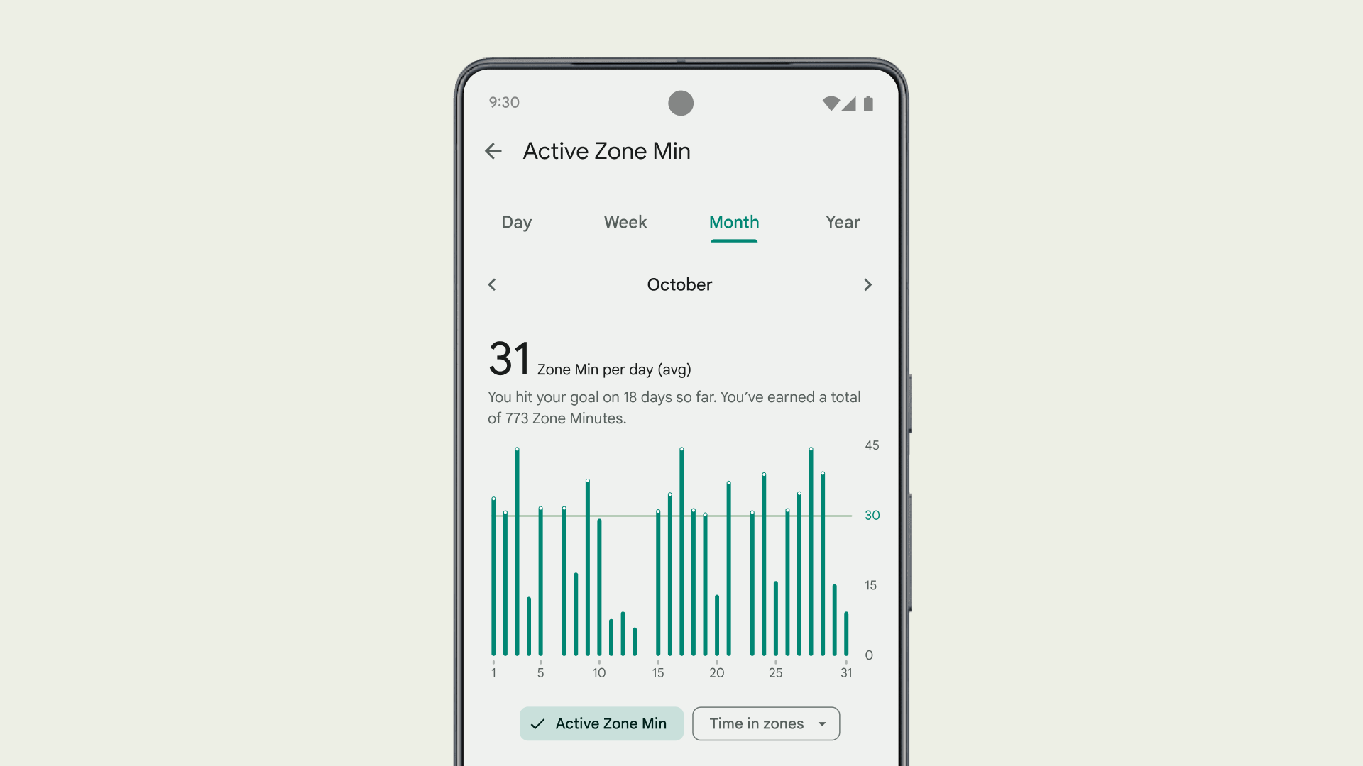
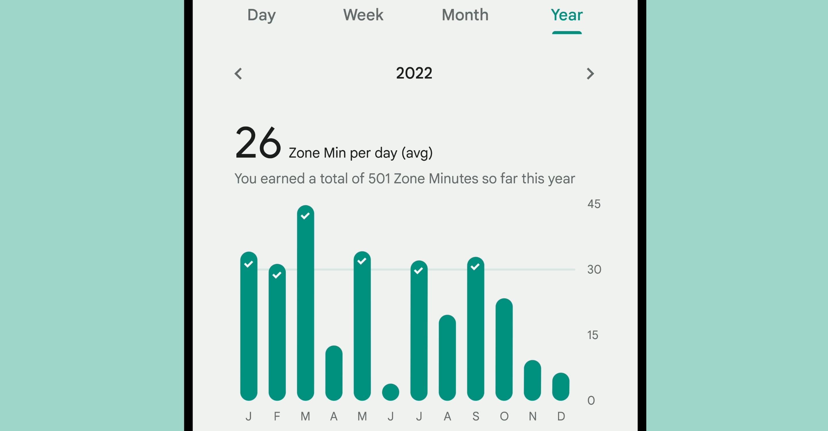
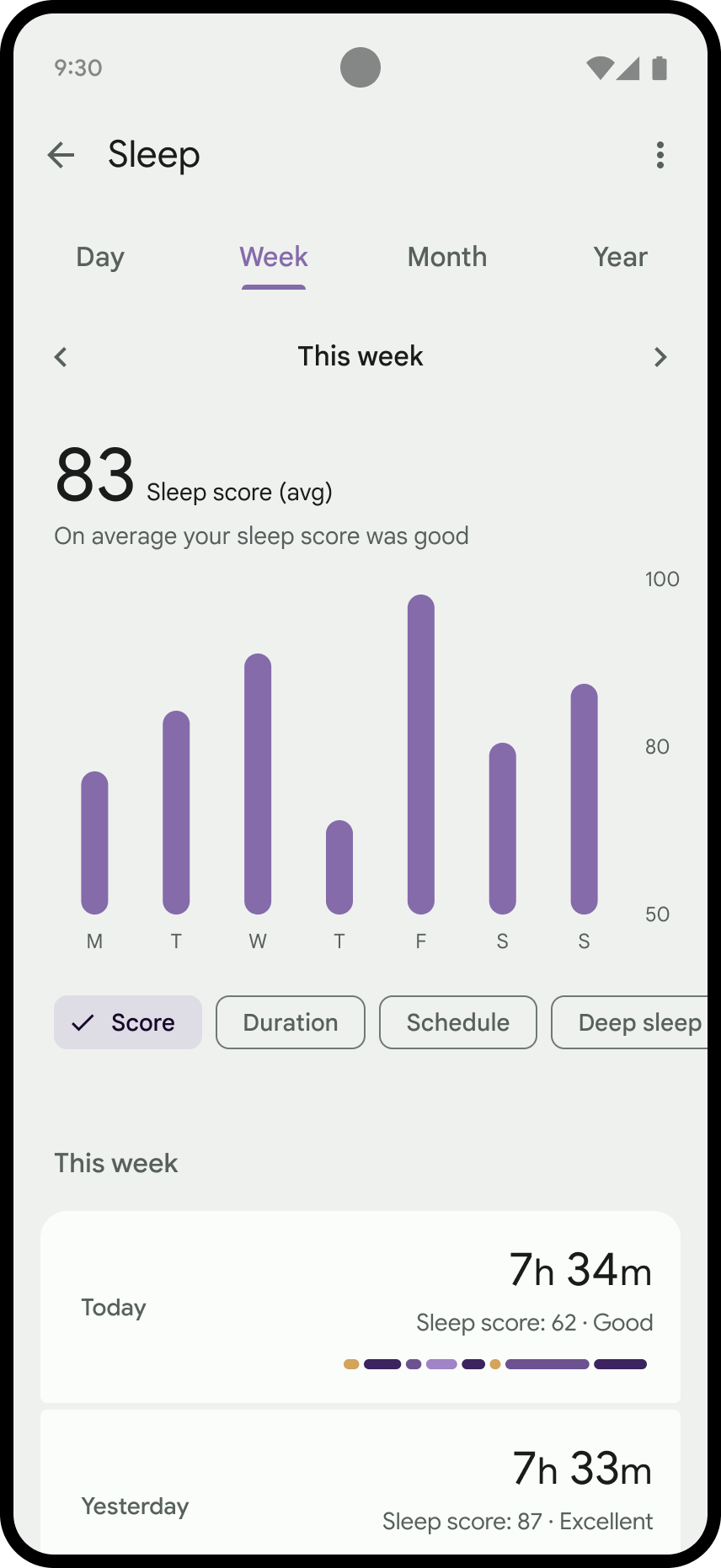
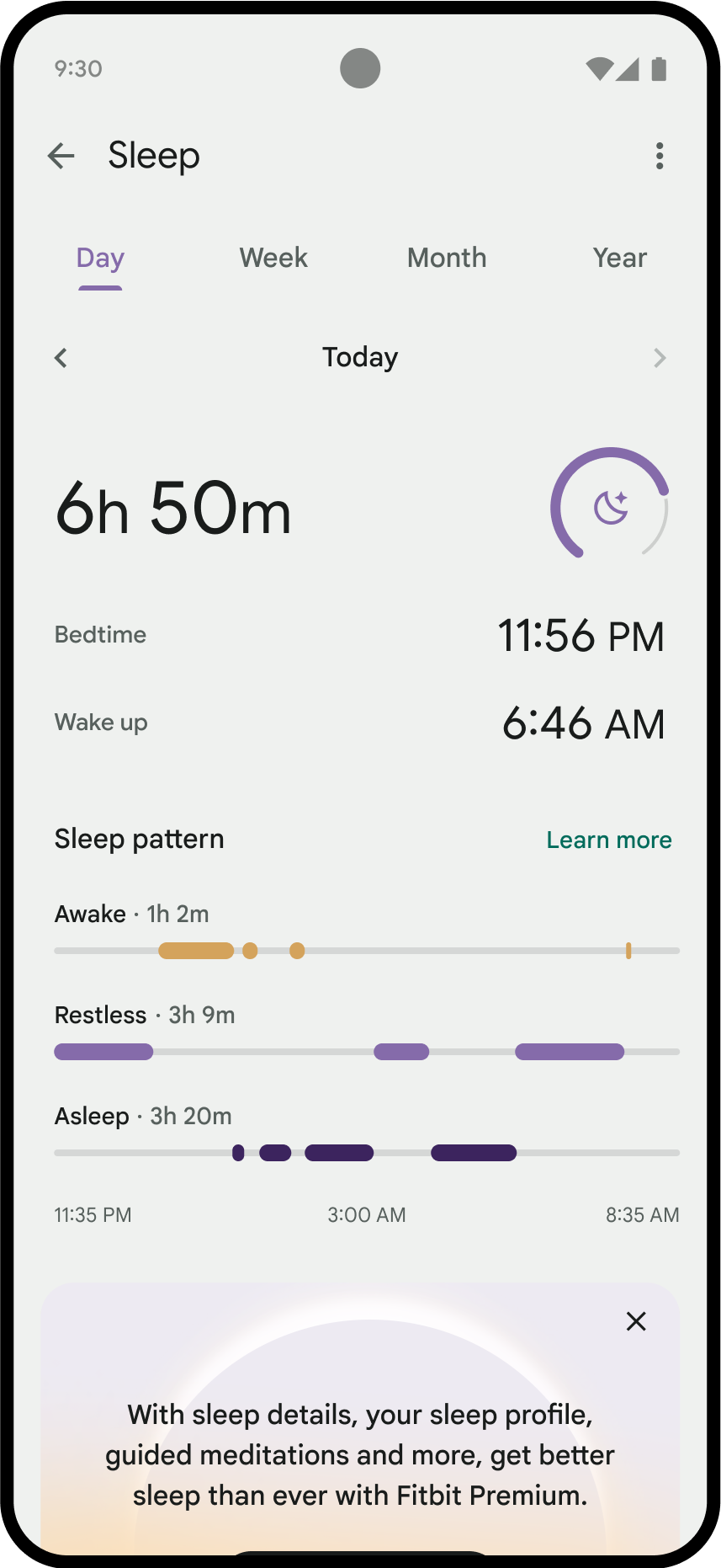
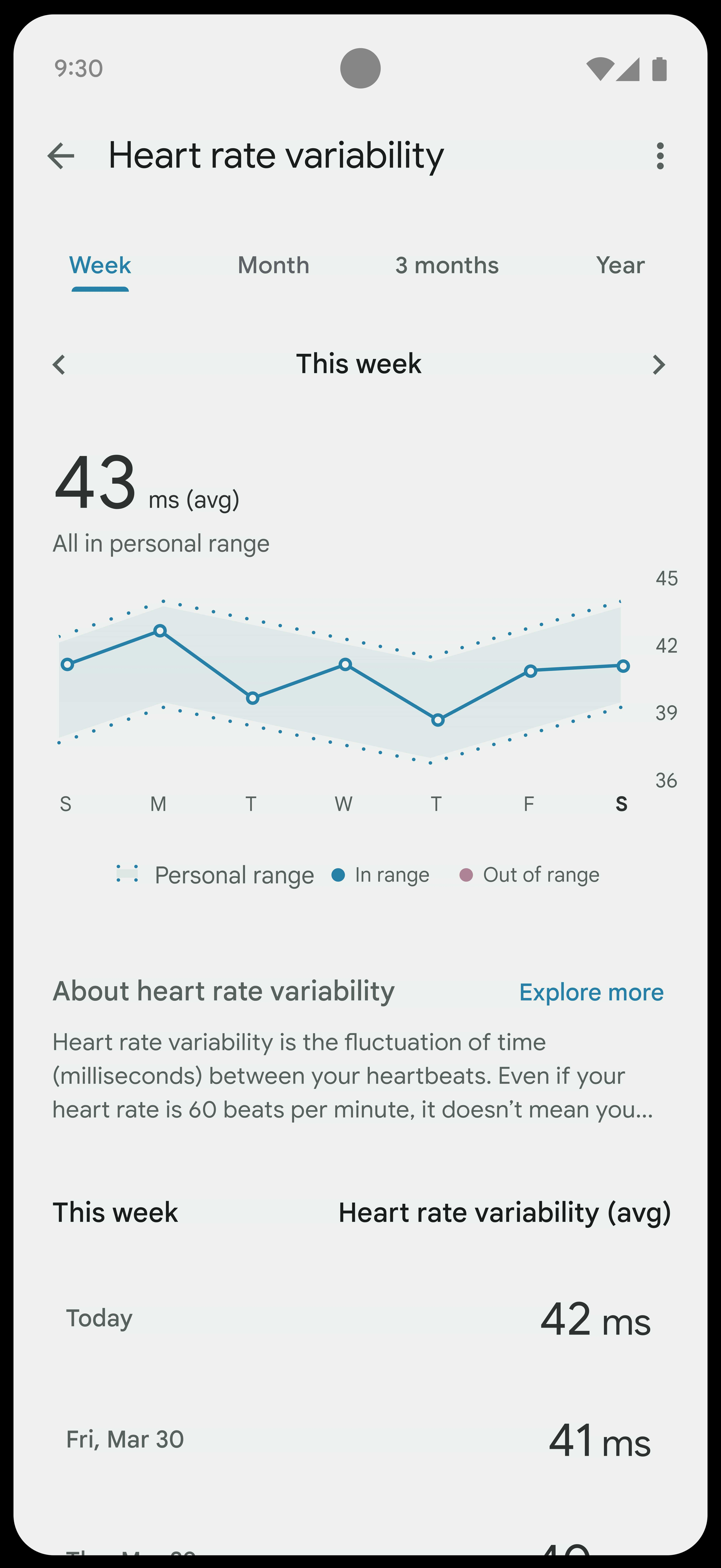
Metrics now take advantage of more consistent charts, while icons and graphics throughout the app have been updated to a more modern and consistent style.
“Coach” is the next tab in the tall Material You bottom bar. There’s a featured carousel of workouts and mindfulness sessions, while “Collections” lets you quickly dive into Favorites, Strength, Cardio, Yoga, Recipes, and What’s new.
Filters there let you search by duration, equipment, intensity, and format. On the main page, you’ll also find carousels for specific instructors and brands, like Calm.
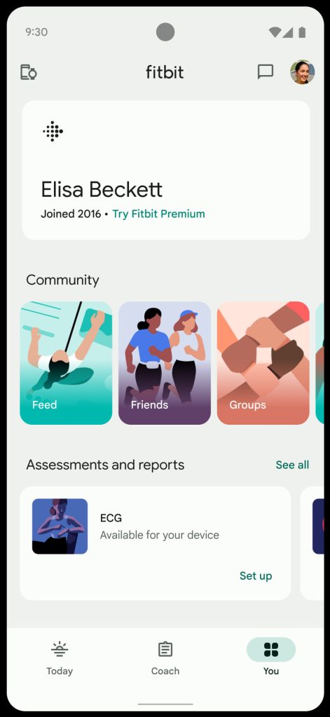
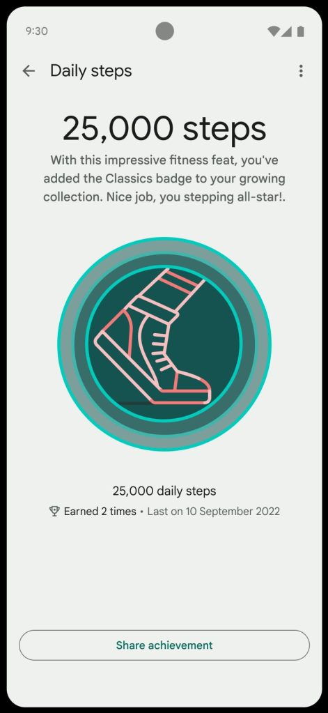
Finally, there’s the “You” tab with badges and health assessments, while links to Community are found here. A message bubble icon next to your profile avatar (settings) is how you access messages and notifications, while device preferences are on the other end of the app bar.
There’s no Dynamic Color, with Fitbit’s turquoise used as the accent color throughout.
FTC: We use income earning auto affiliate links. More.





Comments