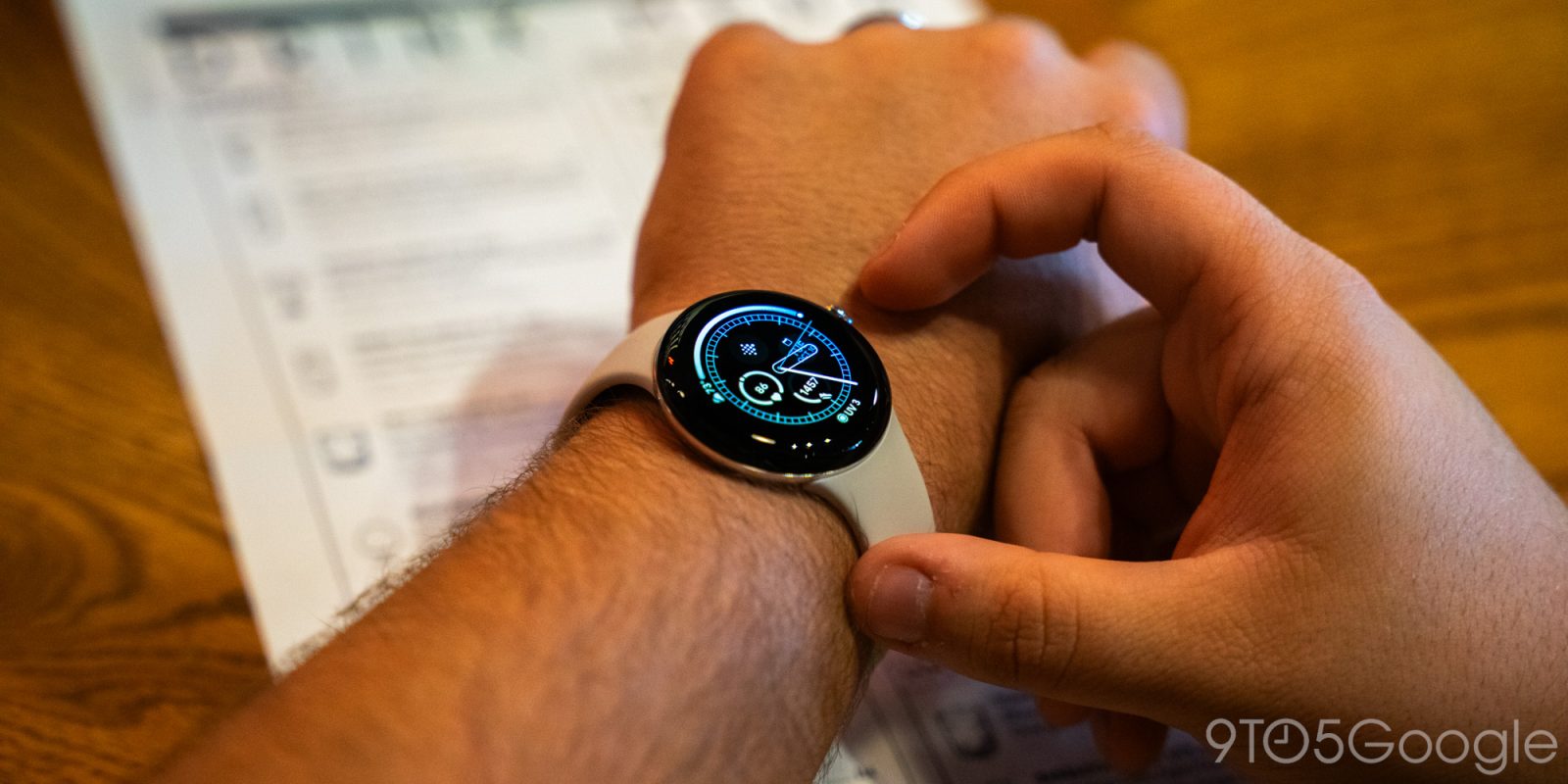
Or, how I went all-in on info density. The Pixel Watch 2 introduces six new watch faces, and here’s how I would rank them from worst to best:
9to5Google has a rebooted newsletter that highlights the biggest Google stories with added commentary and other tidbits. Sign up to get it early in your inbox, or continue reading 9to5Google Log Out below:
6. Adventure
I wanted to like this pseudo G-Shock watch face, but nope. It has too many unnecessary flourishes that just clutter the screen and make the display feel small. The Digital Arcs layout has four perimeter complications and two circular slots, while you get the day and date as a line in the middle. “DIGITAL MODE” appears at the center, which mercifully disappears on the AOD as it’s completely pointless and is my least liked addition. The Digital layout just shows the two circle complications.
Analog Minimal, with its sharp hour and minute hands, just shows the day and date. Analog Max has four circular complications, and Analog Arcs adds the perimeter ones. You have eight complications here, while day/date technically make it nine.
5. Large Scale
This rather simple face has four layouts to it. Just Time is basically Android’s two-line lockscreen clock, with Stacked Time adding a large complication to the right. Circular puts the slot underneath a single-line clock, while Linear is the day, date, and time.
4. Rotation
There are two key design traits behind this analog watch face. The day and date appear in the minute and hour hands, respectively. Meanwhile, every time the second hand passes over a numeral the hour animates in. I’m not too crazy about that particular aspect, nor do I see the utility, but I like Rotation because it naturally and seamlessly adds information to a conventional clock design.
Layout options include Minimal with nothing but the hands, while Indices add in the hour markers. Max will throw in four circular complication slots.
3. Digital Bold
This face has a corresponding lockscreen clock on Pixel phones running Android 14, which is nice for cross-platform consistency. Your color options are Pomelo, Melon, Lime, Spearmint, Aqua, and Bubble Gum, which is not as pink as you would expect. Radial shrinks the Just Time layout into a circle to fit in three complication slots. However, the AOD version uses lines that are way too thin to my eye.
2. Analog Bold
If the Arcs variant shows the most information, Analog Bold gives you the most visual customization for numerals. The Numerals layout is the simplest, with just 3/6/9/12 markers that can be customized with a Standard or Rounded font. You can also have Dashes, Dashes & Dots, or nothing for indices.
Meanwhile, you can replace numeral three with the Date, while Info I swaps out six for a circular complication and Info II replaces 3 and 9 instead. Finally, Info IV will add four arc complication slots.
1. Analog Arcs
With up to eight complication slots, Analog Arcs shows you the most information at a glance. The four circular slots inside are paired with arc complications that show an icon and some text. I’d greatly recommend using Simple over Ring Indices for a cleaner, less complicated look.
Max Four shows the most complications, while Max Two drops you down to six by using two semi-circle perimeter slots. I think the arcs – which also appear in Minimal Two and Numerals Two – are too large without showing enough information.
Minimal Four keeps all the arc complications but swaps the inner circular slots with just one line at the top, while Numerals Four adds 3/6/9/12 markers.
From 9to5Google
Google is increasingly providing Pixel support on Reddit
Chrome for iPhone, but not Android, now lets you have a bottom address bar
Review: Backbone One PlayStation Edition is the essential controller for PS5 owners
YouTube is now fully blocking ad blockers around the world
What (else) is happening
Samsung confirms a list of over 20 Galaxy smartphones that will get Android 14
- Samsung releases Android 14 update for Galaxy S23, coming to US ‘soon’
- Samsung brings new AI camera features to Galaxy devices; improved iPhone-style image clipping, document scan, more
- Samsung Galaxy phones on One UI 6 get a new ‘Auto Blocker’ tool for added security
Google app on Android getting dedicated notifications feed
Google working on Pixel update to fix Android 14 storage access issue
Google Pixel Car Crash Detection expands to a few new countries, but not on all devices
Google Pay on the web has a Material 3 redesign
Google Tensor G4 reportedly uses an updated Samsung 4nm process
Google Fiber is increasingly going by ‘GFiber’
Porsche will adopt Android Automotive, complete with Google apps
Google will release Android RISC-V emulators to test apps in 2024
Google uses search revenue to strongarm Android OEMs into pushing security updates
From the rest of 9to5
Electrek: Chevy launches Equinox EV at $49K, $35K 320-mile model coming soon
FTC: We use income earning auto affiliate links. More.


Comments