The Amazon Alexa app is getting a long-awaited redesign, and the new look is nearly identical to the Google Home app.
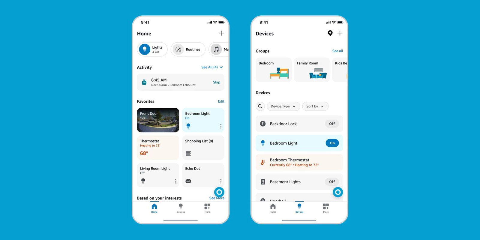
In a post today, Amazon has officially revealed the new Alexa app for Android and iOS. The revamped app introduces a completely new look for users which also includes new features.
The homepage now has a customizable “Favorites” section with quick controls for smart home devices as well as live previews of cameras, as well as a section at the top with commonly used types of devices such as smart lighting.
Amazon further notes a “Home Shortcuts” feature which can include shopping lists, alarms, routines, and more, all of which can be customized by users. Amazon explains:
A new Shortcuts bar on the Home page organizes devices by category, and shows popular Alexa features like shopping lists, alarms, and Routines. You can customize what you see in the rotating carousel at the top of the Home page. Plus, you can now see the state of your connected devices—like how many lights are on or the temperature in your living room—directly from Shortcuts.
There’s also a “Devices” tab which contains a list of all of your smart home devices with filters to quickly find the one you want, as well as groups to find all devices in say, a bedroom or the kitchen.
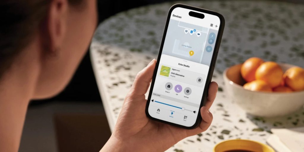
The new app also has a dedicated button for Alexa, and there are also returning features such as the Map View which shows your devices as they are located in your home’s floorplan, though that feature only works on iOS.
The new design, however, is rolling out now to both Android and iOS.

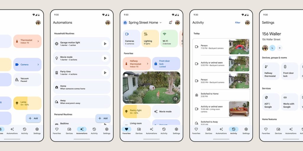
And, if it looks familiar, there’s probably a reason for that. From the home tab’s favorites to the list of devices, the new Alexa app bears a striking resemblance to the new Google Home app. Google launched its major redesign in late 2022 before widely rolling it out early this year, so it’s maybe not a coincidence seeing Amazon pick up on the same ideas so quickly.
It’s also worth noting that Amazon explains the new design similarly to Google, saying that the aim was make it easier to manage a large smart home as “millions of customers have more than 20 devices connected to Alexa.”
Google, when it launched the new Home app, cited that the “average US household has 25 connected devices” and that the goal of the new design was to keep things “easy to navigate” while “[reflecting] the unique needs of your home.”

There is definitely one thing Amazon is still doing differently, though, and that’s splattering ads through the Alexa app. As The Verge shows in screenshots, the “More” tab isn’t shy about advertising Amazon’s products. To be fair, Google sort of does this too, as the Home app sent users a notification advertising the Pixel Tablet earlier this year, but that’s not an ever-present deal.
The new Amazon Alexa app is widely available on Android and iOS starting today.
More on Amazon & Google Home:
- Google Home app Preview Program adding custom camera clips, garage door detection
- Amazon Alexa beats Google Assistant to AI revamp alongside new Echo, Fire TV hardware
- Google Home rolling out first-gen Nest Cam Outdoor support in preview
FTC: We use income earning auto affiliate links. More.


Comments