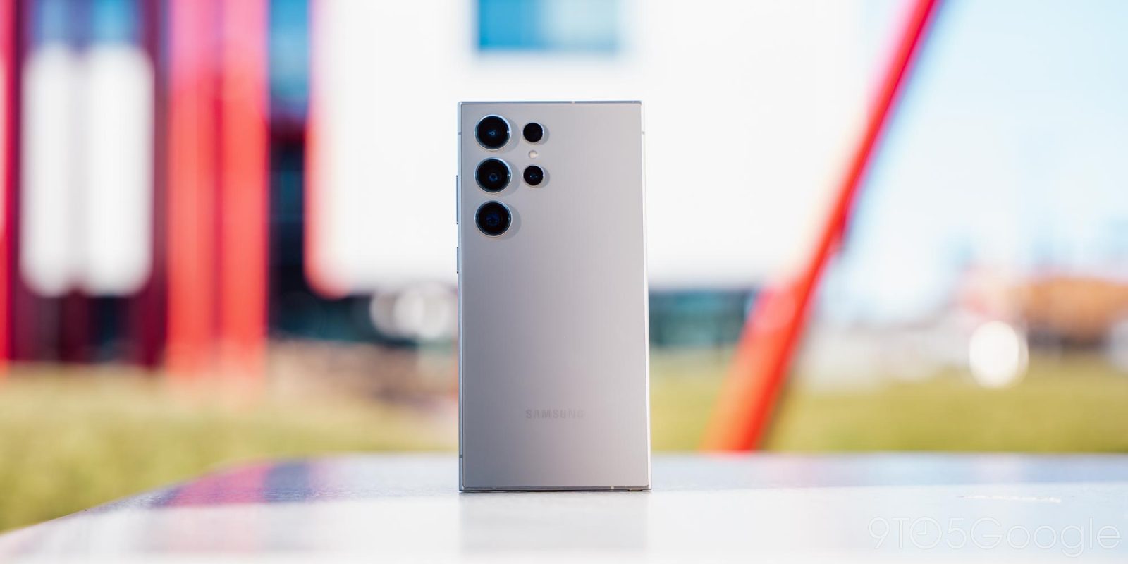
Samsung has all but perfected its formula for a flagship smartphone at this point, and the Galaxy S24 Ultra is the logical 2024 step for that project – just throwing a bunch of AI at the problem. But at a new and higher price of $1,300, Samsung has a lot to deliver on.
Table of contents
Hardware
All hail the flat screen
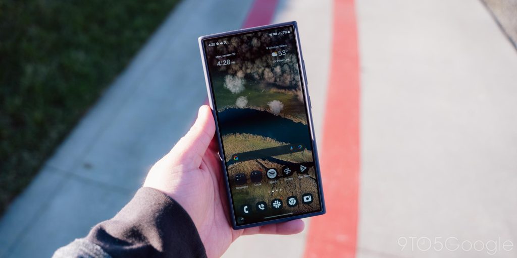
The single biggest improvement Samsung made to the hardware this year is moving to a completely flat pane of glass over the display.
Finally.
The flat, 6.8-inch panel feels bigger to a negligible degree, and has slightly more noticeable bezels, but in terms of usability and looks, this is a major improvement. The squared-off look of this revived Galaxy Note is just so unique in a 2024 smartphone, and I love it. The flat panel also feels better under the S Pen now, and just looks better too. Where the sides of Samsung’s curved screens always seemed to find reflections in every place I wanted to use the device, the Galaxy S24 Ultra’s screen just gets to shine without anything getting in the way, only improved by the anti-reflective qualities of Corning’s new “Gorilla Armor” glass.
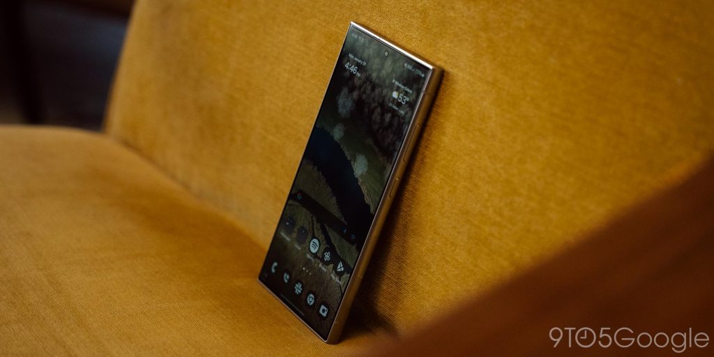
And, speaking of shine, the display underneath is just an absolute beauty. It’s easily the best part of the entire device.
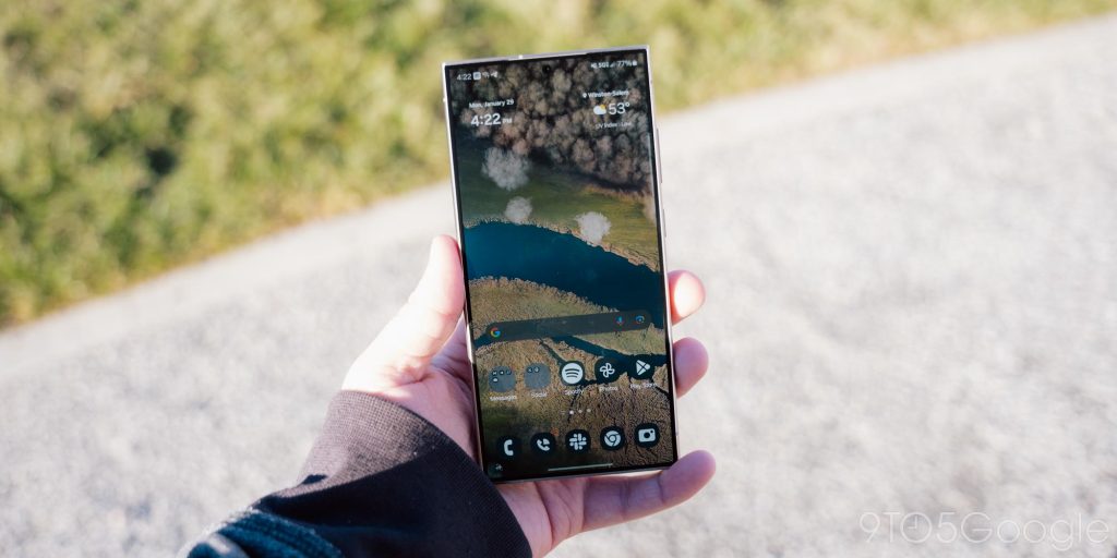
The Super AMOLED panel is sharp as ever, but now even brighter at 2,600 nits. And the quality is just wonderful. I’d say the difference is less noticeable as the competition has gotten better – there’s not a steep difference in quality compared to say the iPhone 15 Pro, Pixel 8 Pro, or OnePlus 12 – but this is still one of, if not the best display on a mobile phone today. It can do some new things too, like showing the colors of your wallpaper on the always-on display, which I actually found myself liking more than I expected, and had virtually zero impact on the battery too.
The flat screen’s impact goes beyond just using the display, though. In the hand, the S24 Ultra feels a little more secure in my hand thanks to the lack of a curved edge, but also due to the revised frame.
Does titanium even matter?
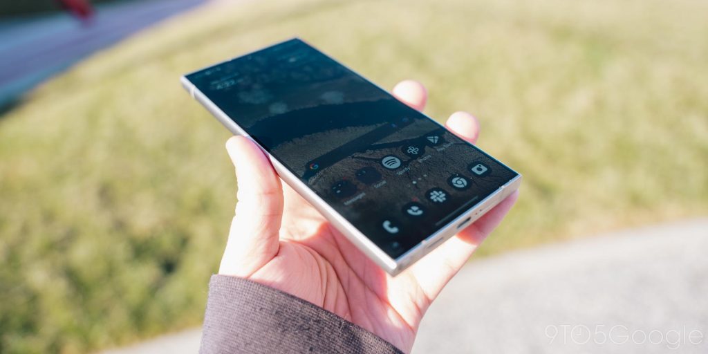
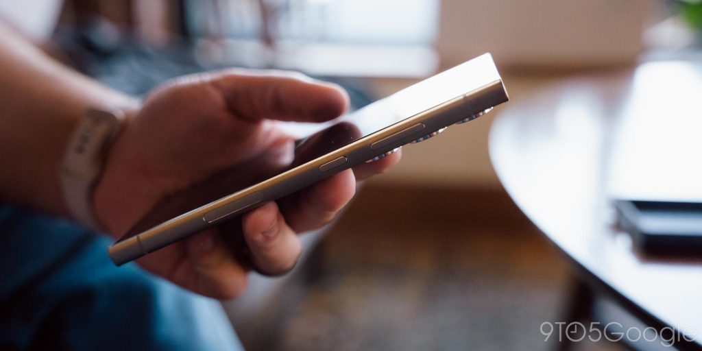
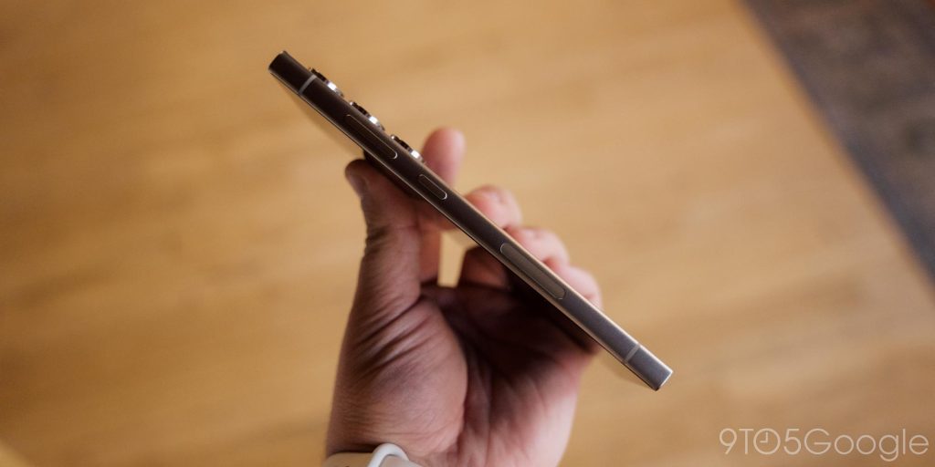
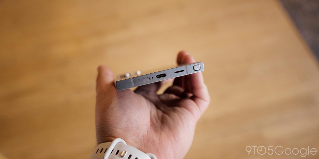
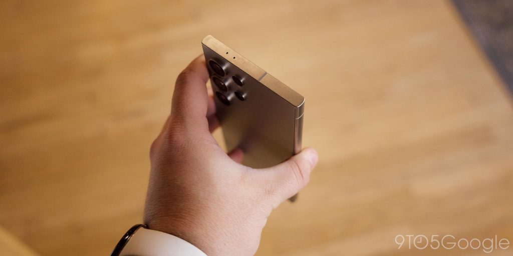
The hardware change that Samsung is more than happy to talk about is the titanium that makes up the entire frame of the device.
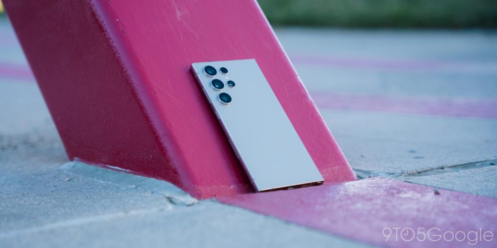
The titanium frame on Galaxy S24 Ultra feels great in the hand, with a matte finish that’s surprisingly grippy. I’ve gone caseless almost my entire time using the device, and I’ve not really been all that worried about dropping the phone.
But, I’m not really convinced the use of titanium really improved anything here.
If I were handed two of these phones, one with this matte titanium and another with matte aluminum, the difference would be negligible at best. To me, this really just feels like Samsung trying to chase after Apple, and there’s no real benefit to the consumer. At least the new iPhone lost some weight thanks to the change. The Galaxy S24 Ultra is almost exactly the same weight as last year’s model.
I’d be shocked if titanium didn’t contribute to increasing the price of the Galaxy S24 Ultra, and it feels like a wasted effort. But I guess it at least feels good in the hand, so it’s not all bad.
Software
One UI 6.1 isn’t for everyone, but it’s fast and fluid
Android is a flexible operating system, and it changes depending on what device you’re using. Samsung has been building out its One UI experience for the past several years, and it remains a divisive take on Android.
One UI takes the approach of “everything and the kitchen sink.” Virtually every feature you can think of is here in one form or another, and that lends itself to an experience that’s very personal to the user. You can adjust things to really feel like your own, and that’s truly wonderful. That sentiment is what makes Android so good. But, personally, I’ve always felt a little overwhelmed by Samsung’s choices. One UI is a lot, both in good ways and bad. I love having so many features to adjust, so many options to tinker with, but there’s also just so much bloat.
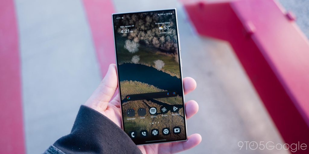
To revisit and earlier mention, the Galaxy S24 Ultra supports showing a wallpaper in color on the always-on display. To use that, you have to go through Settings of course, but the options aren’t under “Display” as you’d probably expect. Instead, they’re under a completely separate “Lock screen and AOD” section that’s further down the page. Fair enough, but the settings for AOD are yet another layer under that. Samsung doesn’t really have an alternative here, as putting more items on the surface page would just lead to further clutter, but it’s a bit overwhelming!
That experience really goes throughout One UI as a whole.
Meanwhile, Samsung removes things from Android that are genuinely useful, like notification history. And no, the Galaxy S24 Ultra still doesn’t support Android’s Seamless Updates feature, which applies updates in the background.
But, at the same time, there are good additions. I appreciate that One UI has more flexibility on the lockscreen, for example, with the ability to add widgets. I do wish that Samsung hadn’t just copied Apple’s implementation here, though, in only allowing a select few widgets.
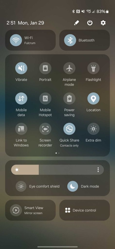
One UI 6.1 also brings some genuine improvements to the whole experience, such as the Quick Settings revamp.
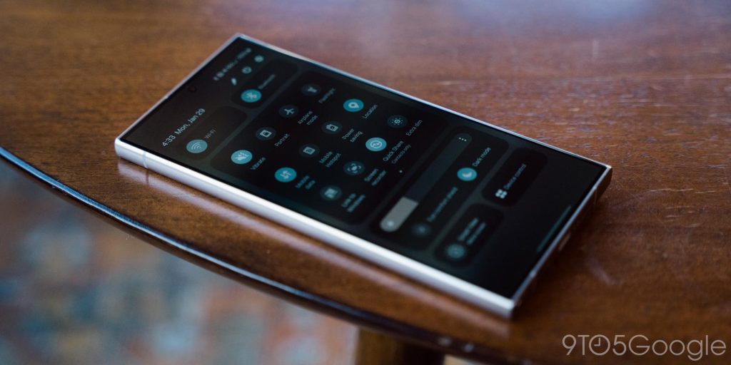
While it’s taken a while to override my muscle memory, the new layout with its dedicated sections for Wi-Fi and Bluetooth, display settings, and a big grid in the middle is really good.
I’ve said it before, too, but I love Samsung’s take on Material You theming as well, as the multitude of accent colors add a little extra spice that looks wonderful.
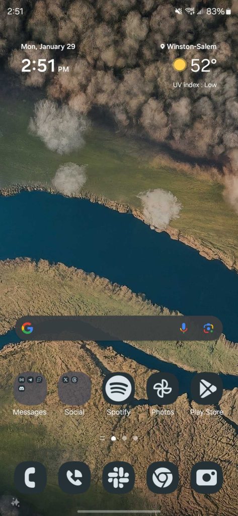
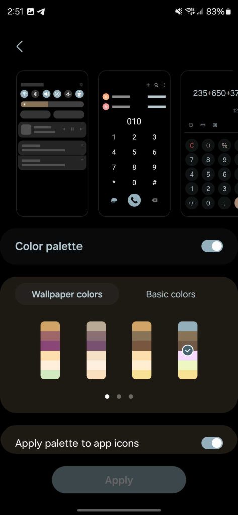
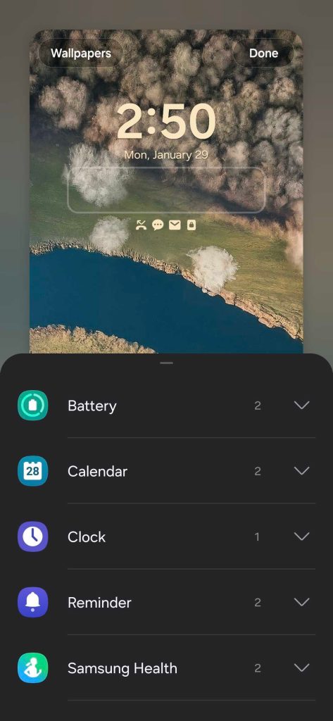
Plus, on the Snapdragon 8 Gen 3 and 12GB of RAM, the Galaxy S24 Ultra is very fast. Not once did the experience get choppy or laggy, which is not something I can say for the Pixel 8 Pro I was using prior to this. The updated animations in One UI 6.1 are also smooth and fluid, which is a nice touch. I’m not much of a mobile gamer, but the few titles I did throw at this phone were handled without even a single hiccup, and all while staying cool.
Galaxy AI has a lot of good ideas, just in the wrong places
As mentioned, Samsung’s big selling point about the Galaxy S24 Ultra is its new “Galaxy AI” suite of features.
The short version is that these features are actually really good, and I’m impressed with how Samsung baked them into its software, but they are also in places that I find myself completely ignoring them.
Galaxy AI is made up of a few core features, and even fewer main ideas.
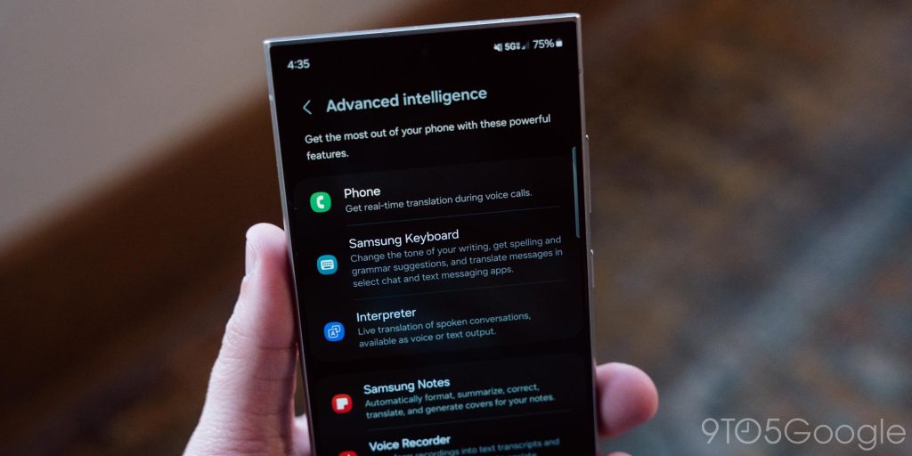
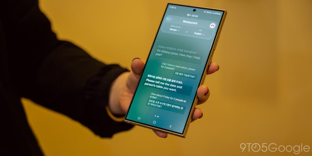
One of the biggest use cases is translation. “Live Translate” can translate a phone call in real-time, entirely on-device. “Interpreter,” meanwhile, can do the same for an in-person conversation, again entirely on-device and offline. The latter isn’t really breaking any new ground, but I was impressed with how well they worked in demos earlier this month. But, in my use of the S24 Ultra thus far, I haven’t used either of these features simply because the situation hasn’t arisen. I’ll be curious to see how this works when I take an international trip next month, though.
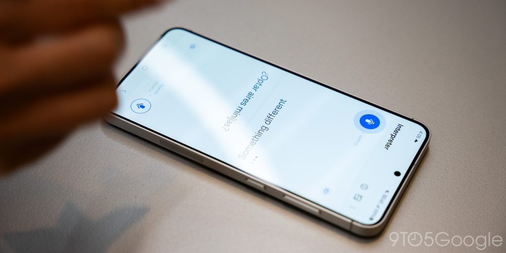
Another translation feature lives in Samsung Keyboard. The keyboard can, with any messaging app, translate a conversation to your language and send your replies in the other person’s language. This is really well integrated, and I love that it shows both your language and the other person’s side-by-side. Also in the Samsung Keyboard you’ll find an AI-enhanced spellcheck, and a “Chat Assist” option that can take something you’ve typed out and generate different versions of the message to better suit the situation. This feature is the one I used most, and it works pretty well overall.
I could go on for a while about Samsung Keyboard’s flaws – and I intend to – but for now, I’ll boil it down to this.
Samsung Keyboard is not good.
It’s horribly bad at autocorrect which is somehow both too aggressive and not aggressive enough. And things are even worse with voice-to-text. Samsung’s model works offline, which is good, but it’s also borderline useless. Words are frequently replaced with ones that aren’t remotely similar, and formatting is a disaster. Very often a pause meant for a comma is interpreted as a sentence, leading to words like “I” and “It” being passed off as full sentences. “It. ‘s so bad” is an actual interpretation Samsung Keyboard had of what I said, ironically about how bad Samsung Keyboard’s voice-to-text was doing in that very conversation.
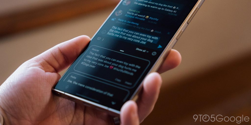
Samsung is pushing AI heavily, yet can’t even get the core components of a keyboard right.
But, that out of the way, let’s get back to the new AI features.
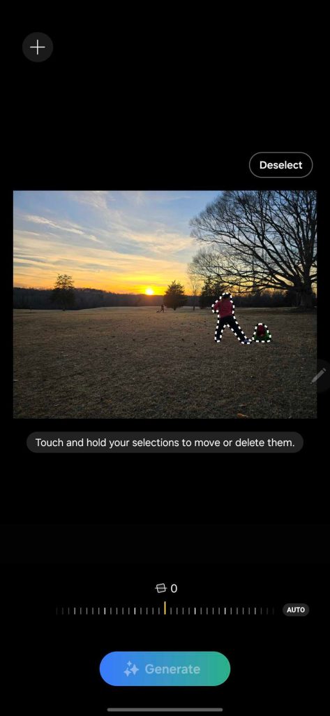
Some of the other new features are baked into the Gallery app for the sake of the camera. “Generative Edit” works like Google’s Magic Editor on Pixel, using generative AI to fill in the gaps when you move or remove an object in a photo. There’s no discernable difference between the two that I’ve noticed (besides Samsung adding a watermark to anything you export), but the perk on Samsung’s side is that you don’t have to back the photo up to a cloud account to make these edits.



Another option in the Gallery app is add slow-motion to any video clip. This works just by long-pressing the video in the areas you want to add slow-motion, and AI will generate new frames for the sections you’ve selected. After you long-press the section you want to apply slow-motion, you can enter the full edit mode and the Gallery app will automatically suggest you apply slow-motion the portion of video you “selected.”
It can work well, but only in ideal scenarios. A video of my dogs wrestling felt very choppy in the slow-motion edit, and a video of a disc golf putt (seen below) literally resulted in the disc disappearing and re-appearing between frames. I expected there to be quirks with this, but the final product is pretty rough. I also struggled to get the timing down right to start the long-press, and ended up having to edit it more later anyway.
Note: Both of these clips have been compressed
Yet, that’s not my main problem. My main issue with this feature is that I don’t feel it’s intuitive to add slow-motion while just watching the video, as this usually doesn’t appear after you’ve selected the “Edit” mode. Still, it’s neat, and perhaps the most useful video feature here, at least when it works and if you know it exists.
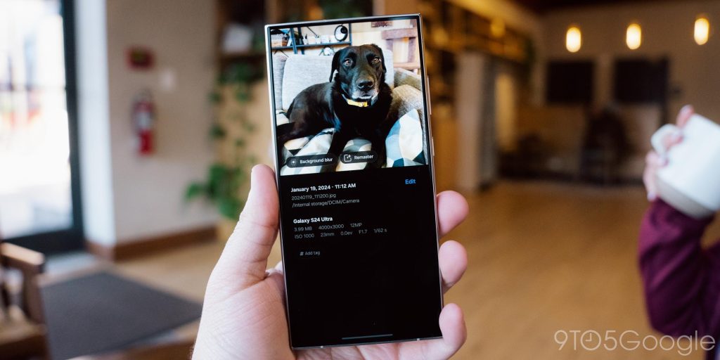
Rounding out the AI features for photos and videos, the Gallery app can also surface suggestions for edits while you’re previewing a picture. A key example is removing reflections from a shot, but it can also suggest adding background blur. Like slow-motion, I think the problem here is discoverability, as these suggestions only appear when you tap the “info” button on the image. Finally, the camera also uses AI to enhance zoom.
Samsung has also baked AI enhancements to its Voice Recorder and Notes apps. The former can use AI to transcribe a recording after it’s been made. It’s not very fast, and it’s not very accurate either. A recording I made of a 15-minute lecture through overhead speakers was quiet, but completely audible in playback. It took about 2 minutes for Samsung to transcribe it. Yet, Samsung’s transcription is messy and full of countless inaccuracies. The sentence “a young couple decides the date of their wedding” was transcribed as “I don’t care I’m deciding the date of their wedding.” While hilarious, that’s a bad transcription. The most useful feature is the ability to create a summary of the record, and that actually works really well, even if the transcription is full of errors. Summaries work similarly well in the Notes app, but more useful are the formatting options that can take your Notes and convert them into bullet points or similar formats.
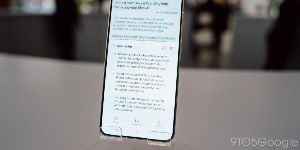
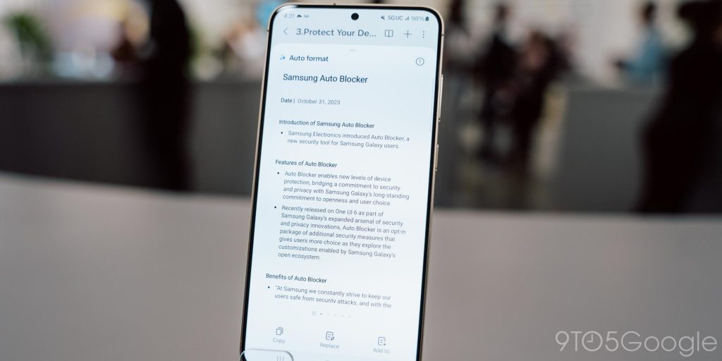
For me, though, I found that I was having to force myself to use all of these features. They’re all baked into Samsung’s apps, and those apps are limited, for the most part, to just Samsung’s devices. If you happen to use a different brand’s tablet, or have another phone, or even use a laptop that’s not a Galaxy Book, a lot of this stuff won’t carry over, which is rather frustrating.
The most useful “Galaxy AI” feature didn’t turn out to be one of Samsung’s at all. While the company would love you to think it’s an exclusive, Google’s “Circle to Search” debuted here but will be coming to other Android phones in time (starting with Pixel 8). The feature works wonderfully, with a long-press activating a UI where you can circle or tap or highlight on anything on screen to get results. It’s handy!
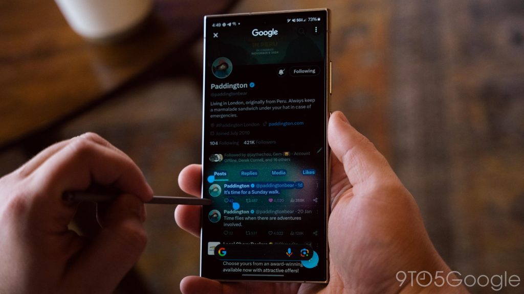
Samsung has had a lot of really good ideas, and surprisingly good implementations, of these AI features, but I don’t see myself using them long-term just because they’re a bit locked down to software I personally don’t want to use. That said, if you’re invested in Samsung’s ecosystem, these will probably prove absolutely brilliant.
Battery Life
Still an all-day smartphone
The 5,000 mAh battery in the Galaxy S24 Ultra hasn’t changed in the past four generations, but it’s still plenty for an all-day smartphone.
For every day I’ve used the Ultra, I’ve managed at least 4 hours of screen time and often ended the day with around 40% left. On heavier days, I was hitting 6-7 hours of screen time and still not hitting 20% before bedtime. More than most, this truly is an all-day smartphone, and the advancements in efficiency on Qualcomm’s Snapdragon chips just keep pulling more endurance out of the same battery size.
The charging situation is also unchanged. Wireless charging overnight was my go-to given that battery life was never a concern during the day, but wired charging is available for speedier charging. I did forget to charge the Ultra one night and woke up with around 40% left. It took about an hour to charge fully from that point while connected to a 65W USB-C charger, which is fine, but leaves plenty of room for improvement. Right now, max charging rates top off around 45W, but slow down as the battery fills up.
Something I was glad to see, too, are more options for battery protection. In One UI 6.1, Samsung has introduced new options for limiting charging to help you lengthen the life of the phone’s battery. “Battery protection” is found in the Settings menu and has three tiers. “Basic” prevents the phone from staying at 100% if it’s left plugged in for an extended period of time, while “Adaptive” adjusts to your usage patterns to slow down charging so you wake up with a full battery. “Maximum” limits charging to 80%, as a full charge can degrade the battery a little faster. Given how good the battery life is on this device, an 80% charge actually seems reasonable to handle a full day.
Camera
One step forward, one step back
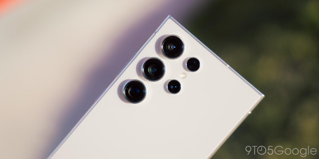
The camera system on the Galaxy S24 Ultra is fairly similar to all of the Ultra phones before it. A primary sensor with a crazy number of megapixels paired with an ultrawide and two telephoto lenses. And, as in previous years, it’s still capable of some truly stunning shots.
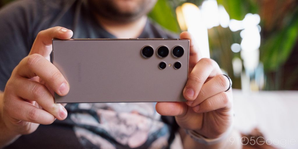
The problem in years past has always seemed to be with processing, and particularly motion. Samsung does seem to have finally paid attention to processing as a whole on the Galaxy S24 Ultra, with noticeable improvements. Shots are often softer, leading to more natural textures in hair and grass, rather than the frequently oversharpened look that’s been all too common in the past.
Yet, motion is still an area the camera massively struggles, and it hasn’t gotten any better this year. If anything in your shot is moving (or even if it’s not, sometimes), the end result can often be a blurry mess. This should be the top priority for Samsung above any AI stuff. I couldn’t imagine being a new parent with this camera, because I can barely tolerate it as a dog owner.
I’ll let the images below (and viewable in full quality on Google Photos) tell the whole story.
Note: All camera samples are compressed. See Google Photos for full-resolution
The other big downside this year? Samsung ditched the 10x telephoto camera, replacing it with a 5x telephoto. This is a mixed bag. 5x gives you some useful flexibility in places where lower zoom is useful, and the higher quality of the sensor underneath lends itself well to video recording and low-light. Samsung’s AI enhancements for the camera are also really solid, leading to 10x zoom feeling pretty close to optical. But despite what anyone says, a sensor crop is not the same thing as true optical zoom, and it’s a crying shame that Samsung has opted to remove the 10x length, especially as that’s the one thing that really set the Ultra’s camera system apart from everyone else (in the US). Still, the results at 10x and beyond are not impacted that much – it’s not impossible to see, but it’s minimal – so I can’t get super mad here.
As for video, it’s still good. Samsung’s stabilization and end quality is among the best in Android.
Samsung has put a lot of work in on cameras over the past several years, and the Galaxy S24 Ultra continues to reap the rewards of that. Plus, there are some new bits, like being able to record at 4K at 120fps. That’s not something I’ve personally been looking for, but an “Ultra” phone absolutely should be able to do that nowadays, and I’m glad Samsung offers the capability. Low-light has gotten especially good as of late.
And, despite Samsung’s work to improve camera quality in third-party apps, things still arent’ great. Max Weinbach explains:
Samsung claims their processing now extends to third-party apps, and it does, but the problems remain.
The resolution and shutter speed did not change. Many of the problems were not about HDR or Night mode, but rather the shutter speed not matching the normal Camera app. Additionally, the resolution is not as high, leading to significantly lower quality. So now, lighting and colors might look a little closer to the default Camera app, but many of the real complaints that have existed for years were not addressed, and there is still a pretty significant discrepancy between the main app and anything else you’ll use.
Don’t change your habits folks, the main camera app is still the one to use for the best quality the device is capable of.
As a whole, the word that best describes the camera is “lackluster” – defined as “uninspiring.”
Samsung deserves some commendation for throwing a ton of hardware at this situation and delivering what is truly a flexible and sometimes-stellar camera setup. But, it rarely sticks the landing. As has been the case for the past several years, I don’t trust Samsung’s camera, and that’s getting more and more ridiculous as the years go by and the prices go up.
Tidbits
The same old fingerprint sensor?
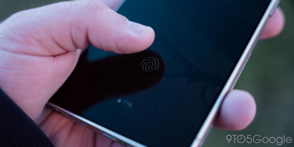
Something else that hasn’t changed over the past few generations of Galaxy phones is the fingerprint sensor, and it hasn’t changed this time around either. The Galaxy S24 Ultra uses an ultrasonic sensor just like its predecessors, and there’s no change in the size of the sensor. Of course, the good news is that this is a point that Samsung has nailed down a long time ago, and despite not being any better, it’s still very good. Fingerprint recognition is fast and super accurate, easily hitting around a 95% success rate in my use.
Update: Apparently, the Galaxy S24 Ultra does have a slightly newer fingerprint sensor.
But there’s still no “secure” face unlock. Samsung will let you use the selfie camera to unlock the phone using your face, but that won’t work for things like Samsung or Google Pay, and any other apps that require a secure form of biometric authentication. That’s frustrating, given Google now offers that on the Pixel 8 series, but what’s even more annoying is how One UI handles the handoff between face and fingerprint unlock.
If you have both turned on, the phone will respond to whichever is recognized first. But if you reach for the fingerprint sensor and the face unlock kicks in, the fingerprint just doesn’t work, which means you then have to switch to swipe to unlock the device. It’s rather frustrating, especially when, again, this is something Google does right on the Pixel, as the area the fingerprint would be used still works to unlock the device even if face unlock is the one that recognizes you first.
S Pen
The S Pen is… the S Pen.
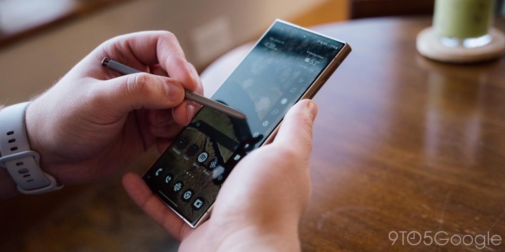
Samsung’s beloved stylus hasn’t changed on the Galaxy S24 Ultra in any meaningful way. The hardware is unchanged, and there’s nothing new in the software either. The only thing “added” is Google’s Circle to Search, which does lend itself nicely to the S Pen, but doesn’t work any better with it. You can’t even summon Circle to Search with the stylus, which seems like a missed opportunity.
Haptics
Samsung has never really put much emphasis on the haptic effects in its Android skin, or in the hardware itself, and it’s really starting to show as other Android brands step up their game. Haptic feedback on the GalaxyS24 Ultra is decidedly fine. Nothing about it is bad, but nothing’s really good either. It’s just kind of there, waiting for someone at Samsung to pay attention to it.
Samsung’s Standing Grip Case
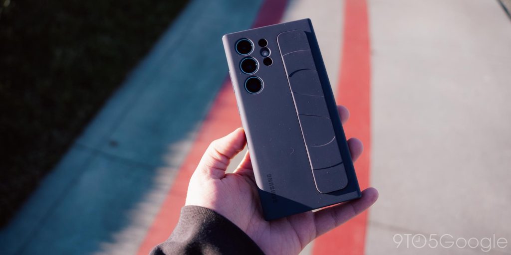
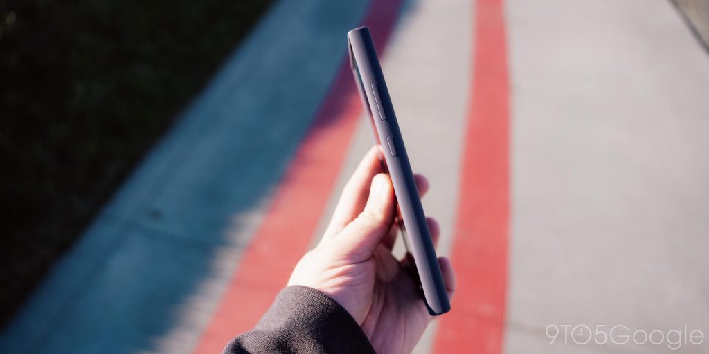
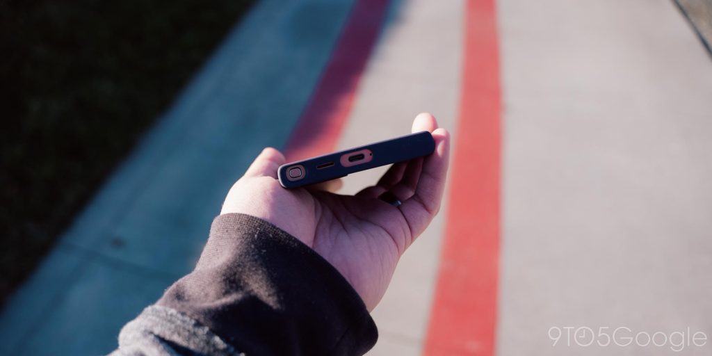
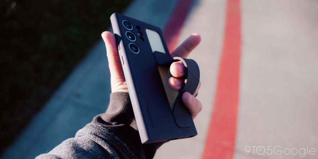
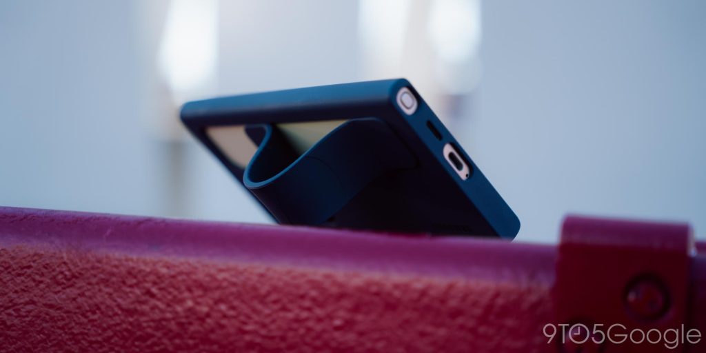
To go alongside my review, Samsung also sent over its new first-party Standing Grip Case. This silicone case has a grippy finish with a strap on the back that can either sit (almost) flush with the case, or slide down and lock into place to give your fingers a place to grip the device, or stand it up in landscape. The case is pretty solid overall, but it’s a little too grippy for my tastes, making it hard to put into a pocket. The grip is fine, but the case is grippy enough to negate the need for it, and it also can’t put the device in portrait mode while standing. It’s a fine case, but I couldn’t see myself forking over the $60 Samsung wants for it.
Final Thoughts
The Galaxy S24 Ultra is fundamentally a very good smartphone. It’s been exactly as stellar as I expected. It is, without a doubt, one of the best smartphones you can buy.
But…
The trouble for the Galaxy S24 Ultra really comes when you look at the bigger picture. At $1,199, the Galaxy S22 Ultra and Galaxy S23 Ultra were already very pricey smartphones, and with the Galaxy S24 Ultra now coming in at $1,299, it’s hard to find what really earns that price tag. No reasonable person should pay extra just for titanium, and the AI features (with their possible future paid subscription) also don’t earn that extra cost, especially when they’re already on their way to last year’s model too.
The only thing that really makes a compelling point for the extra cost is the promise of 7 years of updates, but that same promise extends to the Galaxy S24 and S24+, and they didn’t get price hikes this year.
More importantly, I struggle to accept the Ultra’s price when you look at the competition. This phone isn’t worth $100 more than an iPhone 15 Pro Max, and you’re definitely not getting $300 more phone compared to a Pixel 8 Pro. The OnePlus 12 and its $800 price tag also really ruins any value proposition from Samsung here.
Top comment by Mckillio
In regards to the weight. Do we have any idea if other changes made it heavier? In other words, if they just added a titanium frame to the S23U, would it be lighter than the S24U?
Of course, no one buys a Galaxy phone at full price anymore. You’re going to buy it with a boosted trade-in deal, or a discount from retailers or your carrier. Sales are never-ending. But sales are always based on that retail price, and Samsung is going to be asking for $100 more than it did last year, for a phone that, in my eyes, isn’t worth that extra cost.
Everything I have a problem or complaint about with the Galaxy S24 Ultra really boils down to things being too iterative. Samsung is playing it way too safe. Yes, this is a great device, but so is almost everything else out there. If there’s no compelling reason to buy the latest model because the last one is so similar, what’s the point of releasing a new model at all?
Again, the Galaxy S24 Ultra is a very good smartphone and you’ll be happy if you do buy it, but more than ever before, the price is more than reason enough to take a pause and better consider your options. That Galaxy S24+ is looking a whole lot more compelling this year and, for that matter, so is a used Galaxy S23 Ultra.
Where to buy the Galaxy S24 Ultra
Follow Ben: Twitter/X, Threads, Bluesky, and Instagram
FTC: We use income earning auto affiliate links. More.


Comments