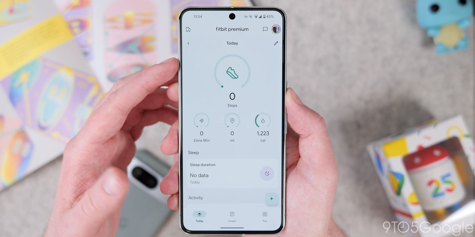
Google Design published an interview with the “Google Fitbit UX team” that provides an interesting look at last year’s Material You redesign of the app, which is still taking shape.
We’re on a journey as a product team to become less about data collection and more about giving you insight and actionable information to take charge of your health journey.
Google wants to take the health metrics it collects and “simplify them so that they become more accessible for more people.” Fitbit has already discussed how it will use large language models to provide personalized coaching that can be delivered in a conversational manner.
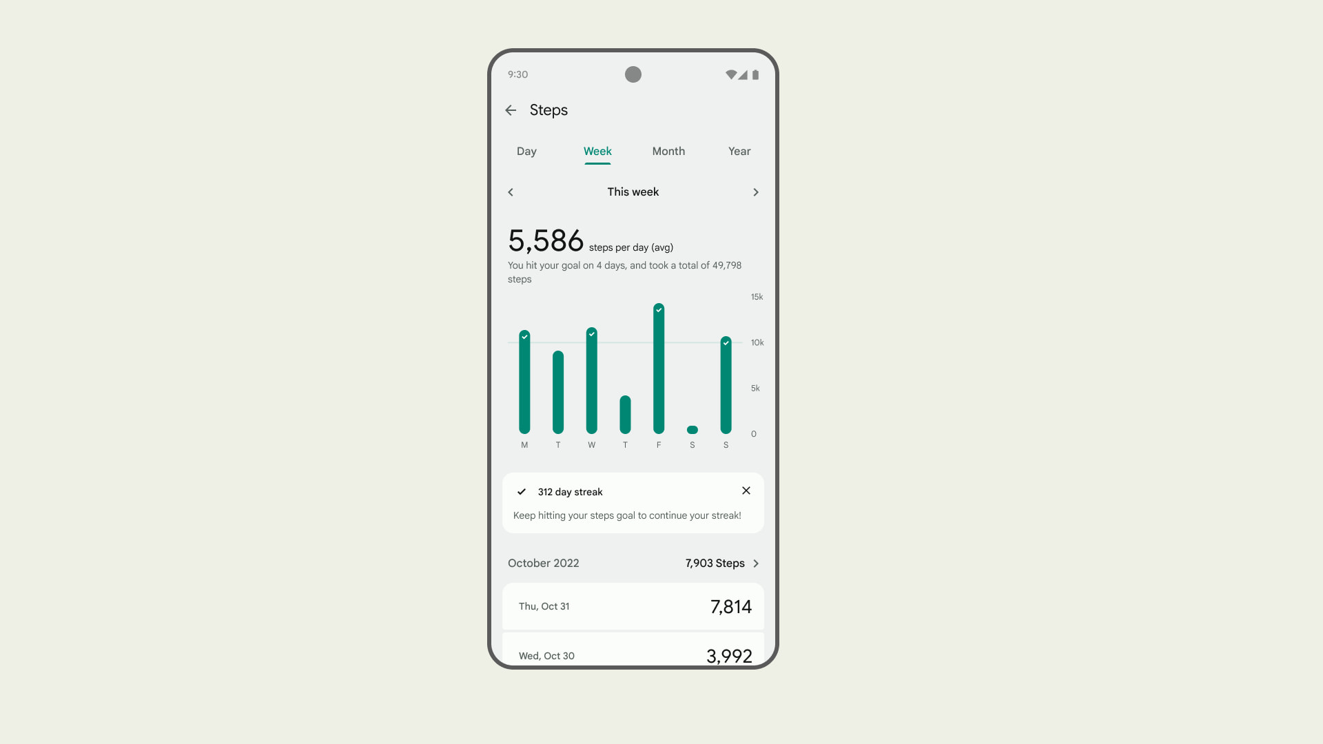
The Fitbit app has been “exploring how charts and text can work together to provide more meaning and clearer takeaways.” For example, the addition of “chart headers “reflects how “people can comprehend a text-based insight much easier than a complicated chart. The visual pulls people in, and the text and the visuals work together as a system.” That said, some users prefer the old charts for being more info-dense.
If you were just to spam people with all these numbers and metrics day after day, that’s not empowering. And it’s a lot of cognitive load. We’ve worked through content writing and design to carry out the goal of improving health literacy, which by definition means not just making information understandable, but actionable.


An interesting consideration is showing long-term stats and patterns:
And there’s not going to be fewer metrics over time, there will be more. It’s our responsibility to keep that complexity from feeling overwhelming. We have to have it solved on the backend and have the presentation of that information make sense and feel personalized.
Top comment by rcfoulk
It is contrary to every successful application development concept I've encountered to make radical changes to a long-standing and much loved application, taking away access to data, without ever having run those "ideas" by the user community, a community that is enraged over having a well used tool functionally made close to irrelevant by the changes made. The September "upgrade" was a horror concerning what it did to the UI and available information. But the wholesale anger presented on their community forum notwithstanding, this brain trust proceeded to last week make the sleep portion of the application a functional nightmare. One of the utterly mind numbing "upgrades" was to remove access to sleep detail over past nights, something that anybody working with sleep issues views as information gold. In it's place they offer a 30-day "average" which is pretty much meaningless to those using that information. Given that the only give-back based on uniform outrage from the user community from the many disastrous changes in the September release was to re-instate the actual charge percentage of the device on the main screen, I have little faith that understanding will overcome arrogance and cause a reinstatement of the missing features and the older, much more user-friendly UI. So, in a market segment now well populated by quality products many of us will with much resentment towards Google ditch our investment in Fitbits and move to one these other worthy competitors.
Another point is how Material You and its “form follows feeling” is relevant when designing for health. Work on the Fitbit app redesign that launched last September “started two years ago” — with the acquisition closing in 2021 — when Material You “was being finalized and was not public-facing yet.” Material 3 was announced in May 2021 with Fitbit also having a present that I/O with the Wear OS 3 announcement.
We also felt compelled to heavily distinguish the product aesthetically. This led us to our creative direction. We leaned into a unique style that emerged from the late 1960s in California, Light and Space, an art movement that rethought how individuals interpret art, how your environment and surroundings relate to you in that very moment. Light is everywhere. When you turn on the screen, it’s a portal of light that reflects you.
In terms of how the previous design differs from the new one:
We’ve navigated bringing along people loyal to Fitbit who find value in the approachability, comfort, and trust that they feel in the brand. Traditionally a lot of that has been achieved through colorful, bright imagery that wasn’t modern. We wanted to hold onto that approachability in the brand equity, but modernize and make it future-proof.
Once again, Google is quite happy with the circular nature of the Pixel Watch hardware and complementing that on the software front:
Having Fitbit lean into rounded forms and softer colors feels fairly unique, and the circular form factor is a big part of how we design for that uplifting and compassionate feeling. We’re able to do this because we’re combining multiple worlds into one holistic health journey experience.
FTC: We use income earning auto affiliate links. More.


Comments