This is the least important part of Fitbit’s absorption into Google — seriously, where is the dark theme — but I hope its logo and brand identity survives. I’m specifically referring to the arrow logo comprised of dots, lowercase “fitbit” wordmark, and soothing green/teal color palette.
9to5Google has a rebooted newsletter that highlights the biggest Google stories with added commentary and other tidbits. Sign up to get it early in your inbox, or continue reading 9to5Google Log Out below:
After the acquisition, with the Sense 2, Versa 4, and Charge 6, “Fitbit by Google” was leveraged. The logo and wordmark remained side-by-side with “by Google” following.
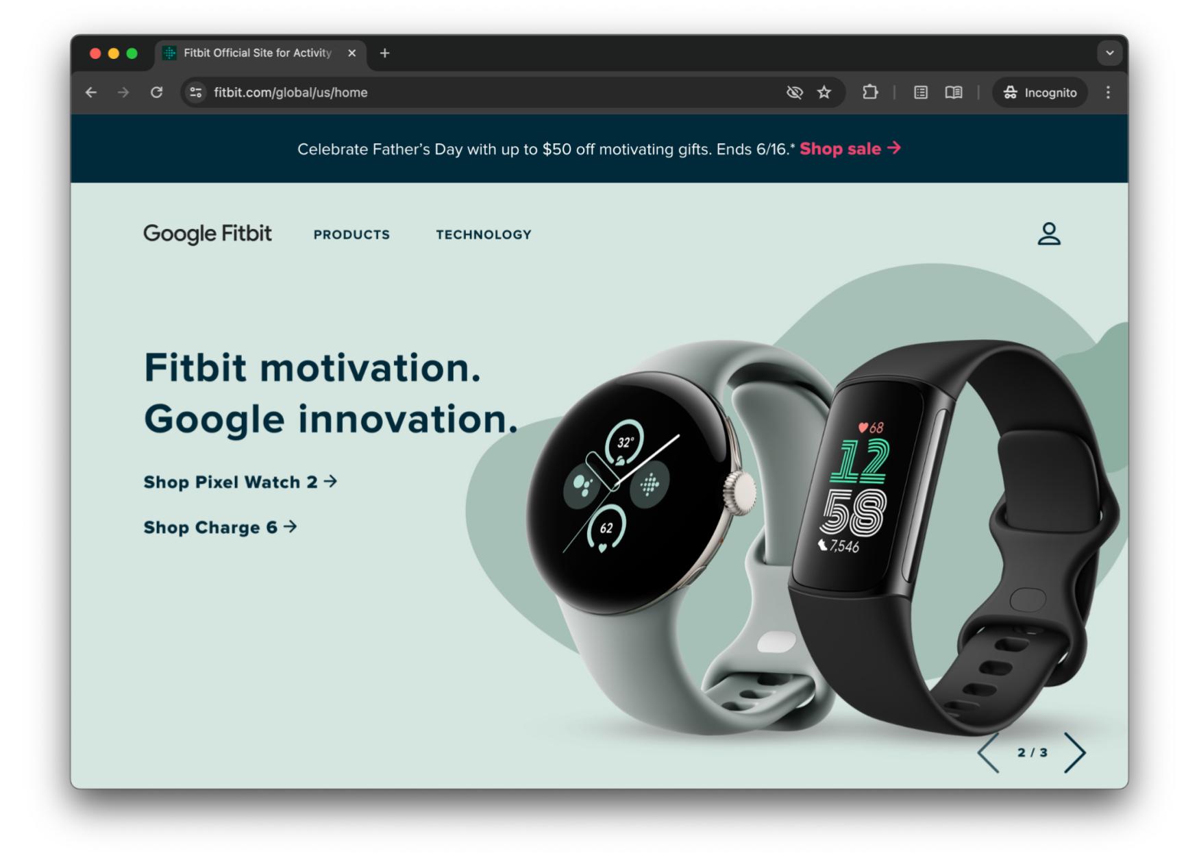
Back in March, it became “Google Fitbit,” with the latter word adopting a new font and becoming capitalized. This is what appears on fitbit.com, which now directs to the Google Store for purchases. Save for the favicon, the logo doesn’t really appear on the page. One of the more prominent examples is as a complication on the Pixel Watch 2.

Meanwhile, marketing emails recently switched from the logo in the top-left corner to just “Google Fitbit.” It’s really pretty boring. I was especially reminded of that blandness when the Fitbit Ace LTE was announced last week.
This kids smartwatch continues to use the old logo/wordmark and is so much more interesting as a result. That entire product is playful, but that continued usage is presumably due to the product being in-development for the past 2-3 years and a change before launch not being easy.


I’m worried about a “Google Nest” repeat. In that case, either the Google Home logo is leveraged or the four-color Google “G” makes an appearance, especially on smart home product packaging. It’s fine on Pixel since those phones never had an individual brand, but a waste with Nest.
That said, there are key differences with Fitbit, like how the Android/iOS app logo and aforementioned Wear OS complication can’t switch to the “G” icon and continue to make sense. In that regard, I’m more hopeful of the Fitbit identity sticking around.


While I like today’s green, I’d settle for the dots eventually getting the blue, red, yellow, and green treatment, which I feel is required/inevitable for its continued existence. (You can see a “Photoshop is my passion” take from yours truly below.)
From 9to5Google
Here’s what you said you want from Android
Google now has Auto Dark Mode for websites in its iPhone app
Direct Google Wallet app notifications start rolling out
Pixel VPN by Google going live for 7/Pro, 7a, and Fold owners on beta
Android 15 Beta 2.2 rolling out with several fixes for Pixel
YouTube TV bug makes it look like you’re not watching live
Does the promise of extensive Android support mean less in the age of AI?
Google Home Favorites widget now in preview, updates every 30 minutes
What (else) is happening
Google’s Gemini responding with weird, repeating gibberish for some users
Galaxy Watch FE leaks in new images, may cost €199 [Gallery]
Spotify is raising prices in the US; $12 for single accounts, $20 for Family
MediaTek’s latest Chromebook chip brings better battery life and AI
- Intel debuts ‘Lunar Lake’ chips that promise to rival Snapdragon X Elite on battery and AI
- AMD’s latest Ryzen chips best Snapdragon X Elite on AI
Samsung confirms Galaxy Ring launch in August as it braces for possible Oura battle
YouTube ‘Like’ button was smashed too hard, disappears for many users
From the rest of 9to5
9to5Mac: The M4 iPad Pro has a new privacy feature Apple hasn’t told anyone about
Electrek: Volvo’s new EX90 electric SUV will launch with the ‘world’s first’ EV battery passport
FTC: We use income earning auto affiliate links. More.


Comments