An update to the Twitter app has swapped the placement of two buttons, leading many to inadvertently bookmark tweets. Here’s what changed and how to delete your Twitter bookmarks.
When it comes to our most used apps like Twitter, Instagram, and Snapchat, it’s easy to build muscle memory for common actions. Many of us on the 9to5Google team make use of Twitter’s “Copy Link” option when sharing tweets with one another, rather than the built-in share features.
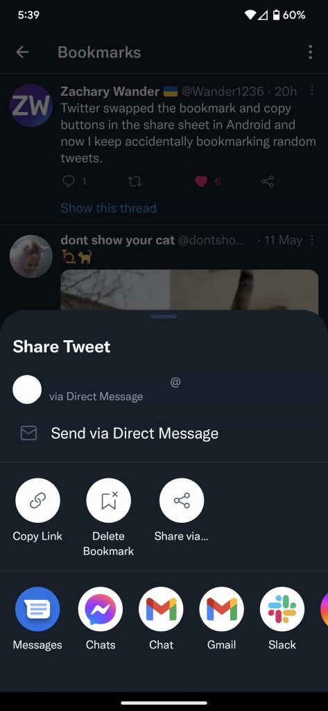
This is a two-tap operation, which involves pressing the Share button, which opens the app’s bespoke share sheet, then tapping “Copy Link” in the middle row of options. With the most recent update to Twitter’s mobile app, “Copy Link” moved from the second spot in that row to the first spot, switching places with “Bookmark.” For those of us who have built up muscle memory, this has led to mistakenly bookmarking quite a few tweets.
While frustrating on its own, the problem is exacerbated by Twitter not making it easy to remove the bookmark. The banner that appears on screen when you bookmark a tweet doesn’t offer an undo action. Upon pressing the Share button again, you’ll see the same option to “Bookmark,” and if you tap this option, you’ll only be informed that the tweet is already bookmarked.
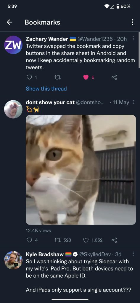
As you’d expect, Twitter users have begun lodging their complaints about the switch-up and the resulting flood of bookmarks.
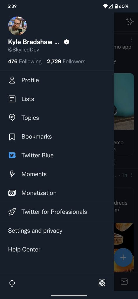
To delete your new collection of unwanted bookmarks, you need to tap your profile picture on the homepage to open the side menu. From this menu, tap “Bookmarks” to see your full list of saved tweets. Finally, tap the share button on one of these tweets and choose “Delete Bookmark.” Alternatively, you can tap the three dots menu in the top right corner of the page to reveal a “Clear all Bookmarks” option, if you simply want to delete everything.


You can also access your Twitter bookmarks from the web and delete them through the same share menu.
9to5Google’s Take
While minor in the grand scheme of things, it’s interesting to see how small changes like this can evoke, shall we say, strong feelings from an app’s users. Changes in an app’s design are inevitable over time, but particularly minor ones like this can sometimes generate a more dramatic response as it isn’t different enough to be obvious but breaks muscle memory.
More on Twitter:
- Twitter preps ‘Search Subscribe’ notifications for new tweets matching a search term
- Twitter for Android working on videos and pictures in the same tweet, ‘awards,’ more [Gallery]
- Twitter adds private Circles, taking a page from Google+
FTC: We use income earning auto affiliate links. More.


Comments