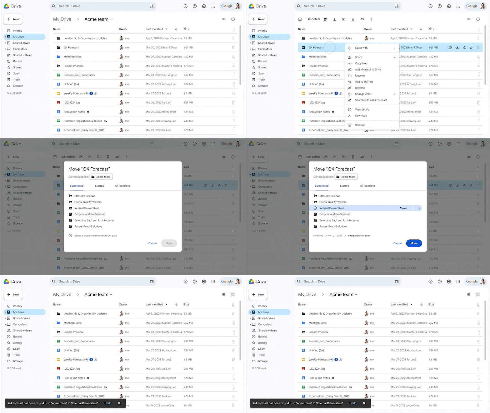
The latest Google Drive web update lets you “quickly and efficiently select a location to organize files and folders” with a redesigned “Move to” picker.
Instead of a small pop-up, right-clicking on a document and selecting “Move to” gets you a UI that takes up most of the screen.
Google Drive names the file you’re moving and its current location. There are top tabs for Suggested, Starred, and All locations. Selecting a location will show the folder path, with the ability to create a new folder. You’ll be notified if you’re moving the file into an empty folder.
After making a selection, there’s a “Move” button “to complete the action of moving a file in one click.” Other aspects include:
- Upon navigating into a folder location, the tabs are replaced by a back button and the name of the location
- Suggested locations and the option to reject the suggestion, which immediately removes it from the list
- A label if a folder is “view only” and explanations for why you might face an error when moving a file, such as not being the owner of a file

Google hopes this will let you “organize files, folders, and shortcuts in Drive in a more effective manner,” and is rolling out over the coming weeks:
- Available to all Google Workspace customers, as well as legacy G Suite Basic and Business customers
- Available to users with personal Google Accounts
More on Google Drive:
- Google Drive’s surprise file limit is already being removed [U]
- Google Drive rolling out persistent search filters on the web
- Google Drive begins rolling out tablet redesign with navigation rail
- Google Drive for Android rolling out PDF drawing and highlighting
FTC: We use income earning auto affiliate links. More.


Comments