
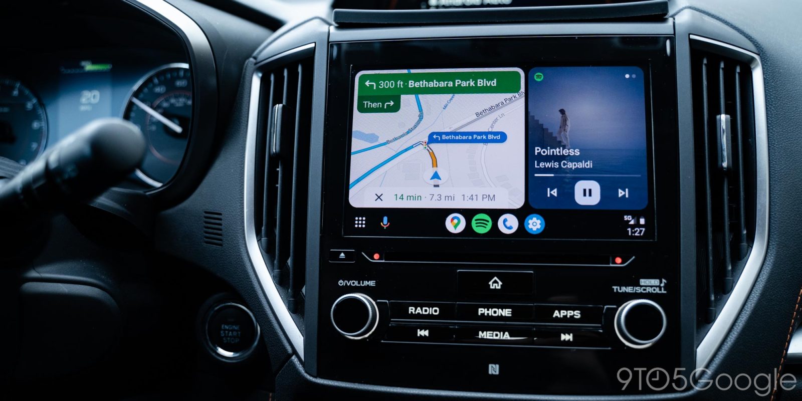
Google Maps is widely rolling out a revamped color palette and, now, that’s also showing up on Android Auto too.
Top comment by Darren
Yeah, and it's horrible in night mode. The color for the active route and the color for alternate routes are VERY similar. The active route is blue and the alternate route is just more of a grey-blue. When looking at this in the car it took me a second to see which route I was actually on, which obviously isn't good when I'm supposed to be paying attention on driving.
This is ironic considering they supposedly changed the colors to make them more visible while driving.
The updated look for Google Maps replaces the usual warm colors with a new, colder color palette. Greens used to represent parks and forests are now a mint color, while roads are grey. It definitely has some usability improvements, but it’s a jarring change.
That change has widely rolled out across the web, Android, and iOS, and it also applies on Android Auto.
In line with the Android app changes, the app now shows its colder color palette throughout the map, as well as through big parts of the UI. As seen below, all text, the blue navigation line, and the direction card at the top of the UI have all changed colors.

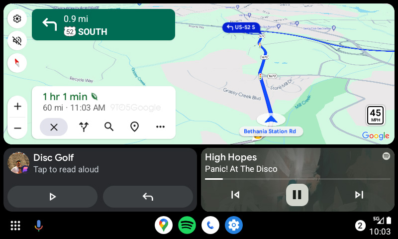
How do you feel about the new Google Maps colors? Personally, I can’t stand the new look…
More on Android Auto:
- Google is looking into broken music apps in Android Auto following Android 14 update
- Android Auto was briefly broken by Google One VPN, but has been fixed
- Android Auto is rolling out another new design for Google Maps


FTC: We use income earning auto affiliate links. More.



Comments