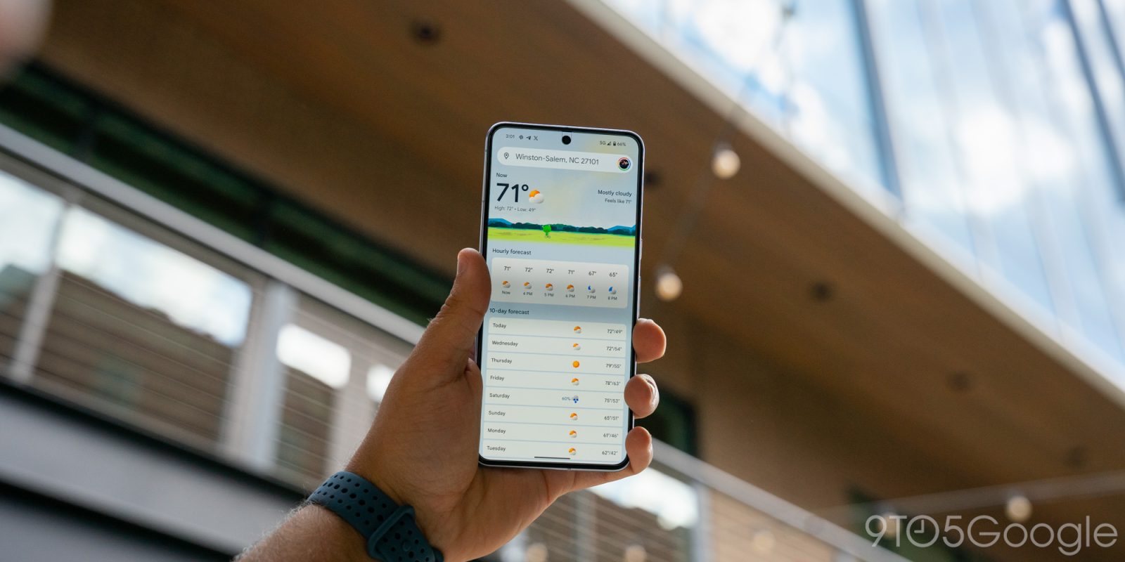
Google did a pretty good job redesigning the Weather experience on Android. It’s modern and has a straightforward layout that shows what’s coming up in the next few hours and days all on one screen.
9to5Google has a rebooted newsletter that highlights the biggest Google stories with added commentary and other tidbits. Sign up to get it early in your inbox, or continue reading 9to5Google Log Out below:
When you do scroll or select a day, digestible cards note wind, humidity, UV index, precipitation, and more. Meanwhile, Google has kept around the lovable “Froggy” with different backgrounds that reflect the current condition to add a bit of whimsy. It really does keep the app fresh.
Helping power 12-hour precipitation forecasts is a deep learning model called MetNet-3 from Google Research and DeepMind that has so far been on par with Apple Weather/Dark Sky in my testing.
This updated Weather experience is currently available on Pixel, but it will presumably expand to all Android devices going forward.
Before the October rollout to Pixel, the last update to Google Weather came in September of 2021. That redesign used Google’s previous Material Theme design language just as Material You was going live in other apps. It’s embarrassing that it took that long to modernize.
Looking forward, I really hope Google has a feature roadmap in place rather than Weather entering maintenance mode until it’s time for the next refresh. An obvious thing to add next is radar and more widgets to show hourly and multi-day forecasts in a 5×1 size. A broader thing Google could do is bring weather to more first-party apps. It’s already starting to do this with Clocks and Contacts, but I think adding it to Google Calendar with a direct link to the full experience would be very interesting and could help people schedule their days.
One thing that could help with that is separating the fullscreen Weather experience out of Google Search and making it a standalone application. For a long time now, it has been part of the Google app.
The reason behind this is presumably because Google views weather as an extension of Search’s knowledge and information purview. The search engine has a rich experience on the web, as well as the Google app on iOS, which also uses MetNet-3. However, that’s not enough, and I think you need to give people a simple app icon that’s ideally preloaded onto every Android device. Given how good Apple’s Weather app is on iOS, Google really should have a 1:1 competitor.
At the very least, Google needs to drop the Pixel exclusivity for the two widgets available today, as that would make for a much more prominent way to launch weather than the homescreen shortcut that’s badged with the Google icon in the corner.
From 9to5Google
Google rolling out first AI Core update on Pixel 8 Pro
Google Cast control notifications now appear in the Android media player
YouTube begins public testing of ‘Playables’ gaming effort [Update: Rolling out]
Google app testing bottom Search bar again, cleans up settings
What (else) is happening
OnePlus 12 revealed; periscope camera, Alert Slider moved, global launch in late January
Walmart launches $15 Google TV streaming stick, available today
Google investigating missing files on Drive, caused by desktop app
Google Assistant ‘animal of the day’ going the way of the dodo
Google Chrome and Calendar are about to drop support for older Android devices
Top comment by Noah Tonk
I have been saying for years that Google needs to integrate a weather radar map layer in Google maps.
Google Slides getting built-in presentation recording tool
IKEA’s new lineup of smart home sensors work with Google Home, and they’re cheap
From the rest of 9to5
9to5Mac: I dare the universe to take my wallet and keys again
Electrek: Tesla Cybertrucks in showrooms attract large crowds
FTC: We use income earning auto affiliate links. More.


Comments