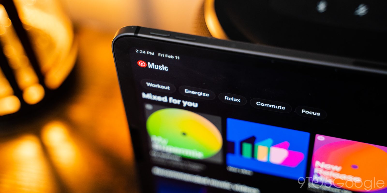
YouTube Music widely rolled out a redesign of its Now Playing screen on Android in June of 2020, brought it to the iPhone over a year later, and this UI is now appearing on the iPad.
The revamp starts with cover art no longer going edge-to-edge as there is now a border. YouTube Music’s song/video switcher is still at the top with Cast next, while the overflow menu is accessed from the top-right corner with this redesign.
Humongous – especially in portrait orientation – cover art is next, with thumbs up/down flanking the song title and artist. You can tap the artwork to quickly share, download, and add to playlist. Below that is the timeline, with play/pause and back/next in between shuffle and repeat.
You can swipe up or tap for the Up Next queue, while Lyrics and Related (which offers a great browsing experience on large screens) round out that bottom row. Compared to Android, you unfortunately cannot swipe on cover art to move through songs.
In portrait mode, this UI is just too stretched out, but it looks better in landscape. Unfortunately, the iPad does not have the Android tablet app’s two-column design that shows the queue next to controls. The app would really benefit from this on iOS. Lastly, when Now Playing is docked, you have access to play/pause and next track, while swiping down gets rid of the current queue.
Speaking of landscape, there is a bug when rotating from portrait results in a fullscreen view where the cover art takes up the entire screen.
The wide rollout of this Now Playing redesign happened on the iPhone last August, and it took the YouTube Music team a year to bring it to the iPad.
More on YouTube Music:
- YouTube Music now lets you see more of your ‘Listen again’ history
- Report: YouTube working on ‘channel store’ for subscribing to streaming services
- YouTube Music now shows ‘Other performances’ of your current song
- YouTube Music starts rolling out redesigned playlist UI to Android phones
FTC: We use income earning auto affiliate links. More.


Comments