
Google’s most awaited Material Theme redesign is of the Play Store on Android. We first enabled it in April and the revamp began rolling out at the end of May before it was pulled in mid-June. Google now appears to be rolling out the Material Theme Play Store again.
Beginning on August 1st, users around the world started seeing the Material Theme revamp of Google Play on their devices. There are over a dozen reports of people receiving it so far. It’s not widely rolled out, with many also having the look over that two week back-and-forth in June.
During that period, Google rolled out new versions of the Play Store that enabled the redesign after sideloading the APK. However, subsequent updates that automatically followed disabled the look.
This time around, there are reports of the redesign active with version 15.8.23. That is also the case for some users on 16.0.15, but force stopping/clearing cache in settings does not enable it. Hopefully, this is the actual launch of the highly anticipated revamp.
Update 8/16: The rollout earlier this month did not stick for users, but the Material Theme Play Store is appearing again on devices in another wave over the past 24 hours.
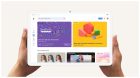
The most striking aspect of this Material Theme Play Store is how the app is now stark white. Google has removed the green (apps & games), red (movies & TV), and blue (books) accent colors from the app and status bar. This bright color is particularly striking in the “My apps & games” list and listings. App names are now much more prominent, while the “What’s new” section sees better spacing.
Orange has been stripped, but that coincides with Music not being included in the new bottom bar. No longer a tab, that store is still accessible from the mostly unchanged navigation drawer as “Browse music,” with shortcuts to the Play apps underneath.
Nested tabs, which violated Material guidelines, are gone thanks to bottom navigation acting as the high-level switcher between the four main content sections. The top carousel is now used for categories like For You, Top Charts, Categories, Editors’ Choice, Family, and Early Access in the case of “Apps.” The Google Sans font is present in feeds, with new tab indicators, pills, and other Material Theme elements leveraged.
On Chromebooks and other large screens, the bottom bar is replaced with a navigation drawer, while the full Google Play logo appears at the top-left. The Play Store expands to fit more, but does not scale to be edge-to-edge.

FTC: We use income earning auto affiliate links. More.

Comments