
YouTube Music has seen a flurry of changes in recent weeks ahead of Play Music shutting down by year’s end. A smaller change sees YouTube Music for Android and iOS revamp its branding.
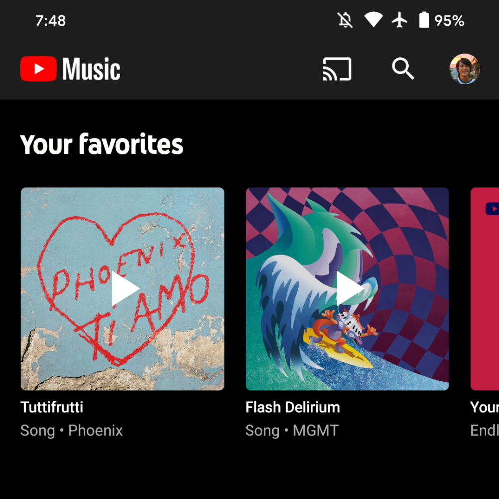
Original 8/28: YouTube Music has always maintained two logos. There is the homescreen app icon where the white play symbol is at the center of a bright red record/CD, while at other times the main YouTube logo is used followed by the word “Music” in the service’s custom font.
That second brand has long been at the top-left corner of YouTube Music for Android and iOS. Version 3.81 changes it to the first instance on both mobile platforms, though the web client has yet to be updated. That said, the Progress Web App (PWA) has always used the round variant.
Meanwhile, the other place users encounter the dueling logos is on playlist cover art. There is seemingly no logic in whether the circular icon or broader symbol is used in the top-left corner of official playlists. For example, “Your Mix” and “New Release Mix” use the latter, while “Released” takes advantage of the round logo. All three have been recently updated/revamped by Google.
3.79 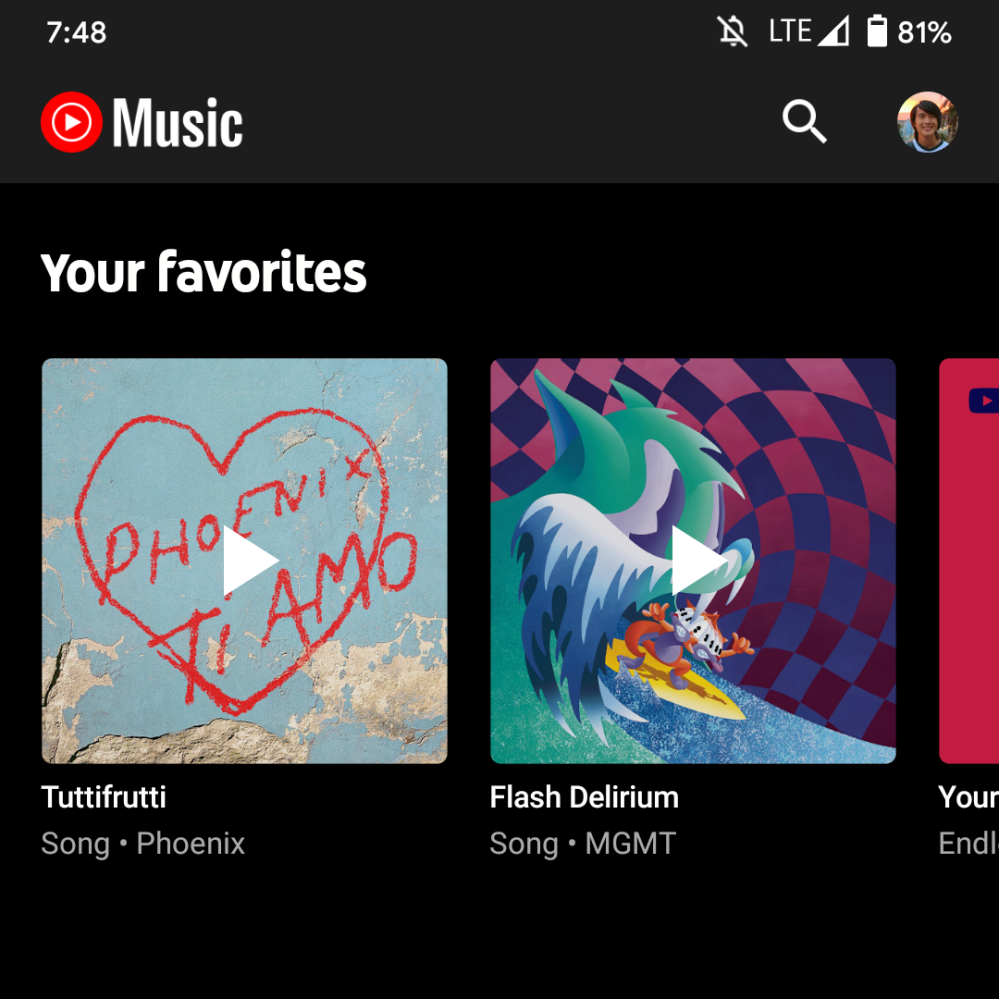
3.81
Update 9/2: A week later, music.youtube.com has followed in implementing this change. On the web, the logo is quite small.

More about YouTube Music:
- Google Assistant Snapshot feed now suggesting YouTube Music playlists, news, sports, more
- YouTube Music on the web rolling out lyrics in Now Playing screen
- Google says it will fix issues with YouTube Music — what are your biggest complaints? [Poll]
- Google Play Music will stop working in October, MP3 store also shutting down
FTC: We use income earning auto affiliate links. More.
Comments