
Android 12 Beta 3 signifies a milestone as the stable OS builds inch ever closer to a full launch later this year. We’ve already done a deeper dive into the “top” new features and functions, but we’ve unpacked a few more that you might have missed but should definitely still know.
It feels like with each Beta release, certain gripes and complaints are being addressed as soon as Google is able, and with Android 12 Beta, it feels no different. Sure, there are some neat new additions, but most of the tweaks are focused upon refining the already enhanced experience that we all know and love.
Summary
- Video — Hands-on with yet more Android 12 Beta 3 features!
- Brand new device setup experience
- New default ringtones
- Updated Picture-in-picture controls
- Minimized ripple selection effect
- Mono color Settings app + tweaks
- New fingerprint unlock animation
- Material You Gboard theming for some
- Android 12 Developer Beta 3: What is your favorite new feature?
Video — Hands-on with yet more Android 12 Beta 3 features!
Subscribe to 9to5Google on YouTube for more videos
Brand new device setup experience
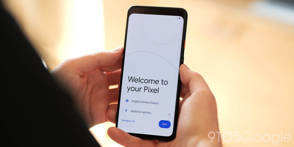
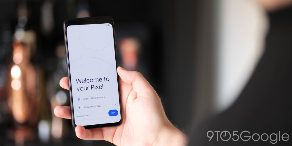
Let’s start right where it will all begin for Pixel 6 owners later this year. Android 12 Beta 3 is introducing a brand new themed device setup screen and experience. We very rarely see changes to the setup walkthrough, but with Material You theming at the very core of Android 12, a lick of paint at the initial launch screen is warranted.
Many of you out there won’t see this screen for quite some time, especially as restoring a phone or setting up is not something you’ll do unless you pick up a new device or encounter a problem that requires a full reset. Google has put further emphasis on teaching navigation gestures with a lengthy tutorial on how to use the gestures. This part isn’t fully new but seems a bit more in-depth now than it was in previous releases.
New default ringtones
With Android 12 Beta comes an update to version 2.8 of the Sounds app, bringing with it some new and updated ringtones. Some of the original defaults appear to have been tweaked to better fit with some of the other Google sound tweaks seen on other devices in recent months.
“Bright Morning” is the current “Default alarm sound” and comes in at 12 seconds. It’s still available, but Google has added “Fresh Start” to the collection. It shares the same structure and can best be seen as a softer evolution. This refinement is also much longer, at 31 seconds.
The current default “Popcorn” notification tone has also been updated, with “Eureka” being a little softer and less sharp than the original. There should also be an updated “Phone ringtone” called “Your New Adventure” to replace “The Big Adventure.” Unfortunately, it fails to download, but this is the clearest example of the lineage between the old and new sounds.
Updated Picture-in-picture controls
When watching content using the Picture-in-picture mode, you’ll notice rounded corners on the video player first and foremost. Those rounded corners were added in a previous beta, but dismissing the video from your homescreen has a new effect.
Dragging the floating player downwards sees the “X” icon become more prominent and slides in from the bottom of your display. Sliding any playing content into this section, and the video will be enveloped with a haptic vibration confirming that it will be dismissed before sliding out.
In practice, this is a really nice animation change that makes it clear to new users just what is going on. Unfortunately, the “X” icon isn’t yet affected by the Material You theming settings, but we’re hoping that too might get a lick of paint. That said, the blue icon is obvious on most backgrounds from your Pixel Launcher homescreen.
Minimized ripple selection effect

Following the first beta, Android 12 users immediately complained about how the ripple effect looked like a graphical bug. Google responded and promised updates, with Beta 3 today delivering a more subtle sparkle. In Android 12 Beta 3, the ripple effect is still available but not as visible or irritating as it was before.
The individual dots/sparkles are smaller and, therefore, less noticeable. Taps and activations now feel less like a bug because the artefacting has been reduced substantially. The result is much smoother and less distracting but still helpful when tapping menus and on-device toggles.
Mono color Settings app + tweaks
The Settings app has been toned down with the color stripped in favor of a mono approach. Menu subsections still retain the Material You theming, but the main list view appears in a greyscale color palate rather than with colorful icons to denote each section.
Also, with the Settings sections, all of the toggles have been updated to be consistent. The App Info page has also had a slight refinement, with rounded corners added to each of the buttons. None of these changes affect the functionality but help tie together aspects of the full OS redesign — for better or worse.
New fingerprint unlock animation
The fingerprint scanner animation when unlocking your device in Android 12 Beta 3 has gained an update to fit in with many of the other new animations in the latest build.
This new “wave” animation effectively copies other lock screen animations added back with Android 12 Beta 2. The Always-on display activates and powers on from the corresponding position in your display top where the fingerprint scanner is placed at the rear of your device — provided you have a Pixel with a fingerprint scanner, that is. This also replicates the Face Unlock animation added in the last beta for Pixel 4 devices.
Tapping the fingerprint scanner — to initiate an unlock — will see the screen activate in a small circular wave until your entire homescreen is revealed. It’s a smooth transition that fits with the rest of the tweaks that have been made within the Android 12 Beta updates thus far. When plugging in a charger, there is a wave ripple animation from the bottom of the screen towards the charge port.
Material You Gboard theming for some
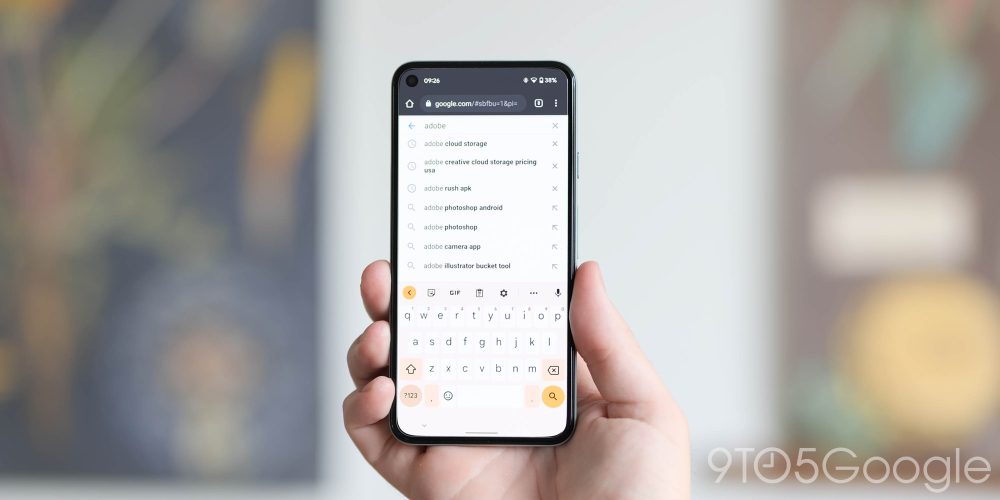
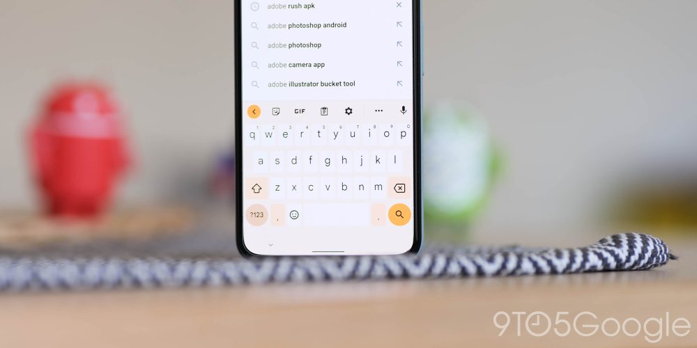
In another one of those pesky limited phased rollout, Gboard now supports Material You theming for some lucky users out there. The change is likely to be made available to everyone at some point in the coming months ahead of the stable Android 12 release, so it is a notable change nonetheless.
The Google keyboard redesign will vary ever so slightly depending on whether you have “Key borders” enabled. If disabled, the ‘?123’ key and spacebar are placed in pill-shaped buttons and adopt a rather dull hue based on your system color settings. While the return key is similarly shaped, but — along with the ‘expand’ key in the top suggestions strip — is much brighter and vibrant in color.
If key borders are enabled, the ‘return’ and ‘expand’ buttons are the brightest keys and are placed in circular icons. ‘123?’ is also a circle and quite dark. However, there is a third level of key theming that slots in between the other two shades for caps lock, comma, period, and backspace. Lastly, the background is themed, while all other keys are lighter/white.
Android 12 Developer Beta 3: What is your favorite new feature?
In combination with our first deep dive, that should be every single feature that we’ve found in Android 12 Beta 3 thus far. Sure, there might be some hidden options that we have yet to find, but for the most part, this is quite the overhaul. What is your favorite new feature or features? Let us know down in the comments section below!
FTC: We use income earning auto affiliate links. More.


Comments