After completing the Tasks migration and introducing tablet optimizations, Google Calendar for Android is next adding Material You widgets.
Google Calendar for Android was updated with Material You in September of 2021. As part of that, the widgets were visually tweaked and adopted Dynamic Color theming. Later that year, Google previewed a design more closely aligned with Material You.
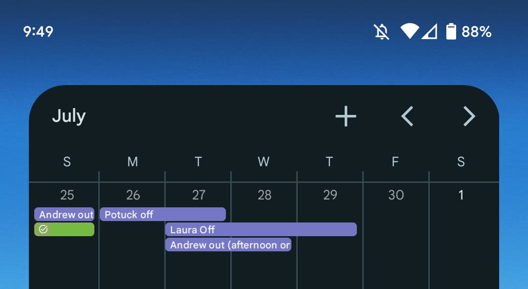
Starting with the Calendar schedule widget in its narrowest form, which Google has fortunately retained, we see that the current month is no longer listed in a miniature app bar. Rather, you get the day and date in the top-left with events going edge-to-edge. The separator lines for weeks have also been removed.
In the top-right corner, you have a more prominent FAB with a rounded square button that’s similar to other Material You widgets, like Gmail and Google Keep. If you make this homescreen object slightly wider, the month returns with few other changes.
Meanwhile, the Calendar month view widget is mostly unchanged. The same M3 button appears in the corner, with the forward/backward moved to the left.
Compared to the original 2021 preview, there’s much less empty space.
Google Calendar’s new Material You widgets are not yet live on devices we checked today. It’s presumably a server-side update with the latest version of the app.
Update 7/14: Google tells us that these widgets are rolling out gradually.
More on Google Calendar:
- Google Calendar booking pages come to free accounts, Gmail adds built-in schedule sharing
- Chrome for iOS adding mini Google Maps and integrating Calendar, Translate
- New Google Docs Calendar template lets you collaborate on invites
FTC: We use income earning auto affiliate links. More.


Comments